SIU FOUNDATION
TEDRICK WELCOME CENTER
-
Vision & Goals
Assignment
-
Space Planning & Integration
-
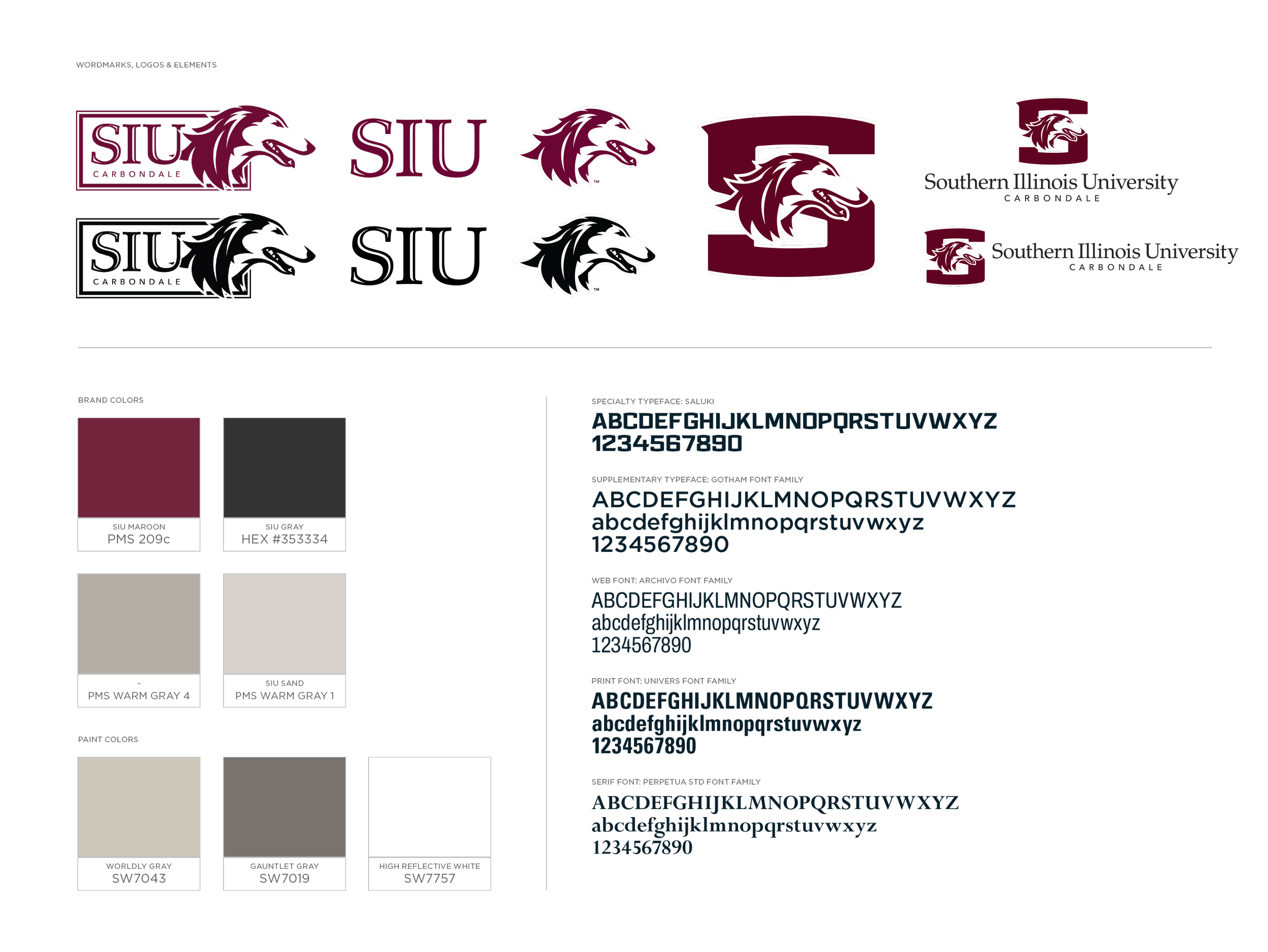
Brand Palette
Elevations and Detail Drawings for each element
01
OVERVIEW
A PLACE FOR THE NEXT GENERATION TO FEEL THE SIU EXPERIENCE AND BE INSPIRED TO COME TO SOUTHERN.
VISION AND GOALS
Starting point for campus visits and tours
A place for Alumni to come home
Prospective students can feel the culture of SIU
Evoke pride from local students
Make regional students feel welcomed
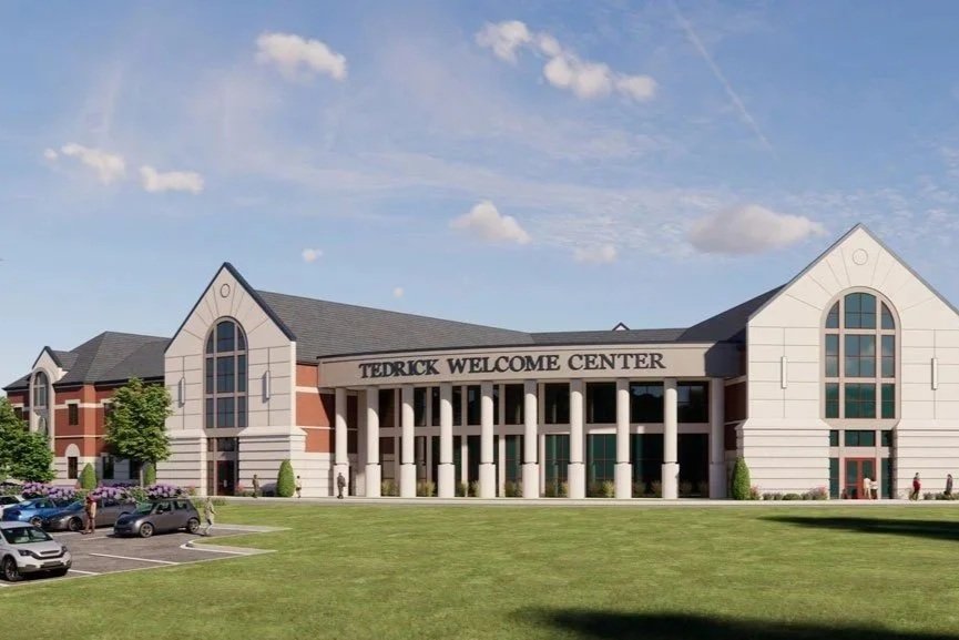
OUR ASSIGNMENT
To develop creative solutions that enhance the visitor experience by fostering meaningful connections between SIU and the diverse audiences that will visit the new Welcome Center.
02
CONTENT THEMES
Space Planning & Integration
FIRST FLOOR
Theme integration
-
Discover where you belong at SIU, connect with like-minded peers, and build lifelong relationships in a vibrant, welcoming community.
-
Explore hands-on learning, innovation, and limitless opportunities that will shape your future and fuel your ambitions.
-
Become part of a proud network of alumni, mentors, and leaders who support you on campus, in the classroom, and well beyond graduation.
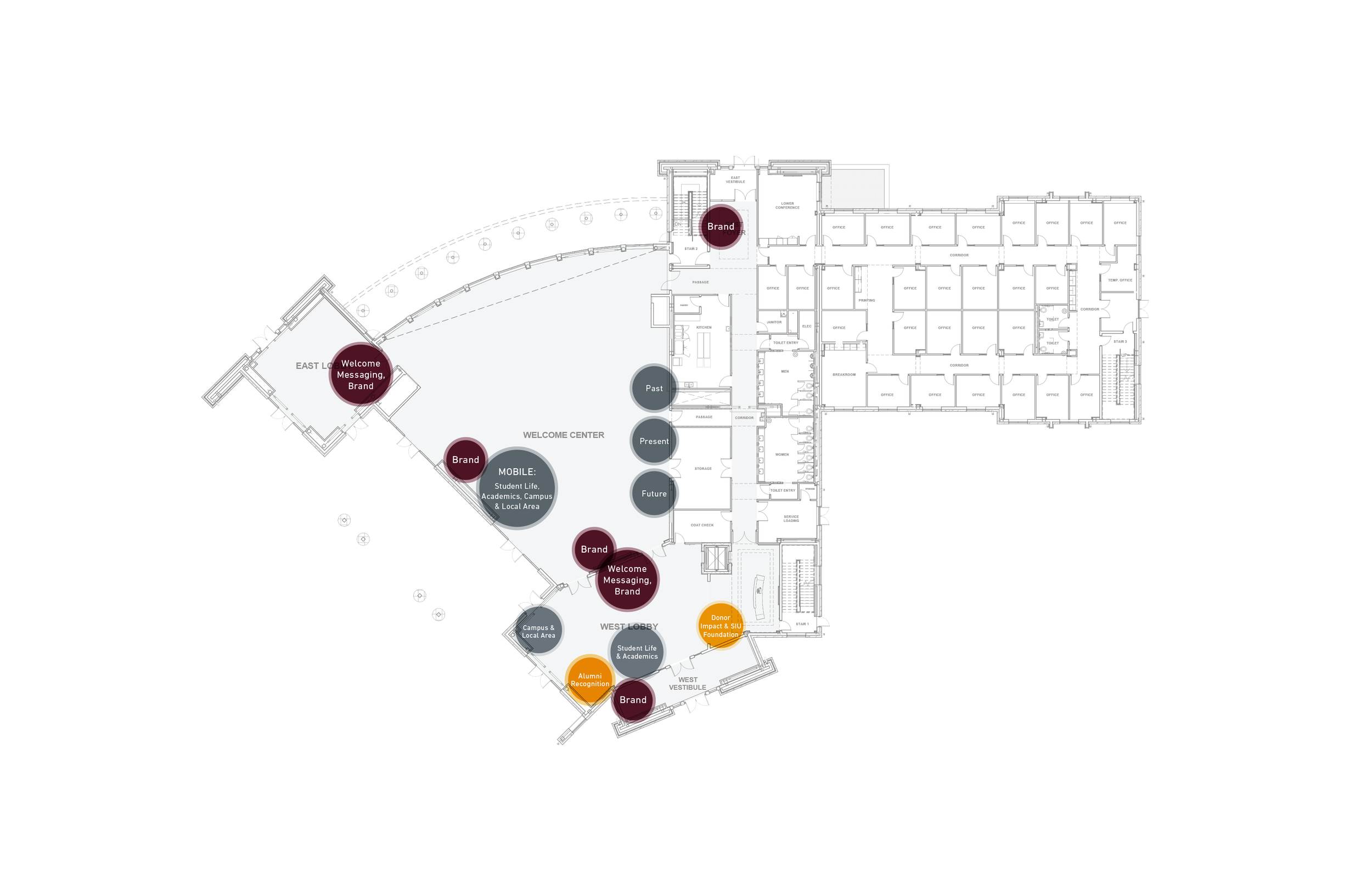
FIRST FLOOR
THEME INTEGRATION
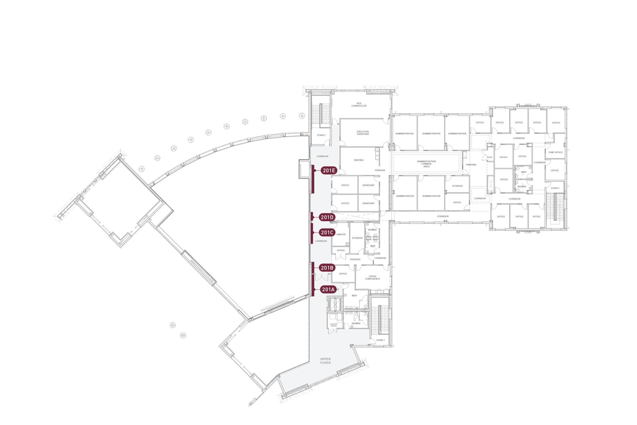
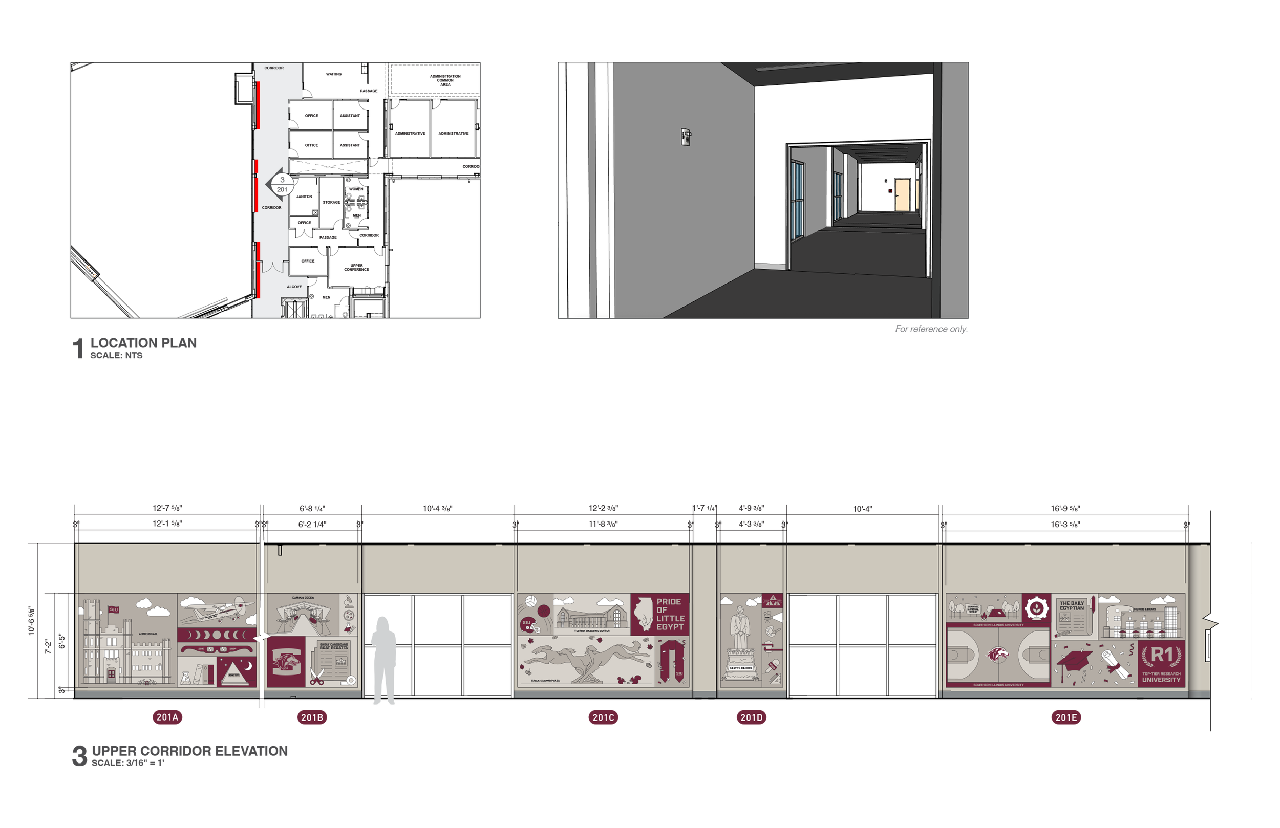
SECOND FLOOR
ACTIVATION LOCATIONS
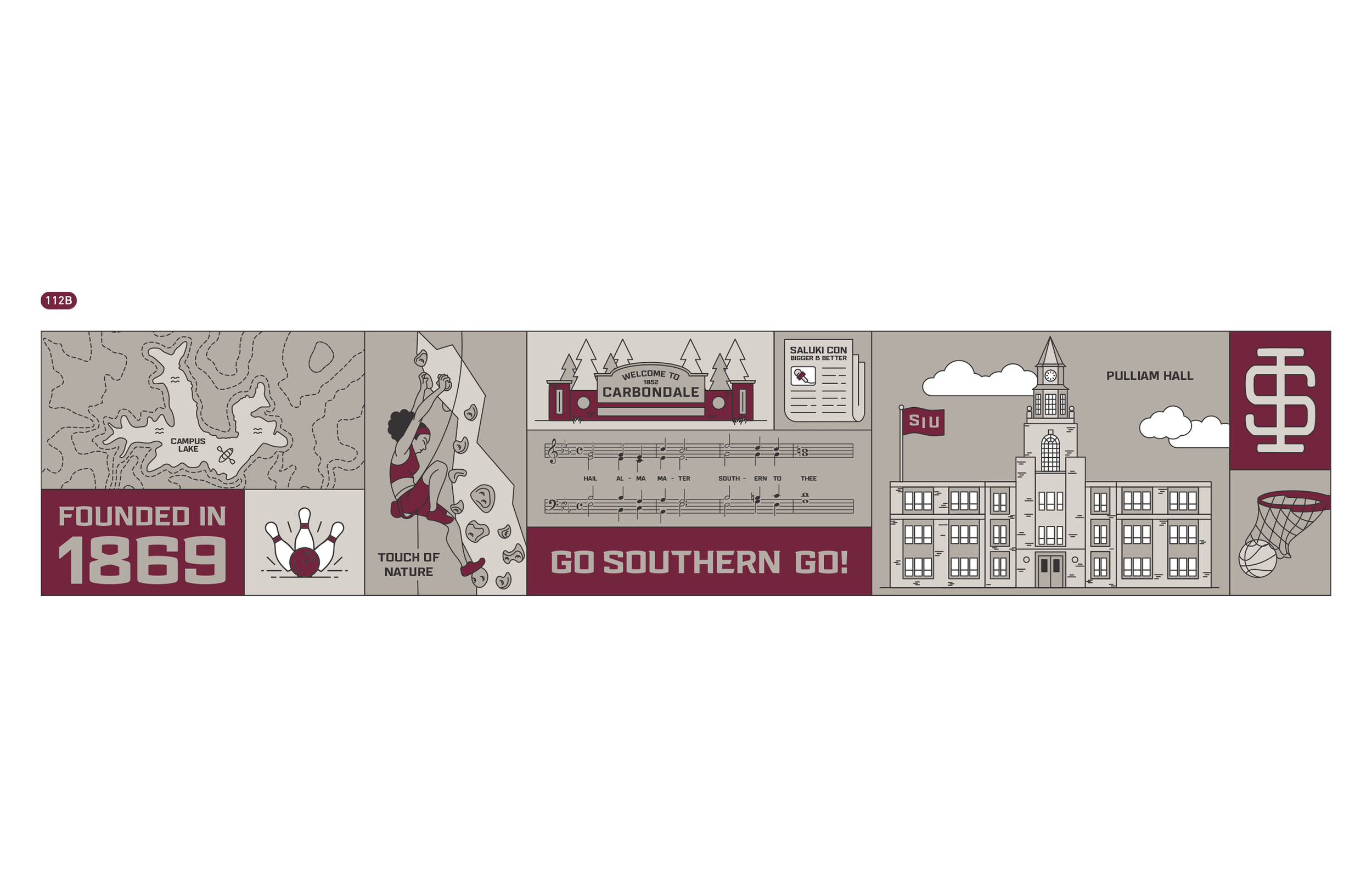
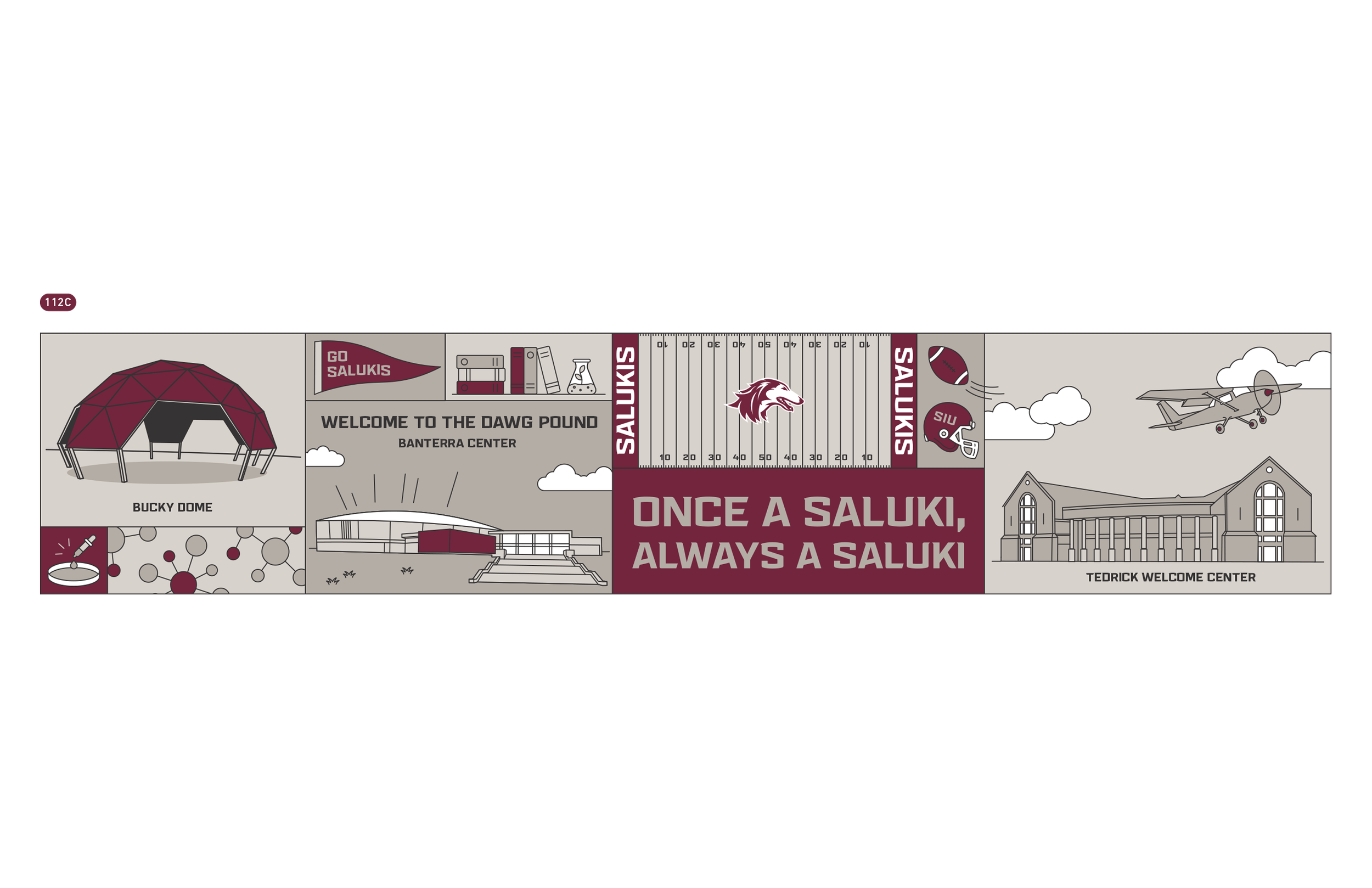
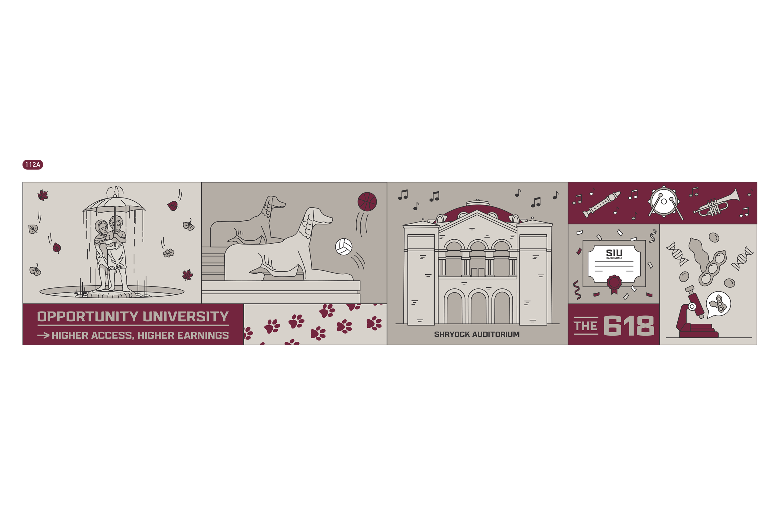
West Vestibule
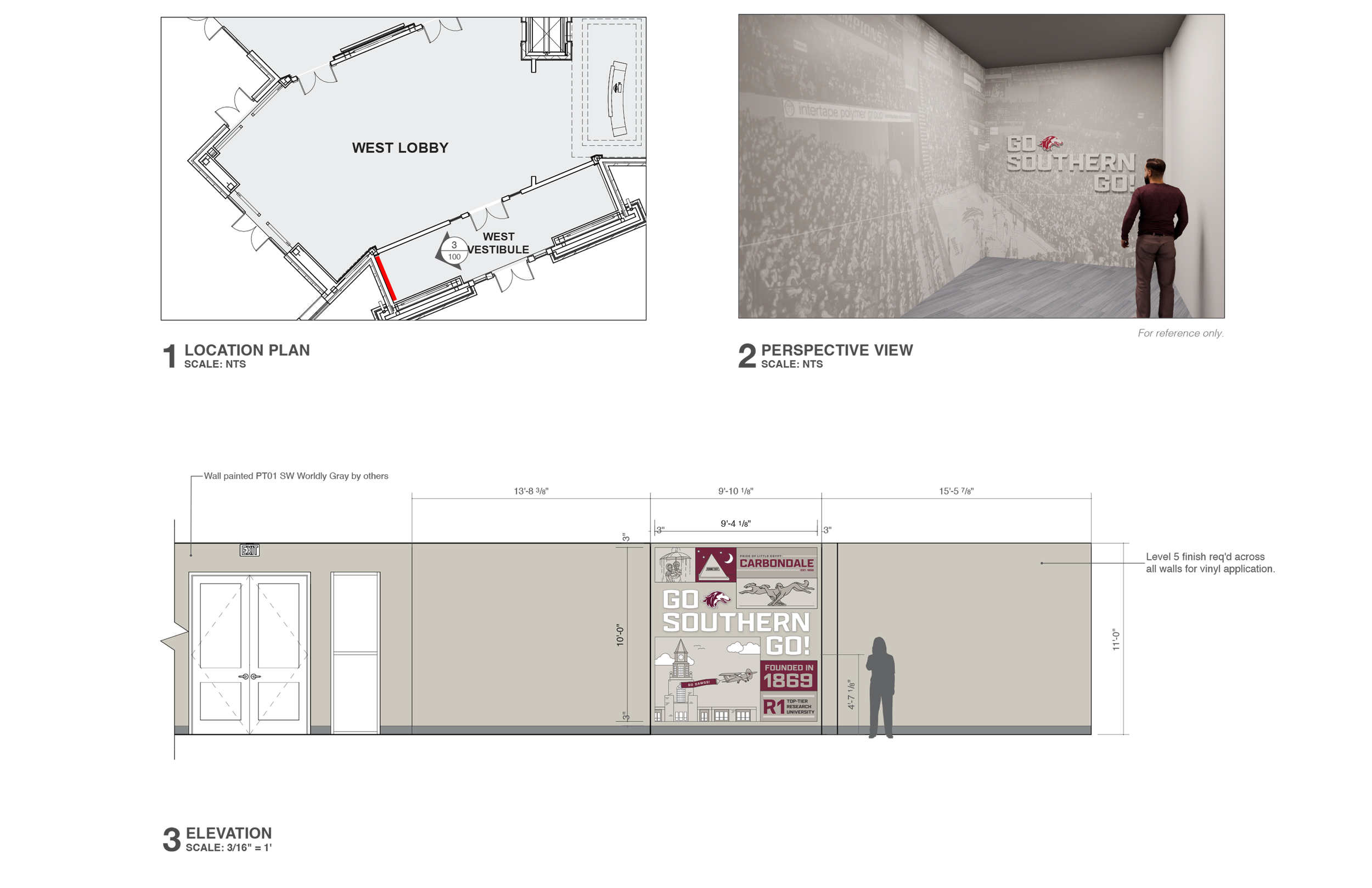
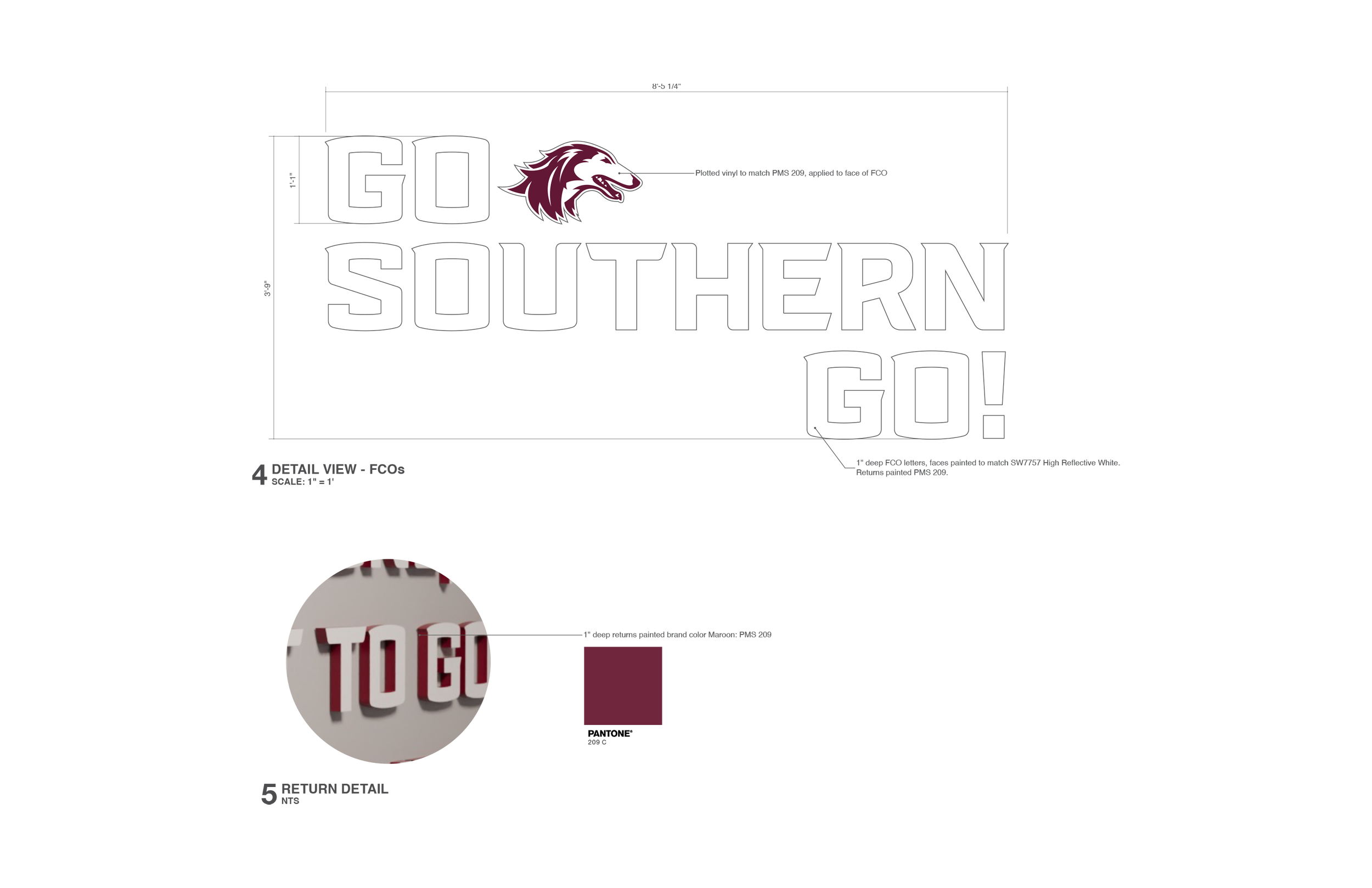
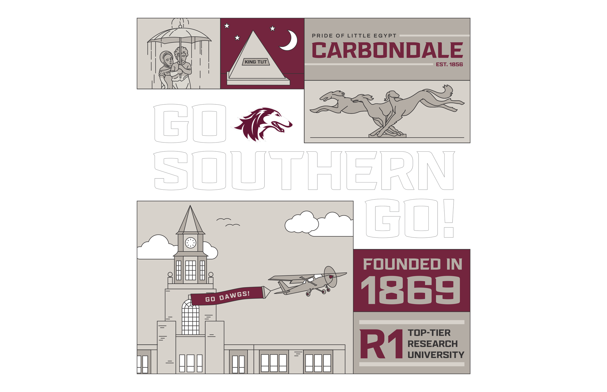
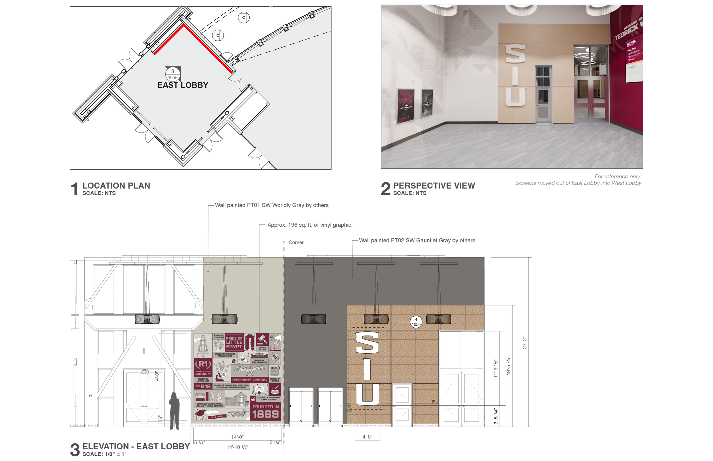
East Lobby
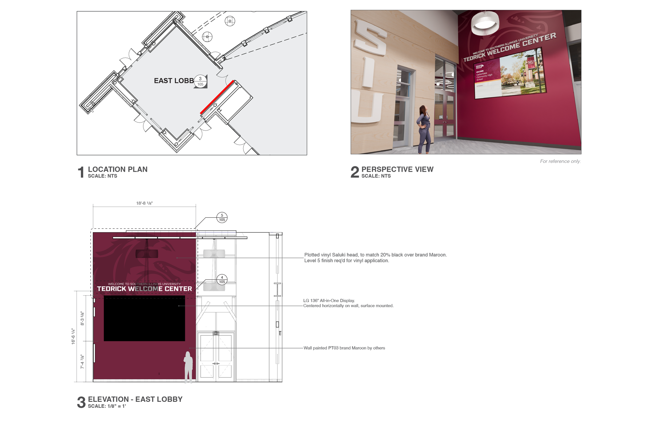

Foundation - First Floor
Second Floor - Foundation
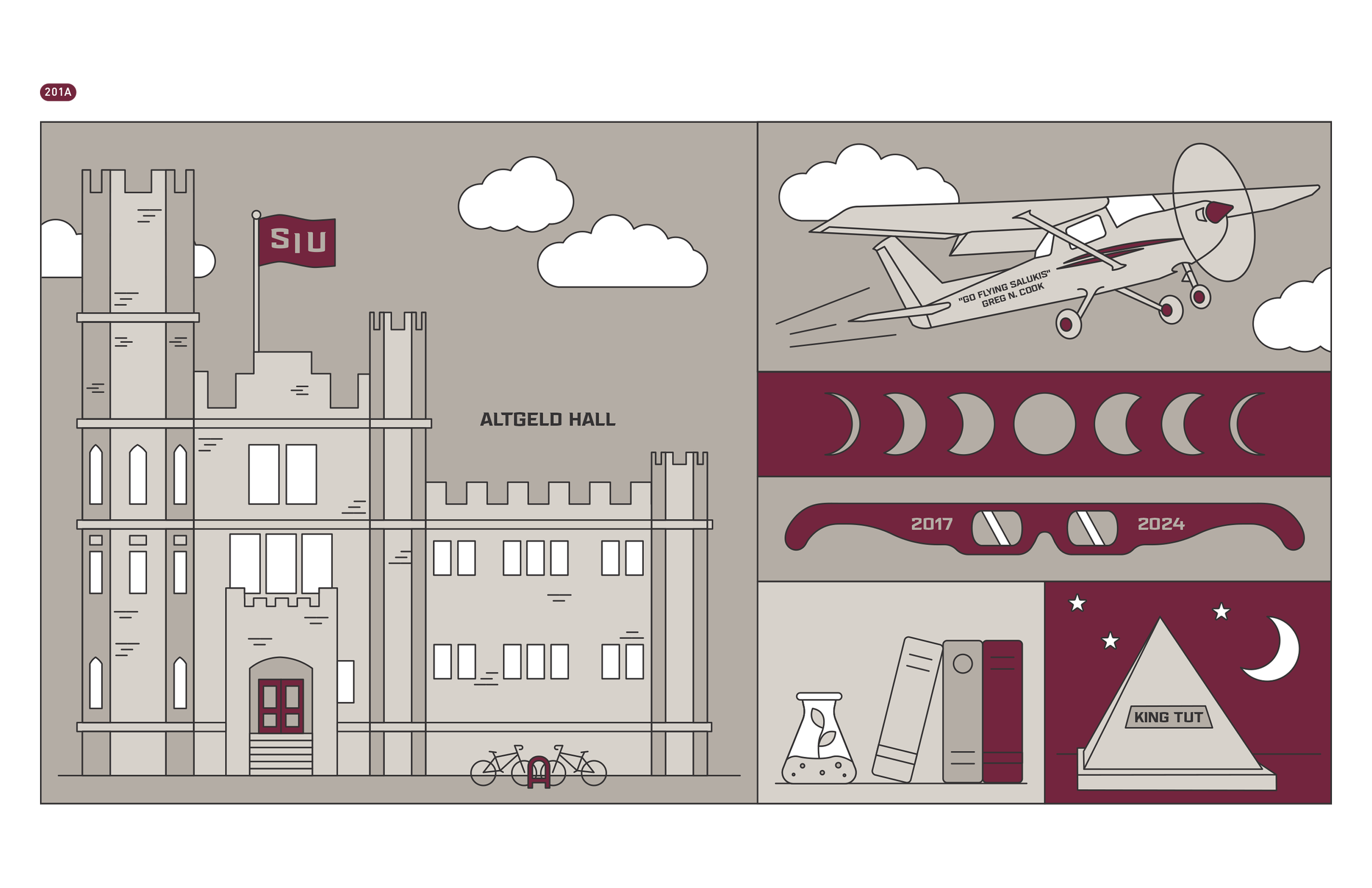
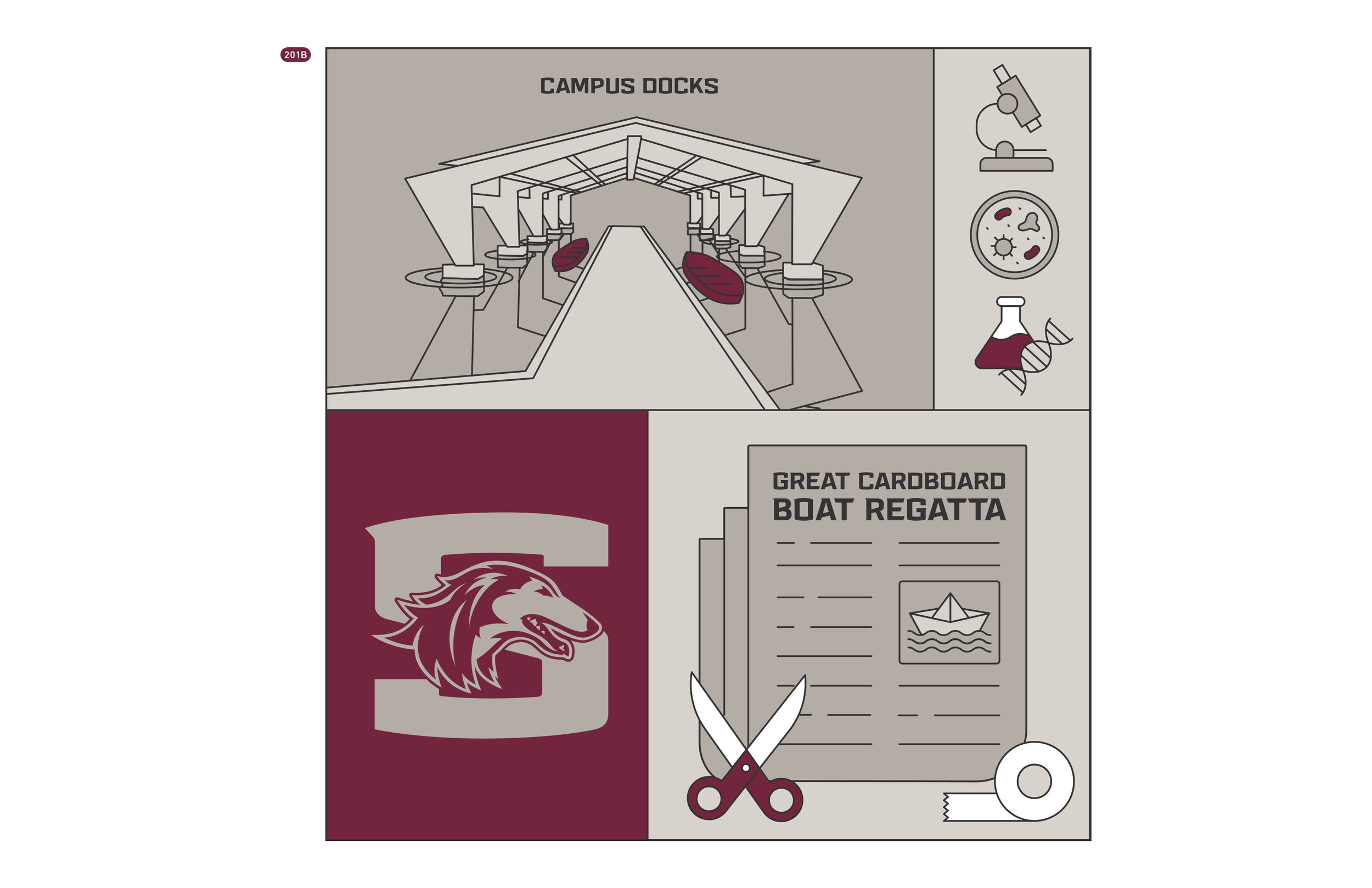
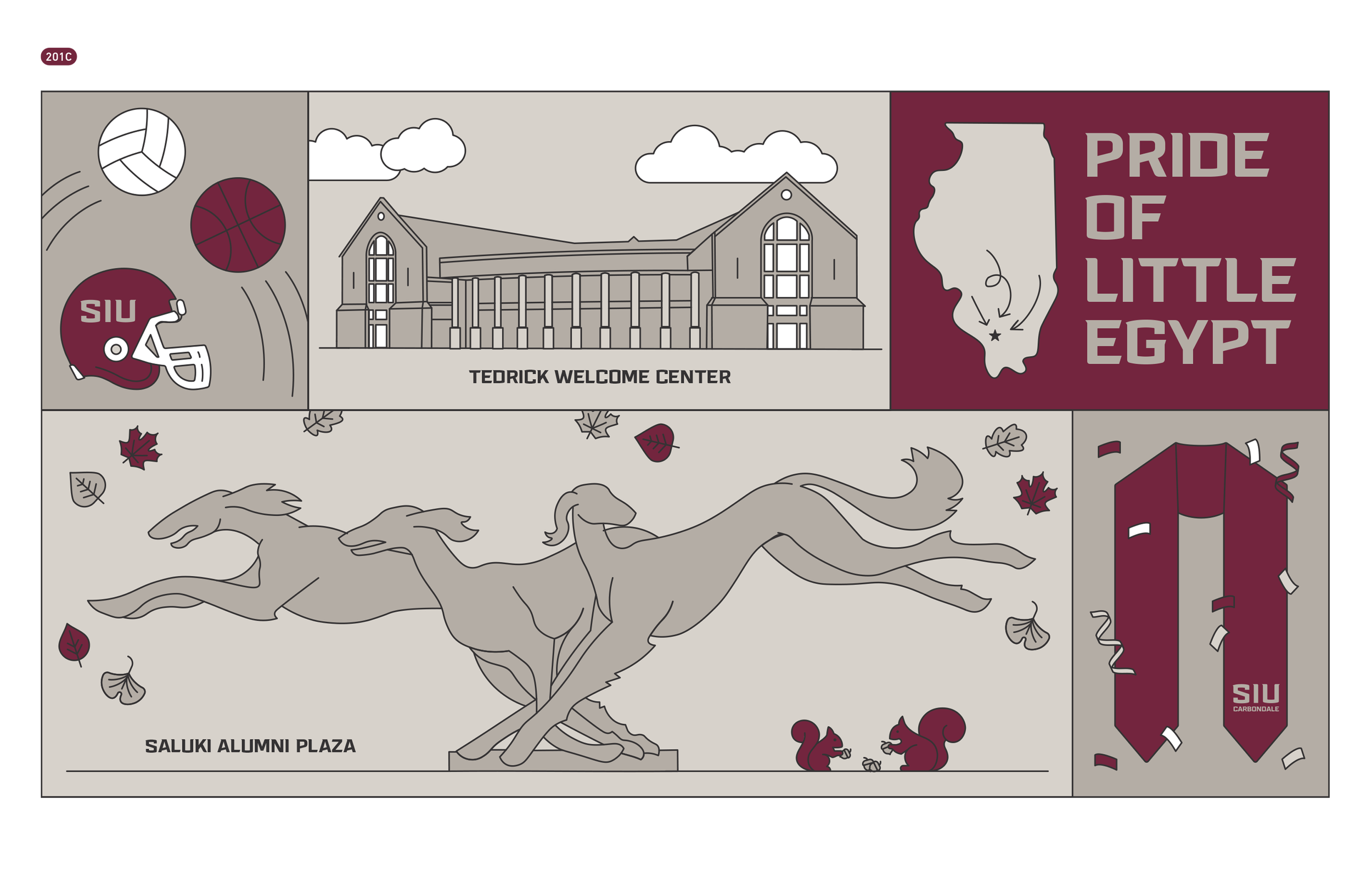
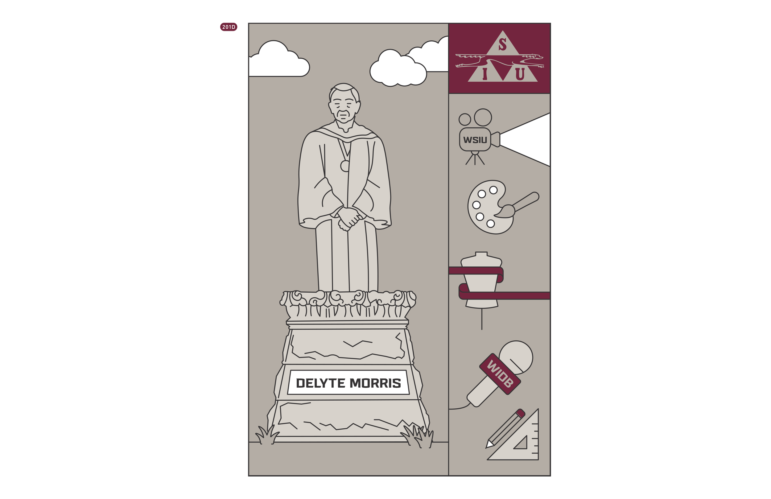
SIU Foundation — Tedrick Welcome Center
UX / UI Design · Experiential Design · Carbondale, IL · 2025
Client: SIU Foundation
Role: UX / UI Designer Year2025
Tools: Figma / Illustrator
My Role
I contributed across the full UX lifecycle on this project — from early information architecture and user flow mapping through wireframing, visual design, Figma components, and developer handoff. My work touched all three of the activations shown here: the Saluki Welcome Board, Pride of the Pack, and the SIU Experience campus map kiosk. Each one had its own content challenges and interaction logic, so a big part of the work was figuring out how to organize information in a way that felt intuitive for very different kinds of visitors — first-time prospective students, returning alumni, donor groups, and families on campus tours.
Project intro
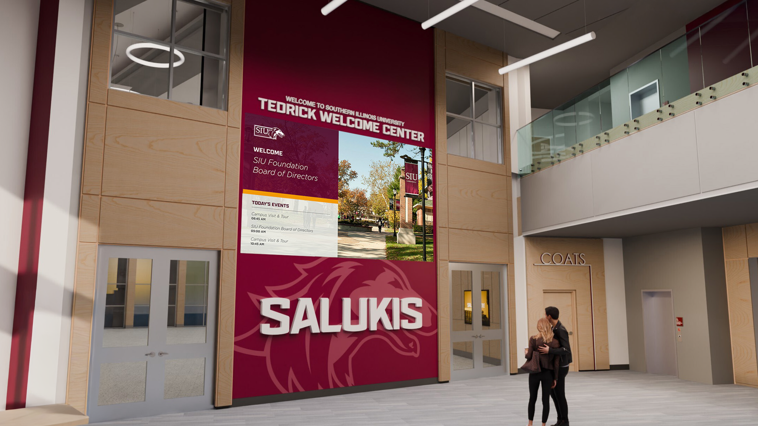
The Tedrick Welcome Center is the flagship welcome and donor experience for Southern Illinois University's Foundation, designed to greet prospective students, families, alumni, and donors as they enter the building. The space houses a series of digital activations — from a large-format LED welcome board in the lobby to interactive touchscreen kiosks — each designed to tell a different piece of SIU's story. This was a full team effort at Dimensional Innovations, and what you're seeing here is the result of a lot of people working closely together.
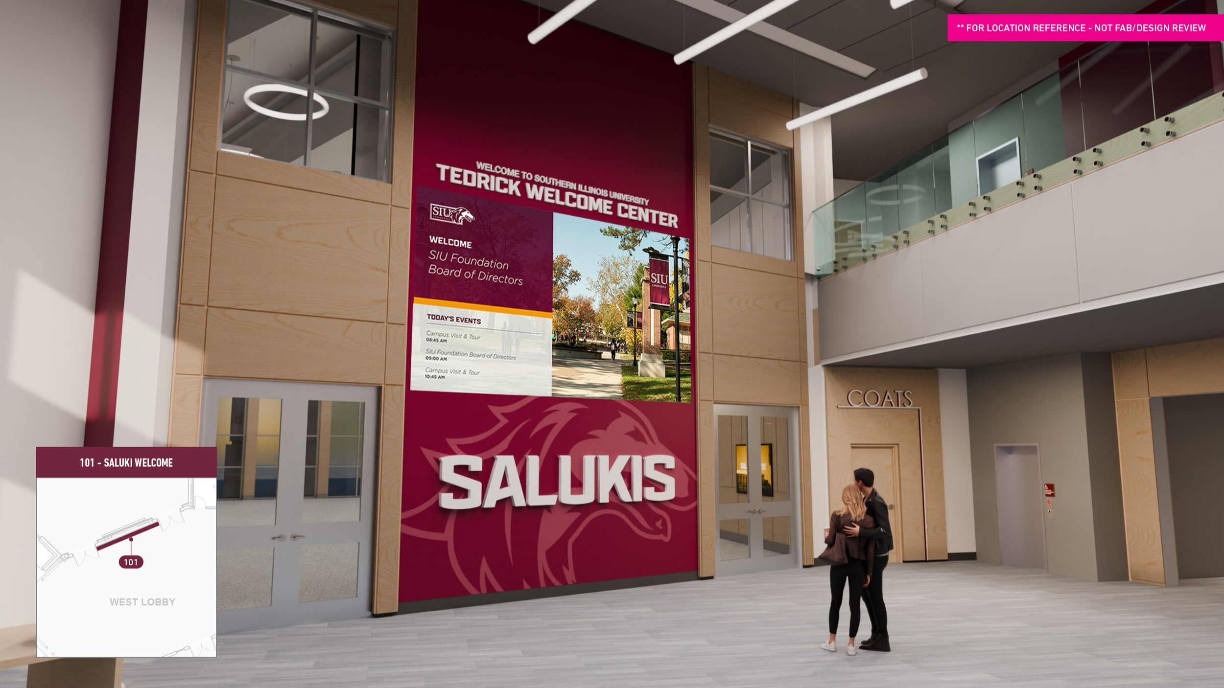
101 — Saluki Welcome Board
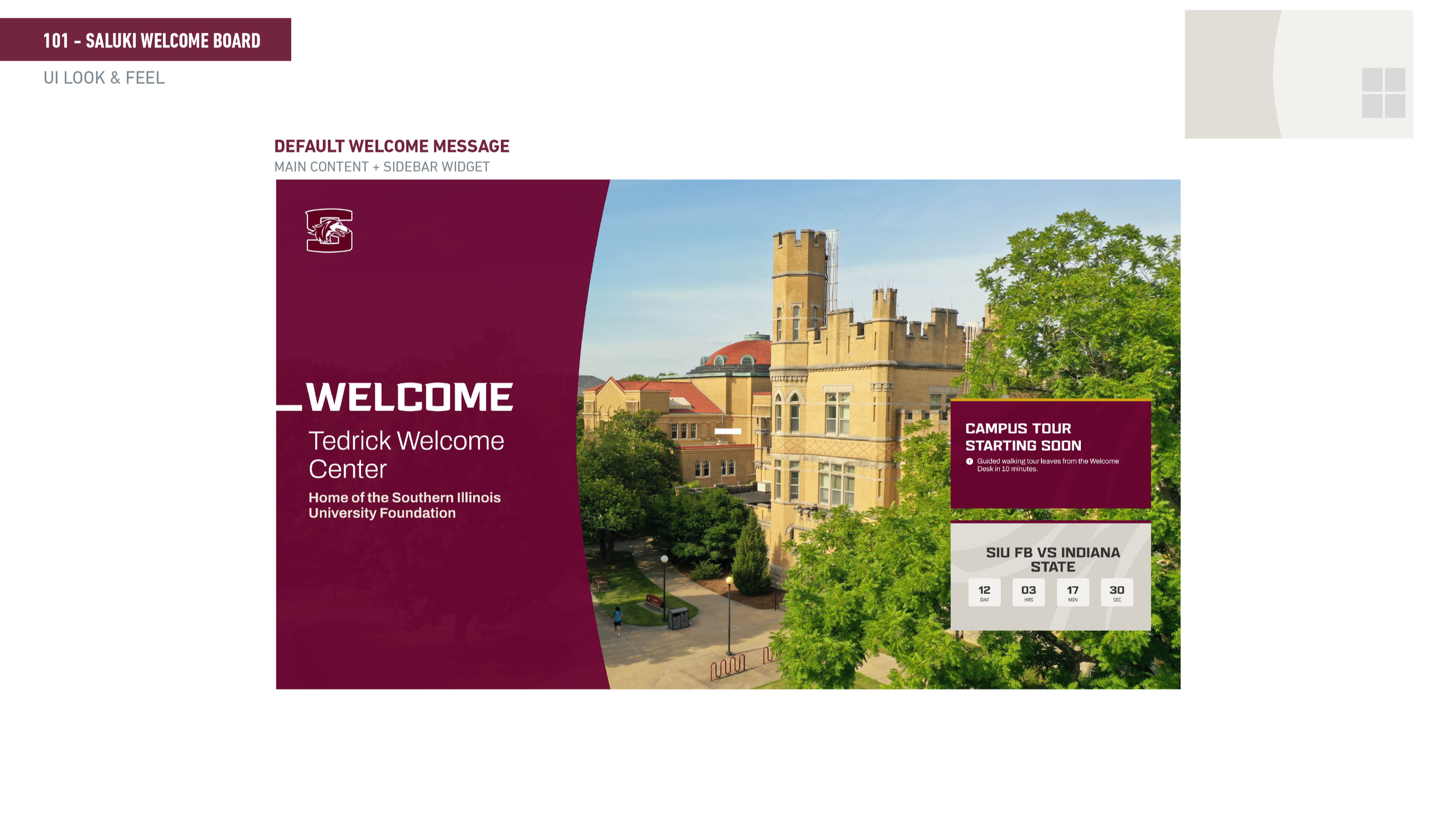
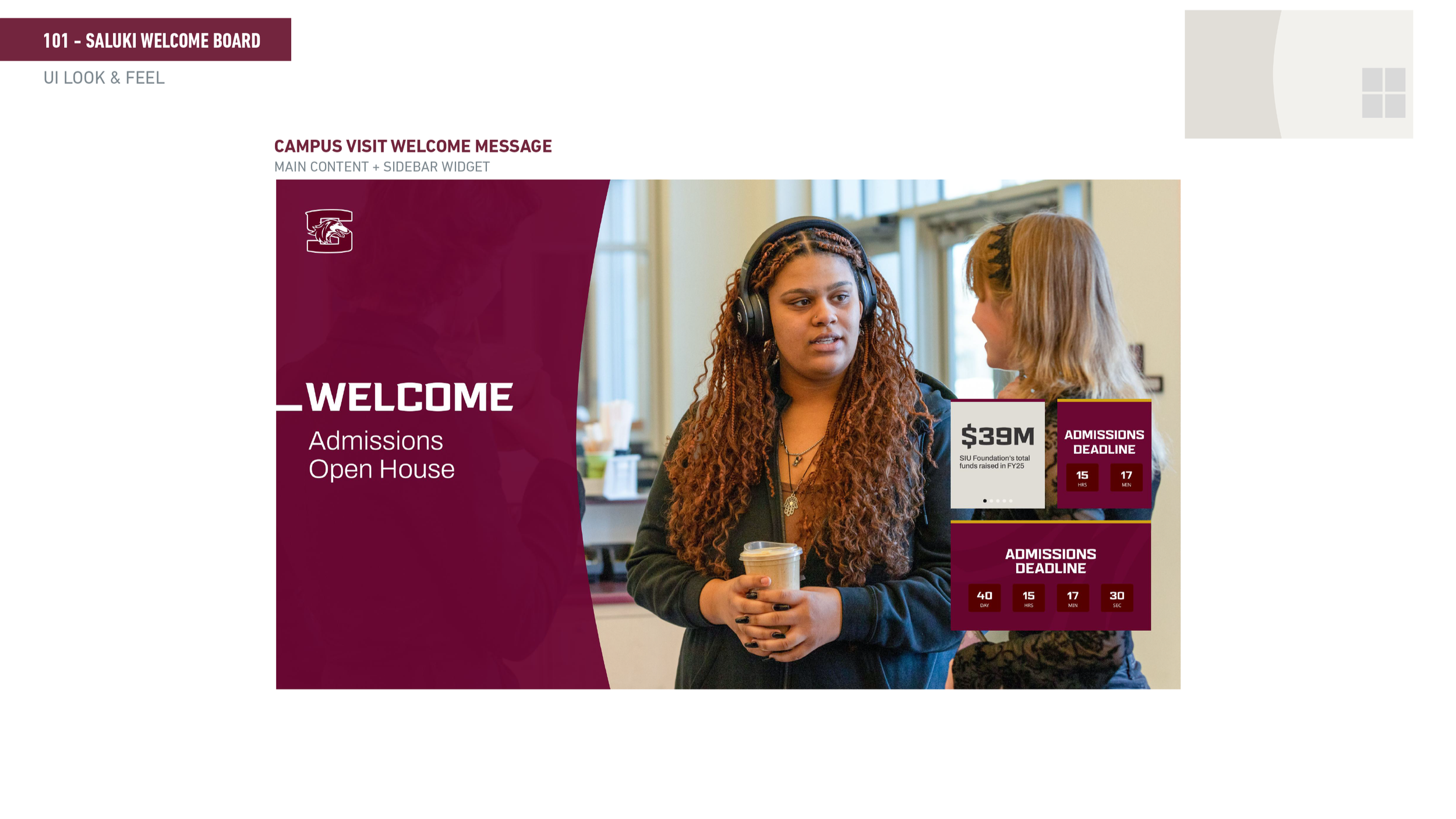
Overview The Welcome Board is a large LED screen in the west lobby — the first thing you see when you walk in. It needed to do a lot of things at once: welcome specific visitor groups by name, display today's events, recognize donors and sponsors, and switch between different content modes throughout the day. The challenge was designing a flexible system that could handle all of that without needing a developer every time something changed.
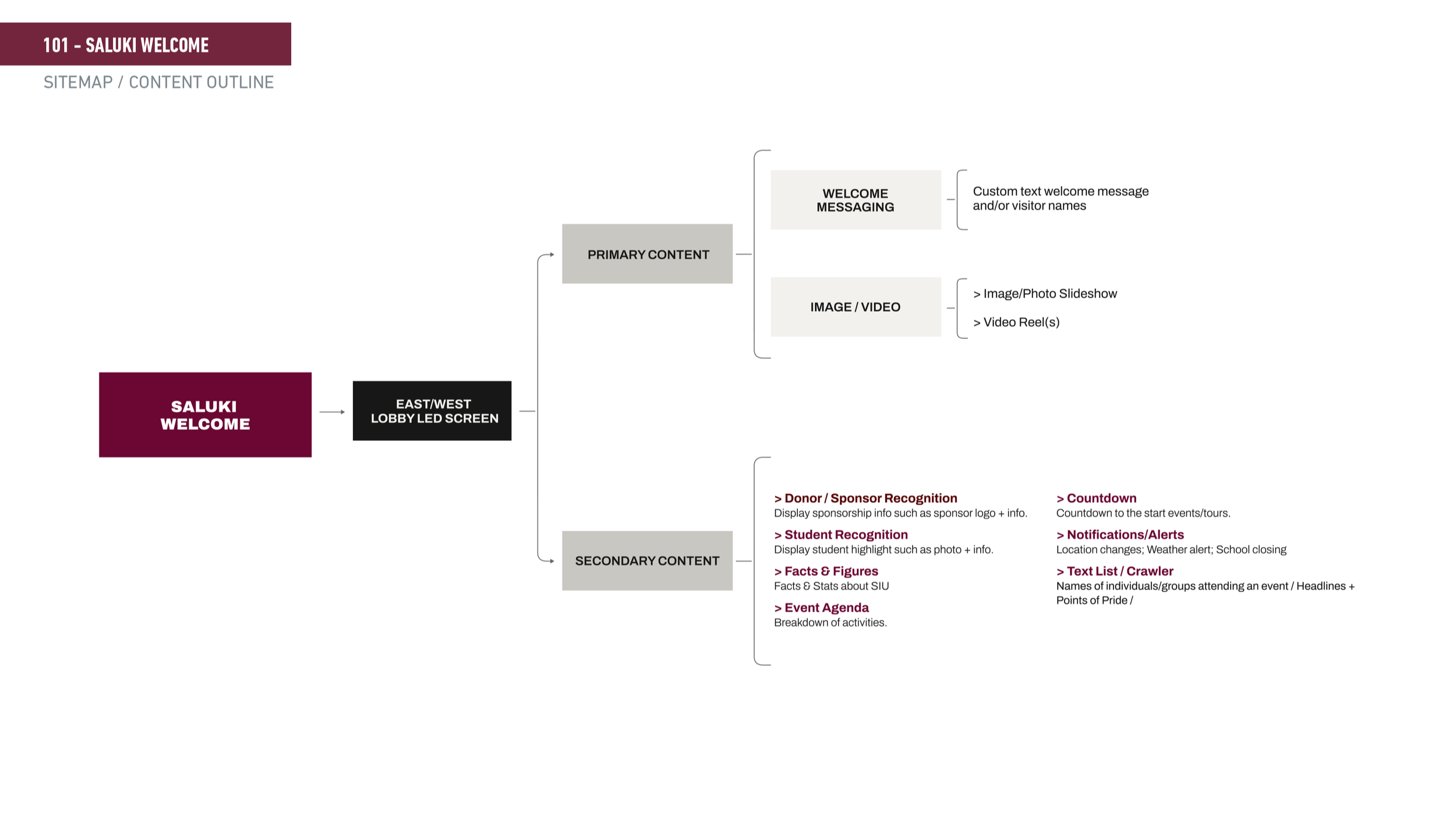
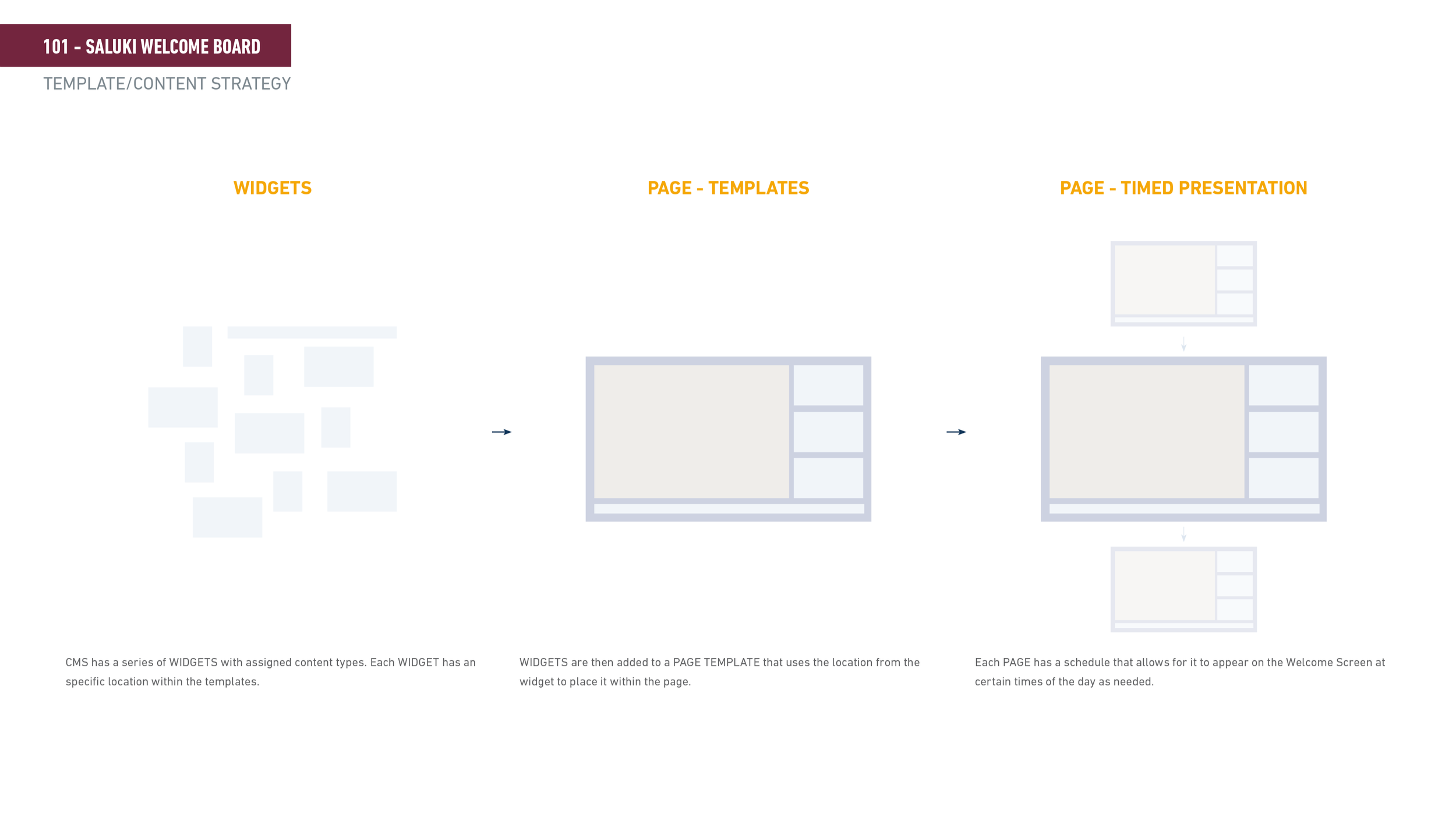
Sitemap caption The content structure maps out two layers — primary content (welcome messaging, photo galleries, video reels) and secondary content (donor recognition, student spotlights, event agendas, countdowns, and a scrolling text crawler). Everything is managed through a CMS widget system that lets staff build and schedule pages without touching code.
Wireframe caption Four page templates handle the different content combinations — Template A is a full-screen takeover, Template B adds a scrolling bottom bar, Template C adds sidebar widgets, and Template D combines both. Widgets slot into fixed positions within each template, then get scheduled to appear at specific times of day.
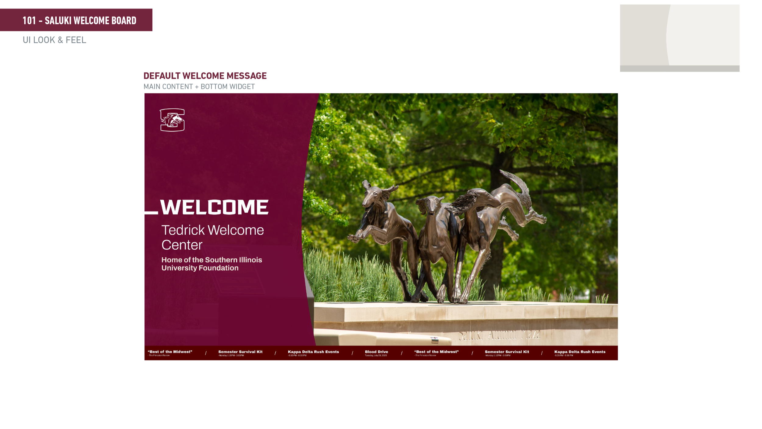
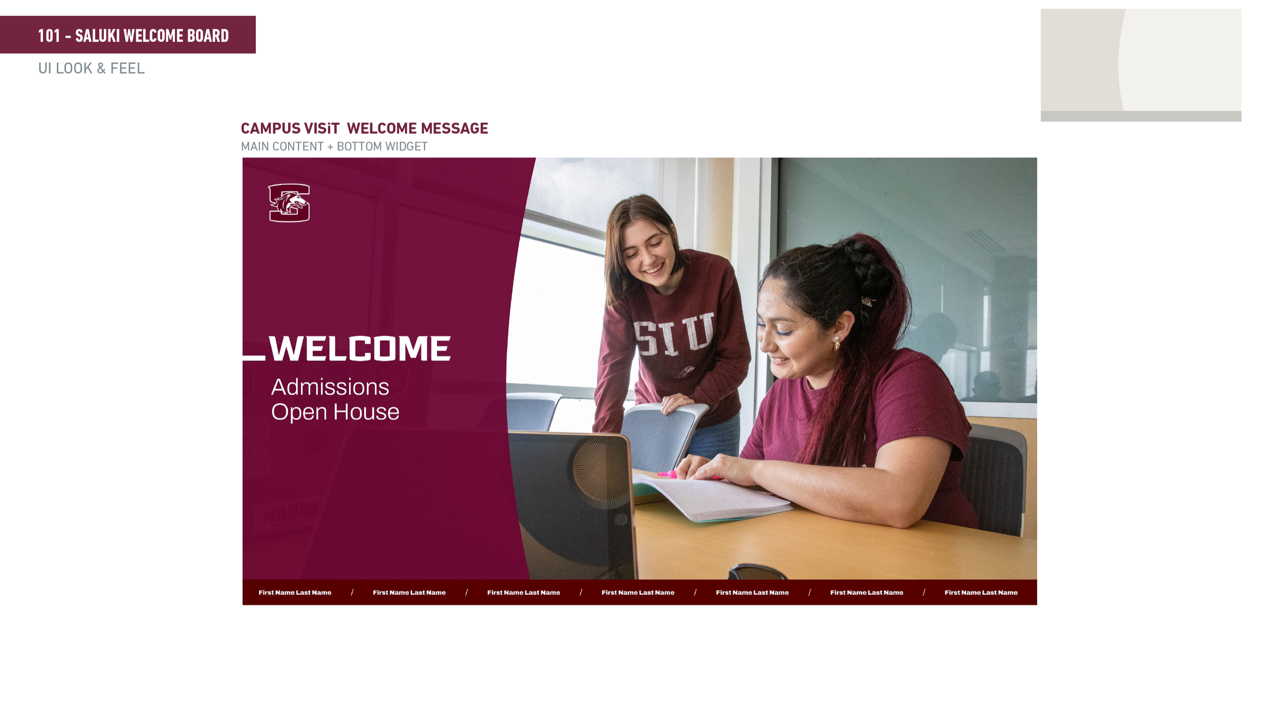
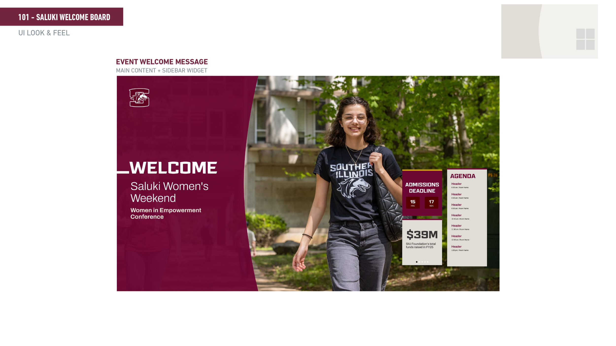
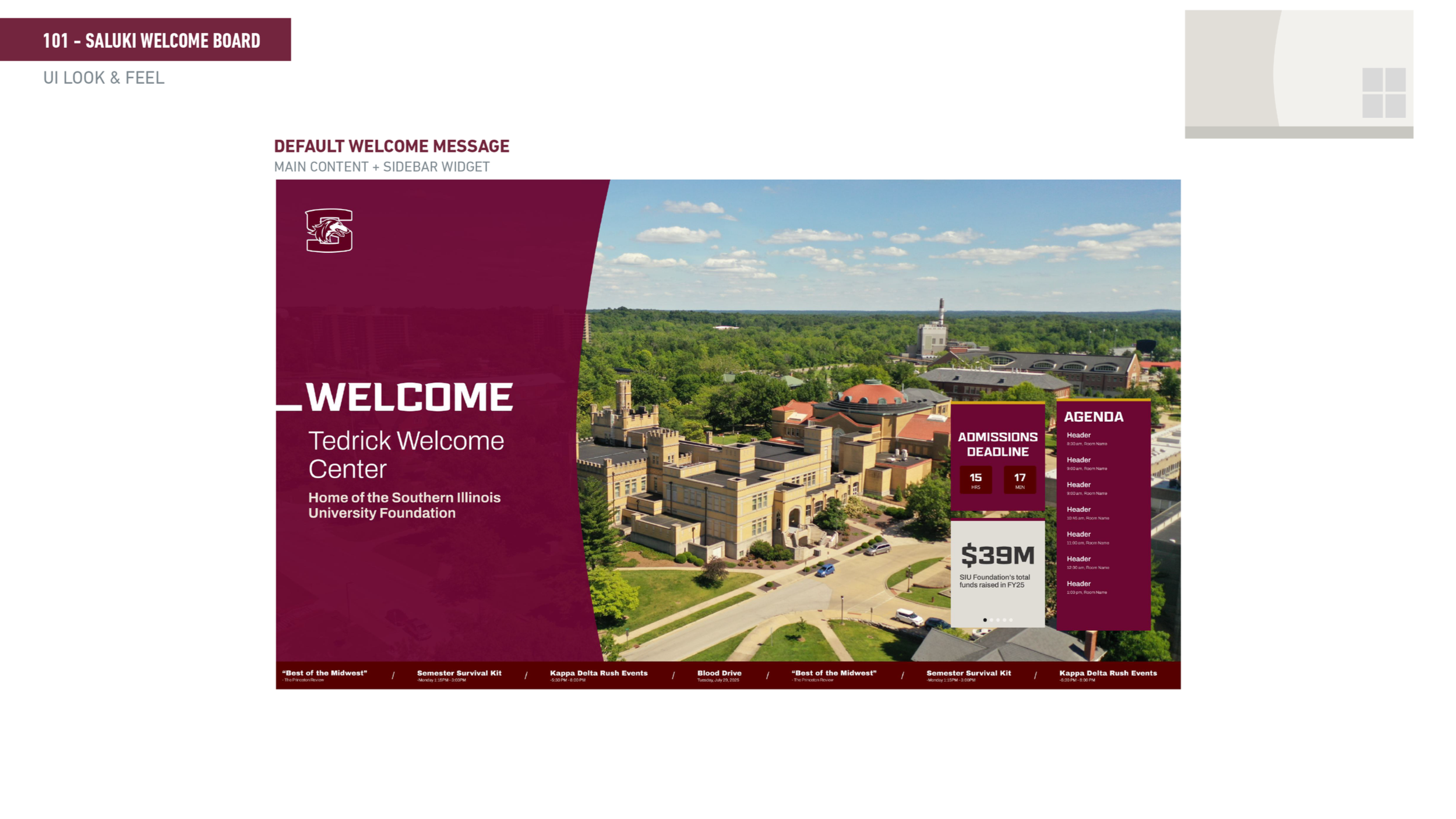
Final UI caption The visual design is built around SIU's maroon and gold brand — a diagonal split layout that balances photography with messaging, keeping the welcome feeling personal and institutional at the same time.
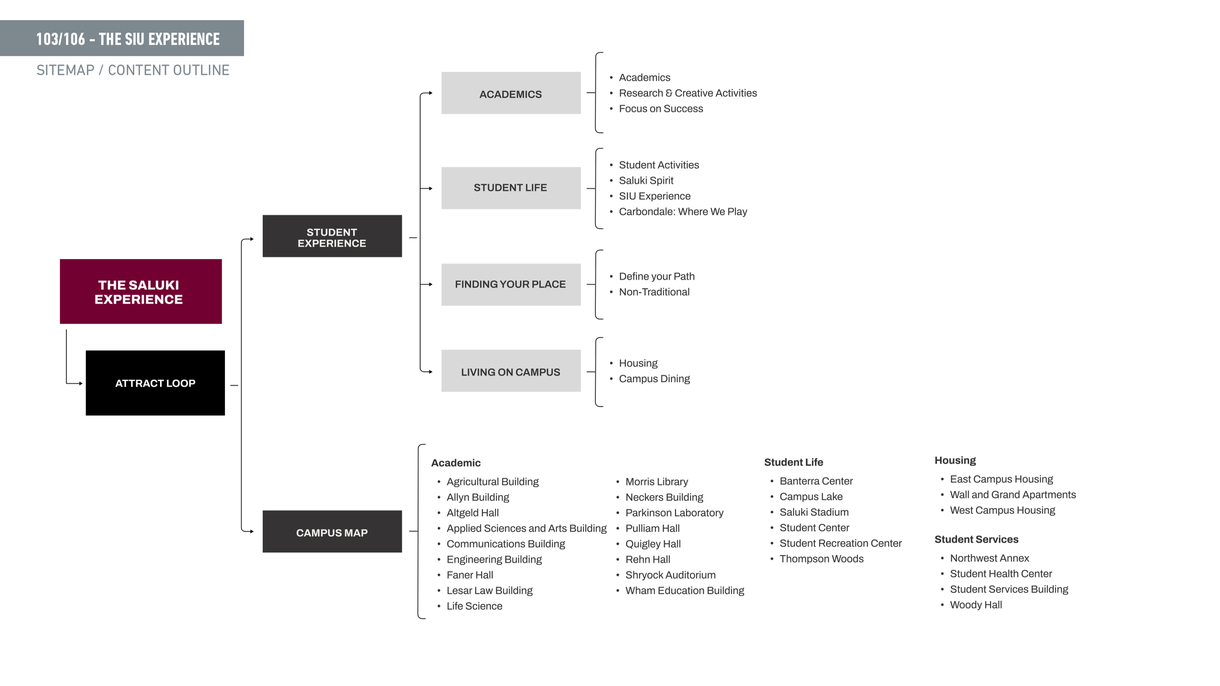
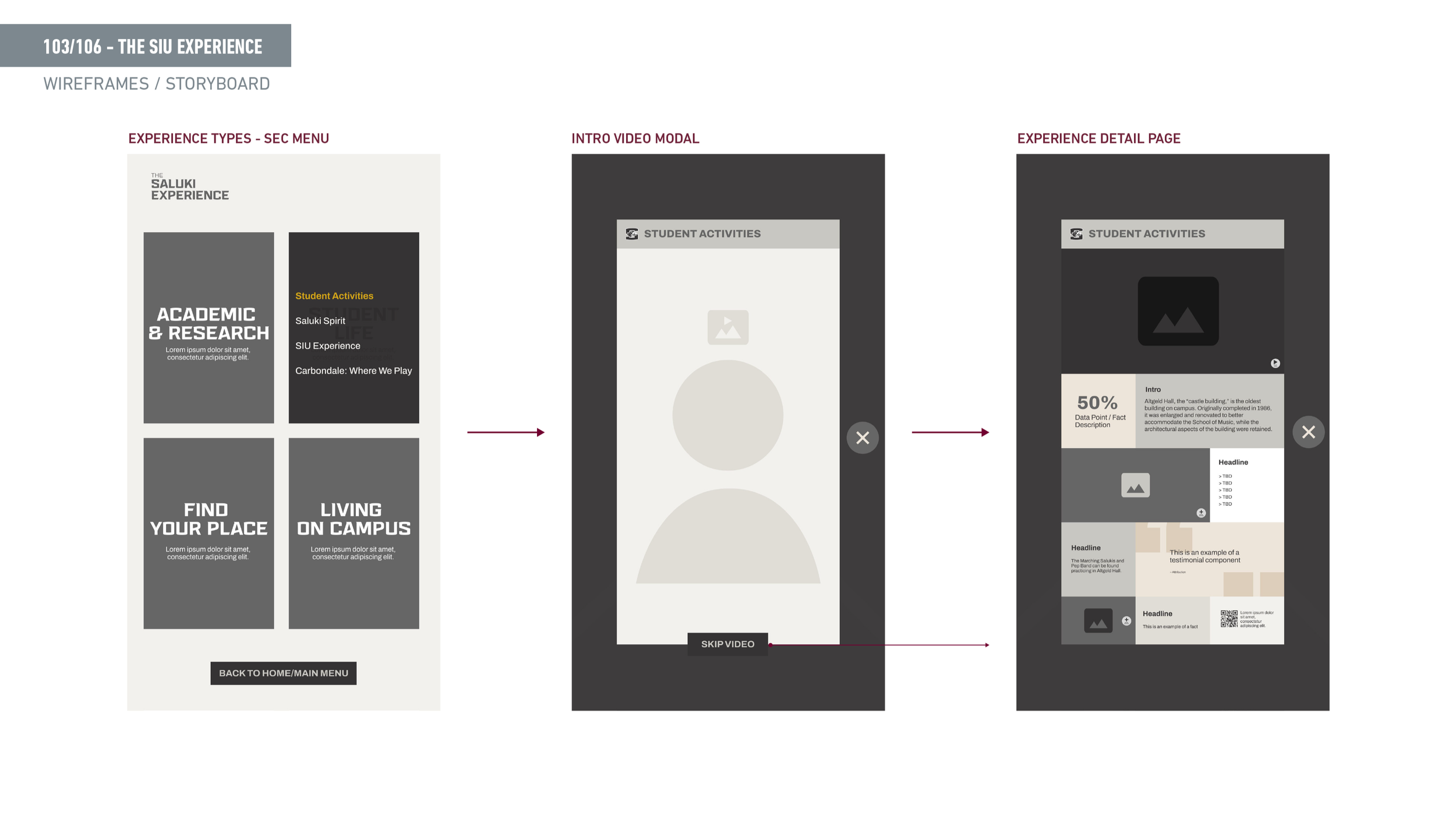
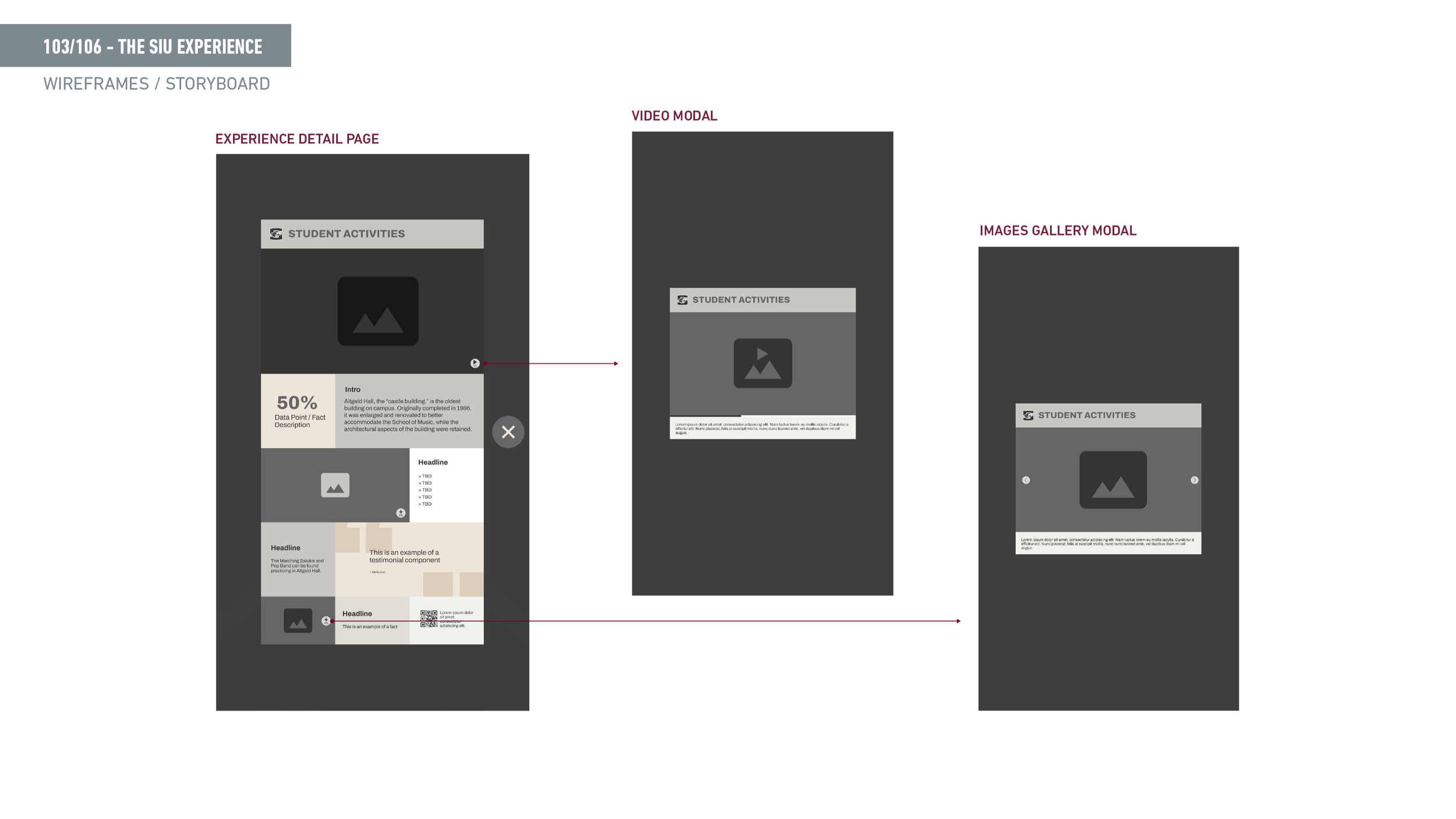
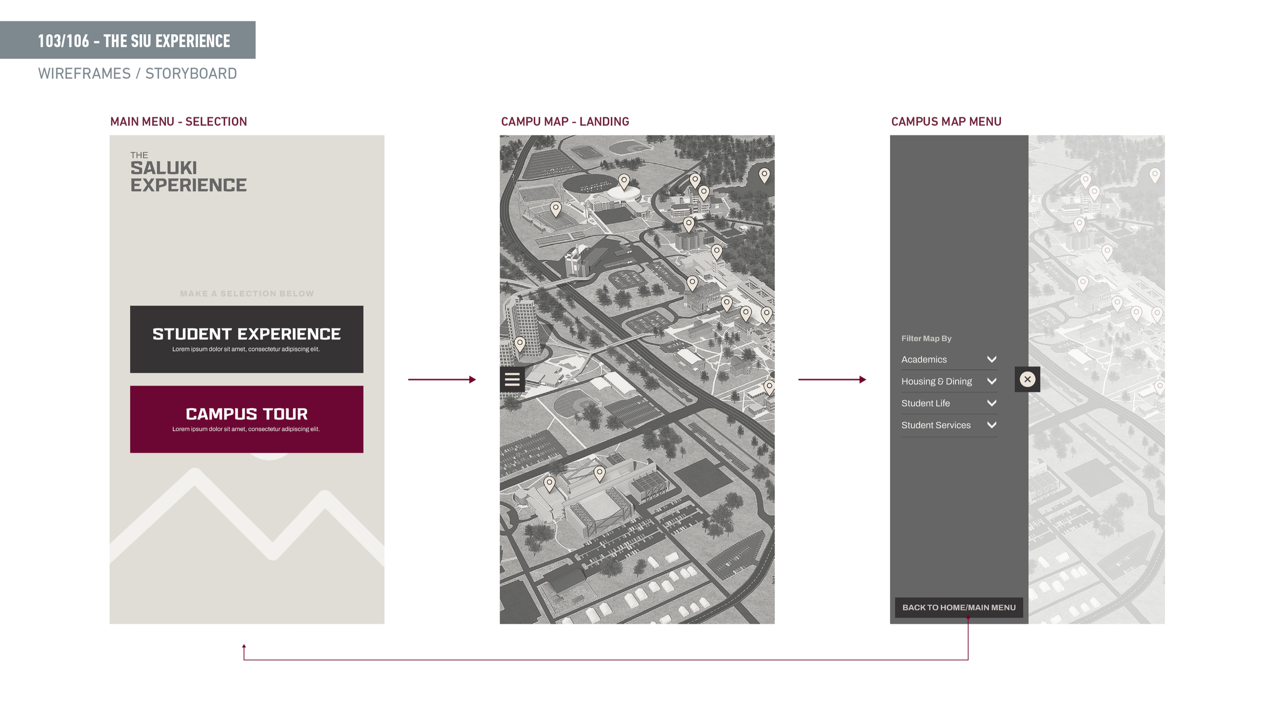
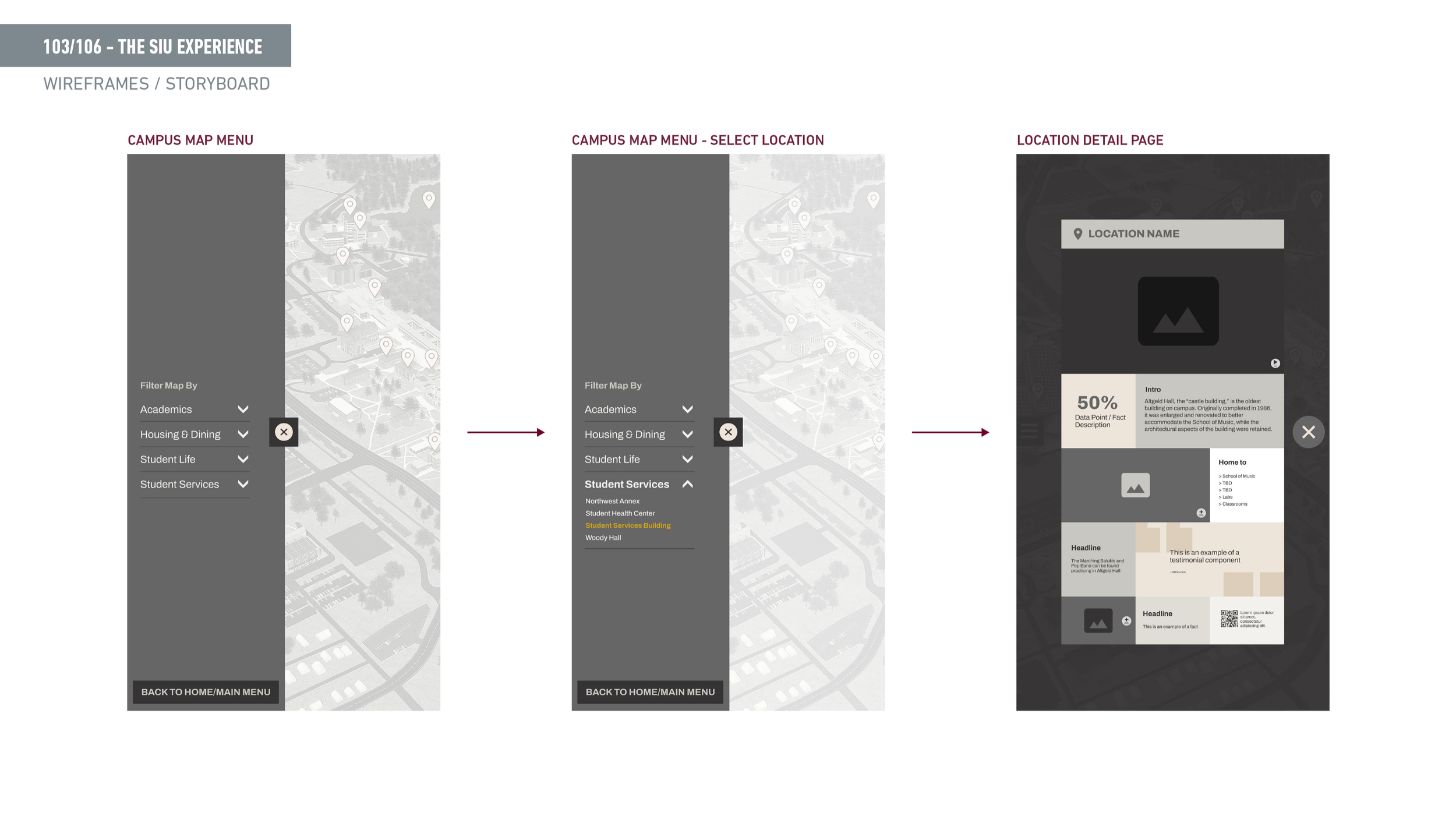
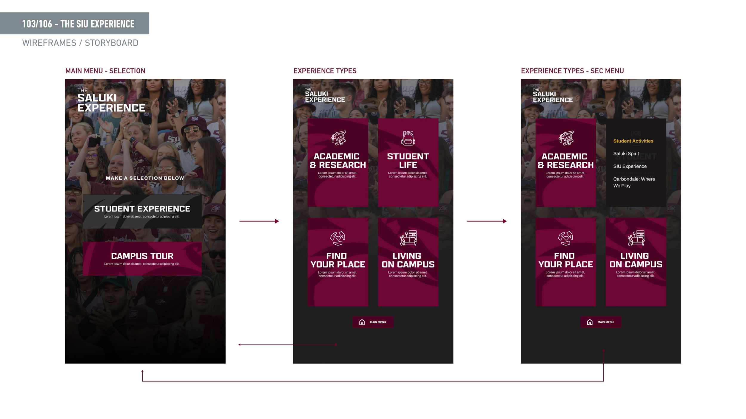
103 — SIU Experience — Campus Map Kiosk
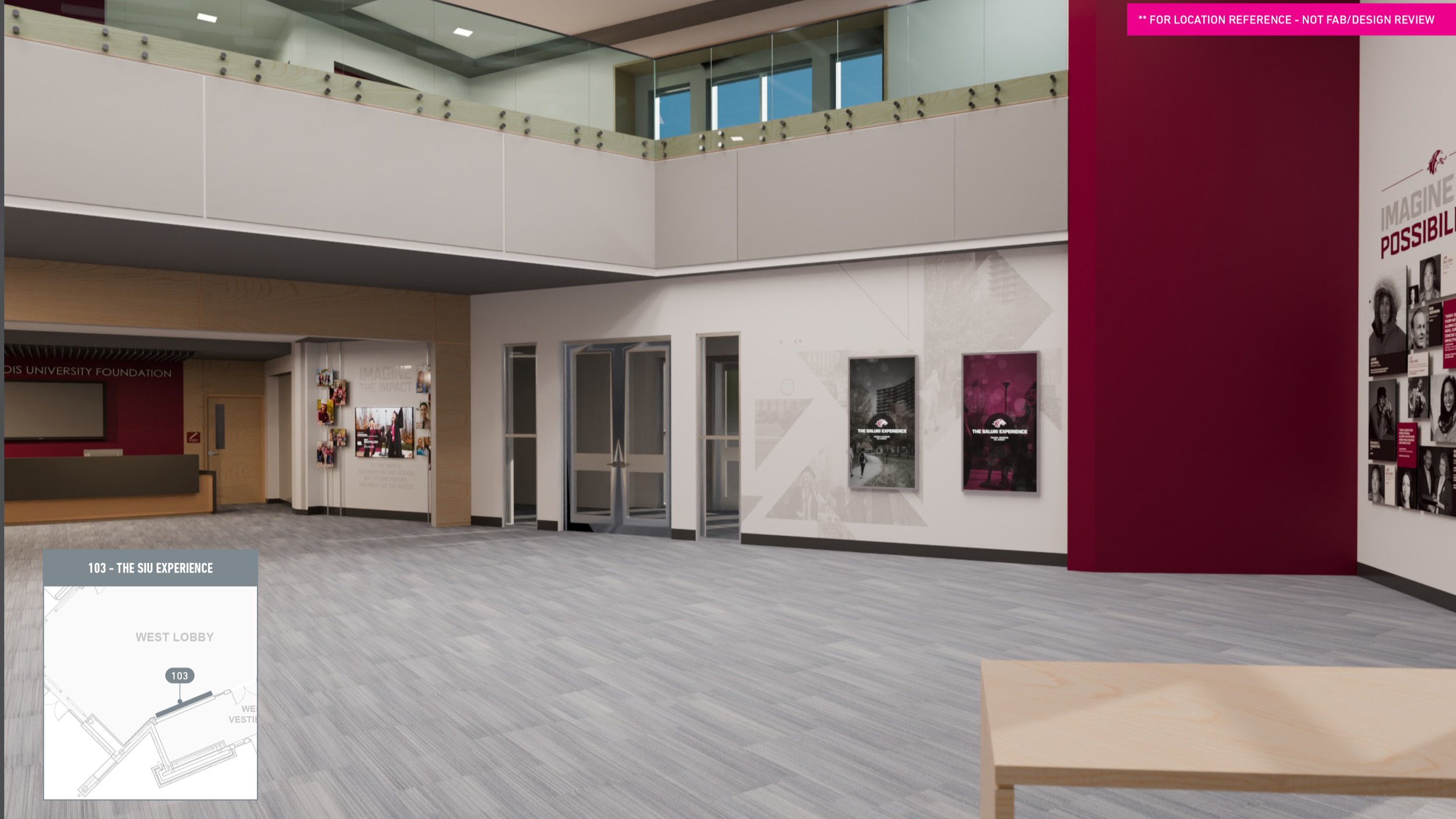
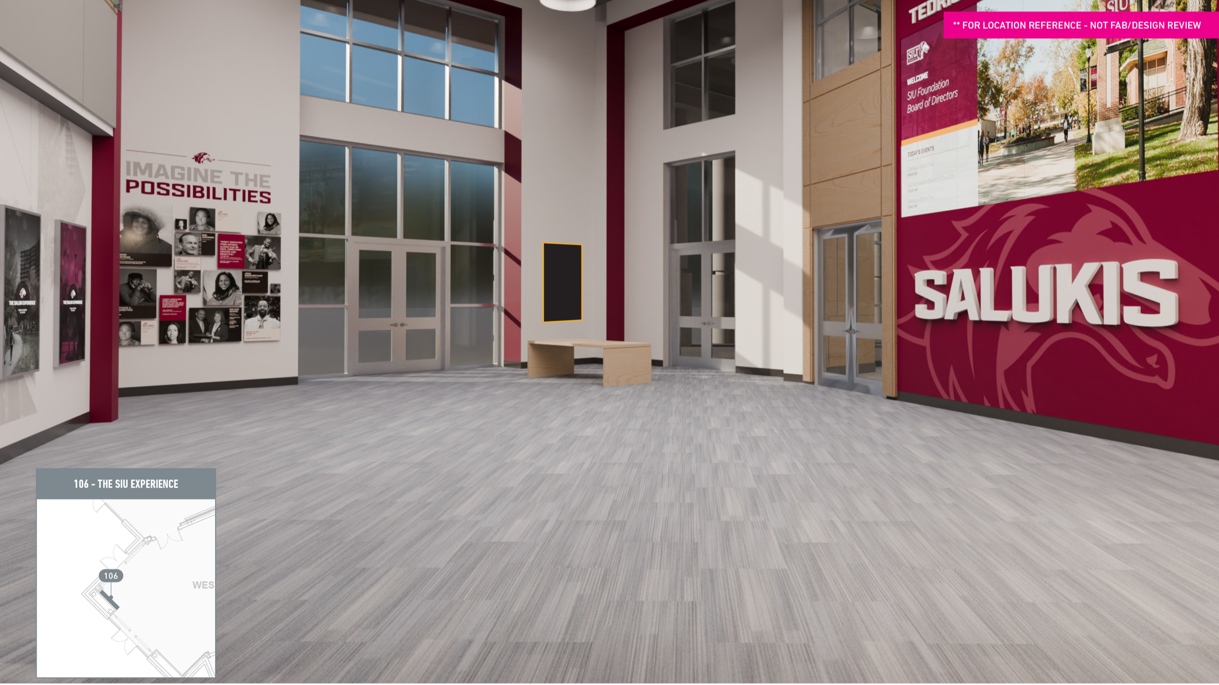
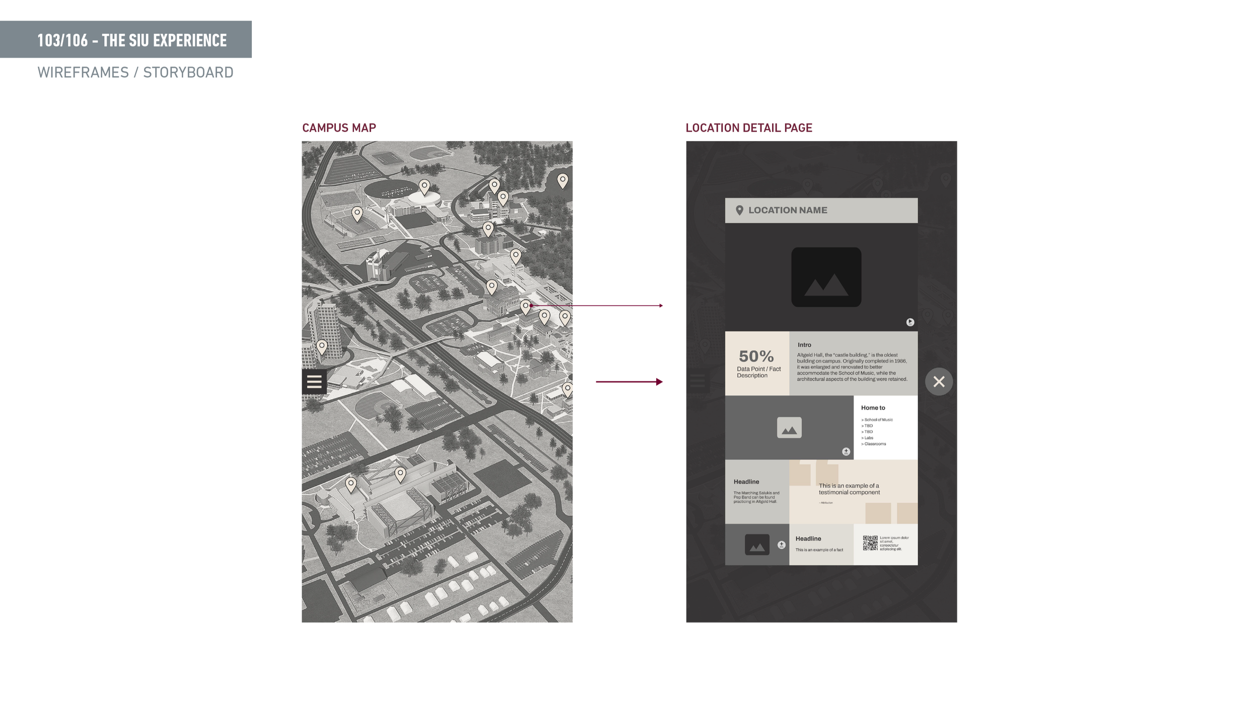
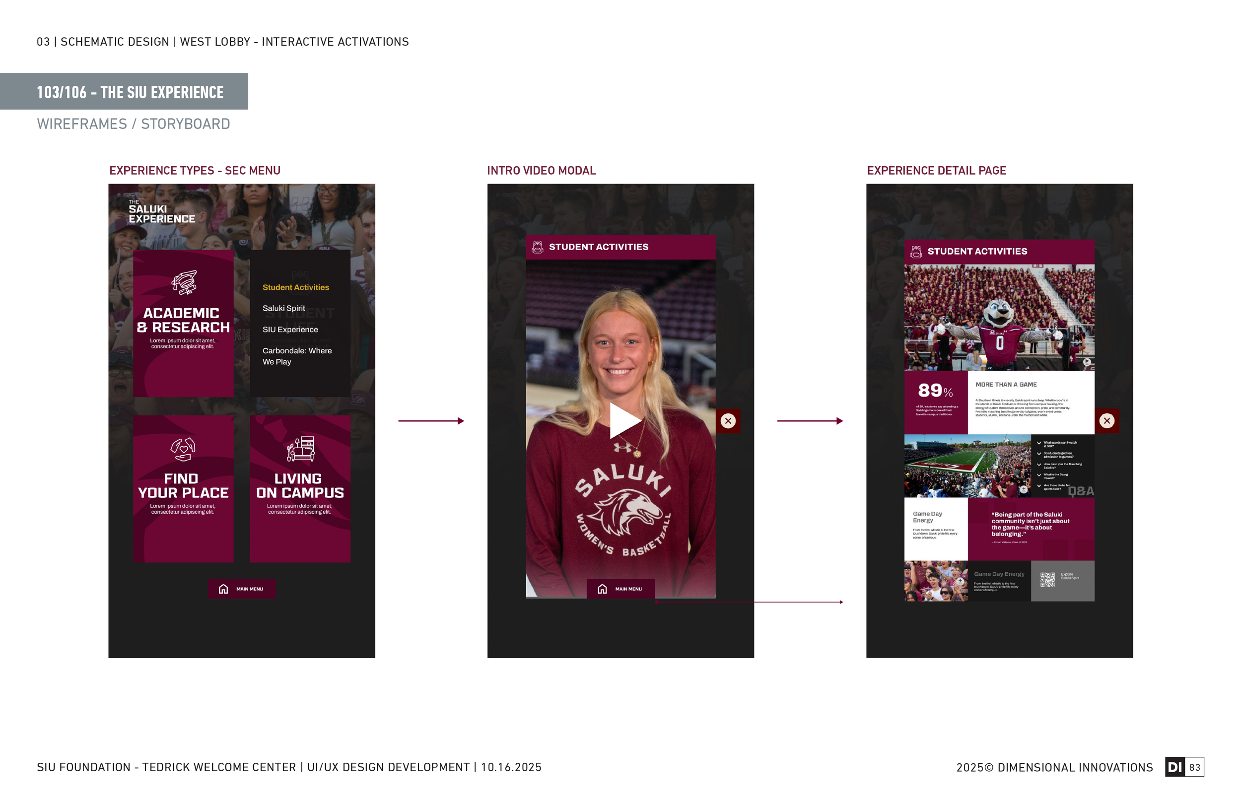
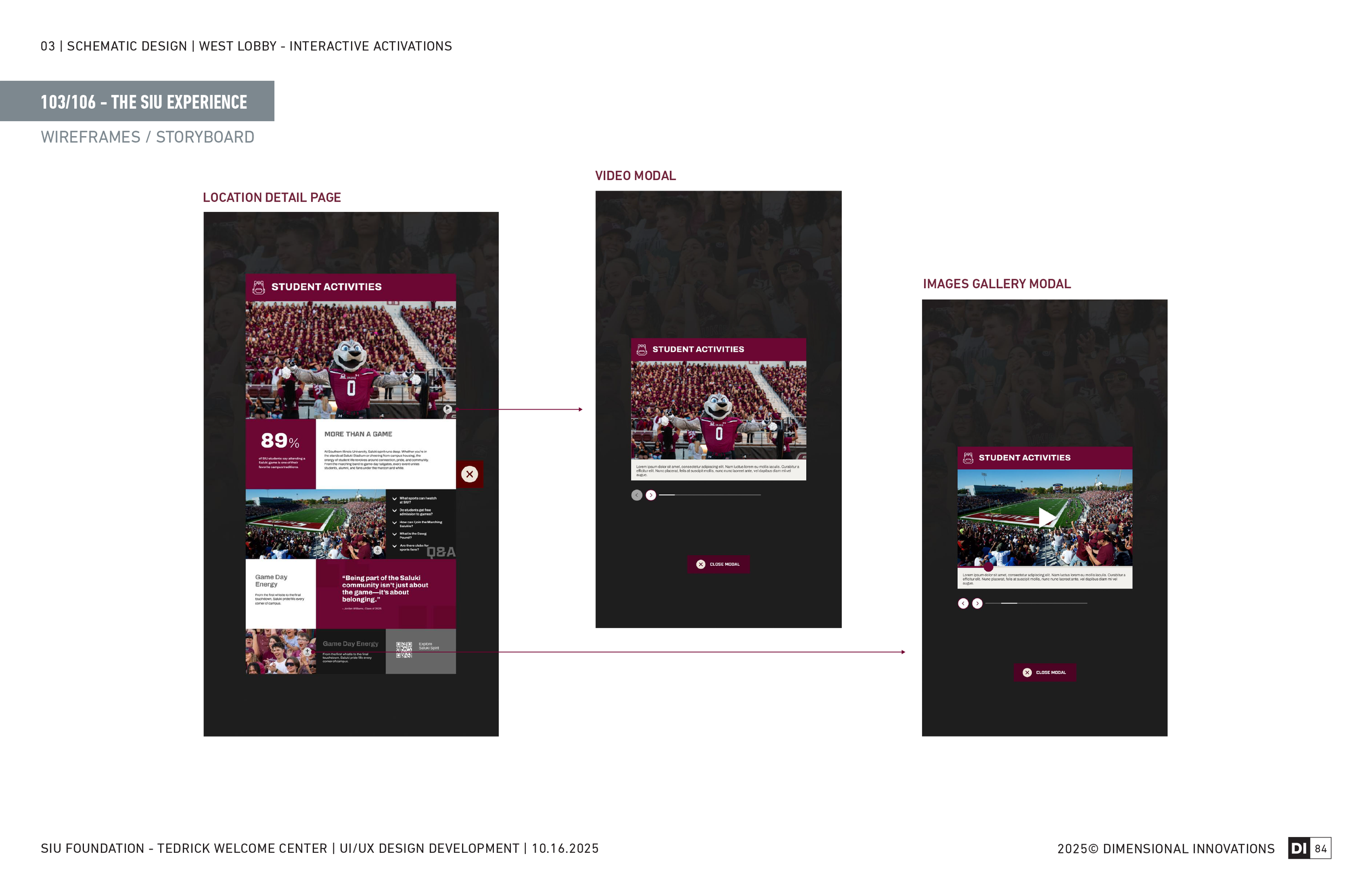
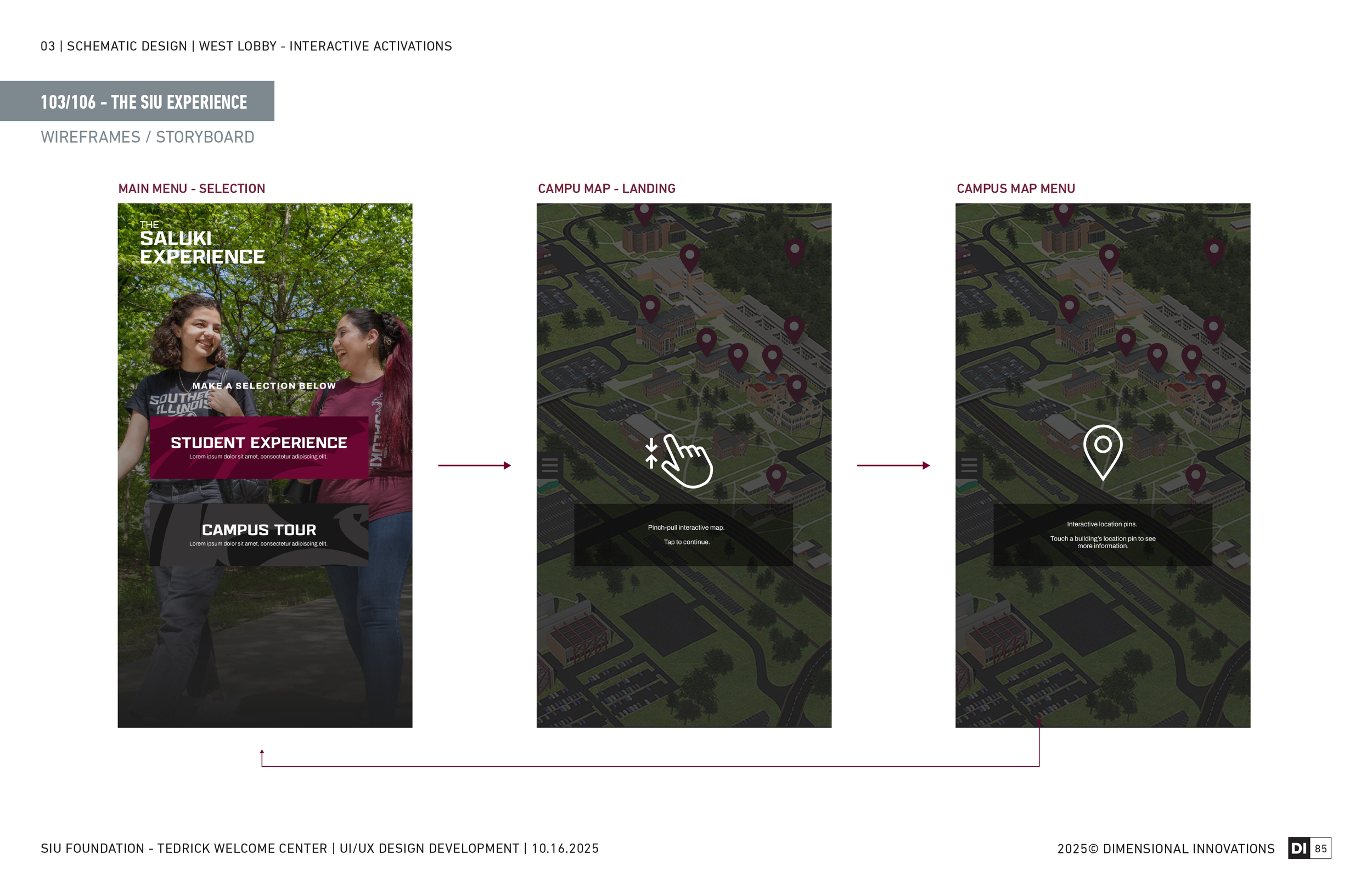
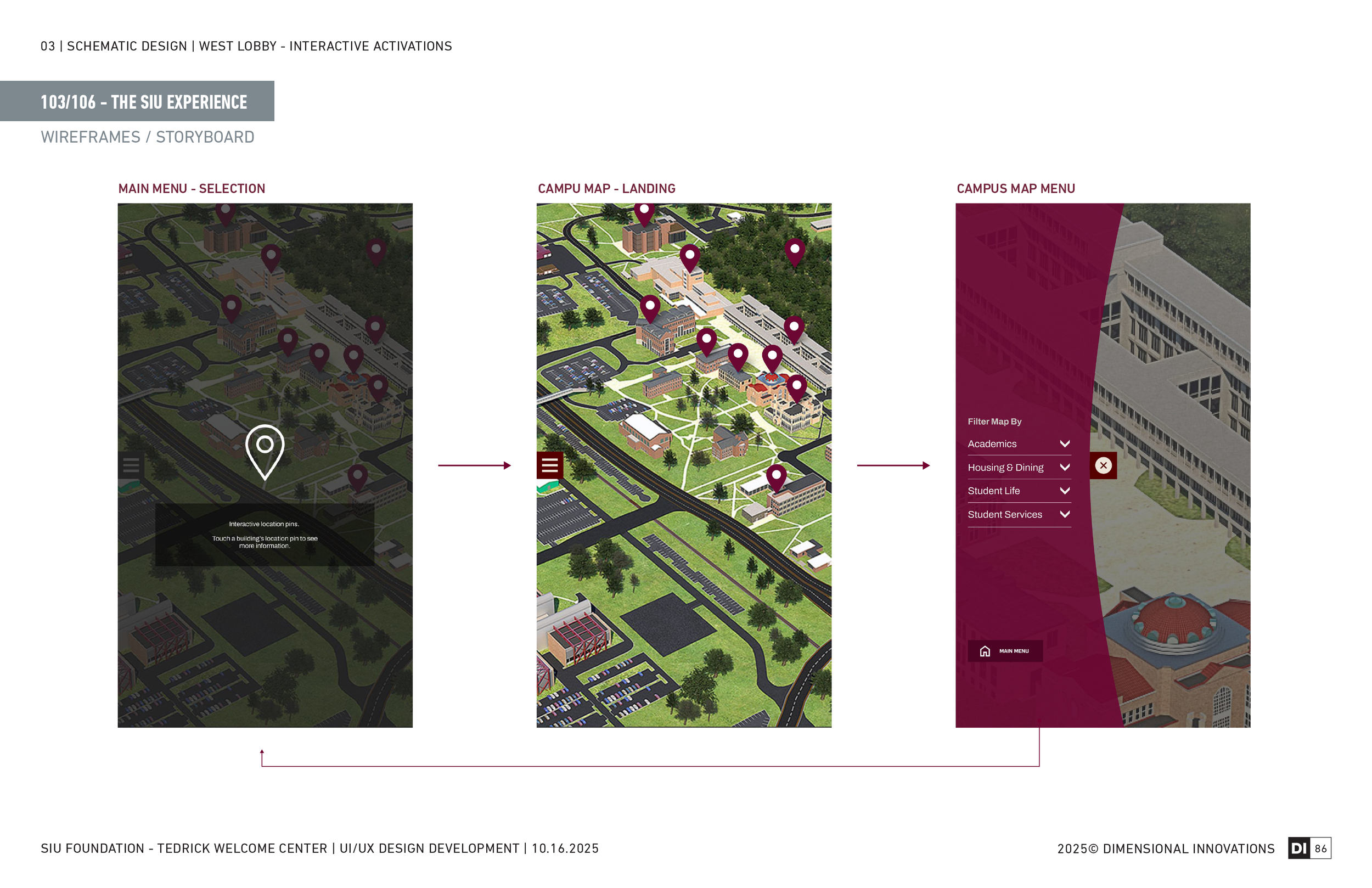
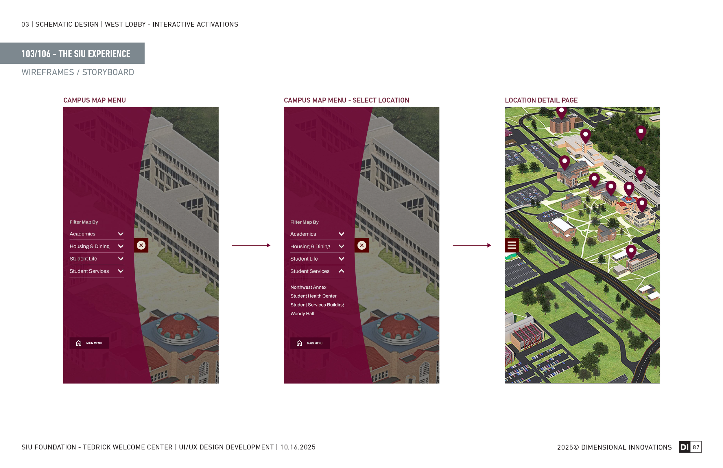
Overview The SIU Experience kiosk is an interactive campus map that lets visitors explore Southern Illinois University's buildings and spaces — tapping on locations to get additional information about each one. It was designed primarily for prospective students and families on campus tours, giving them a way to get oriented and curious about the campus before they even step outside.
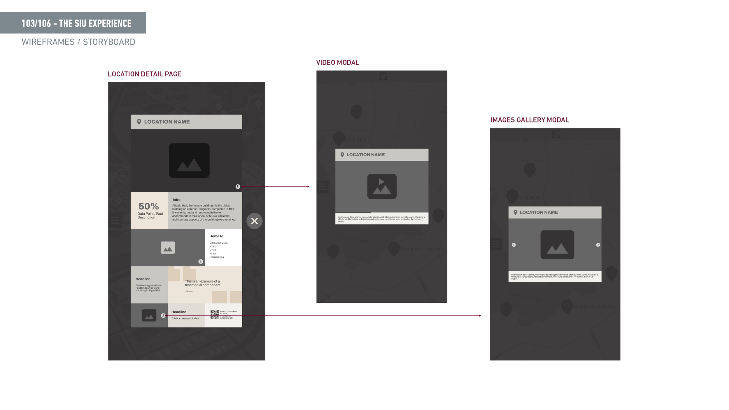
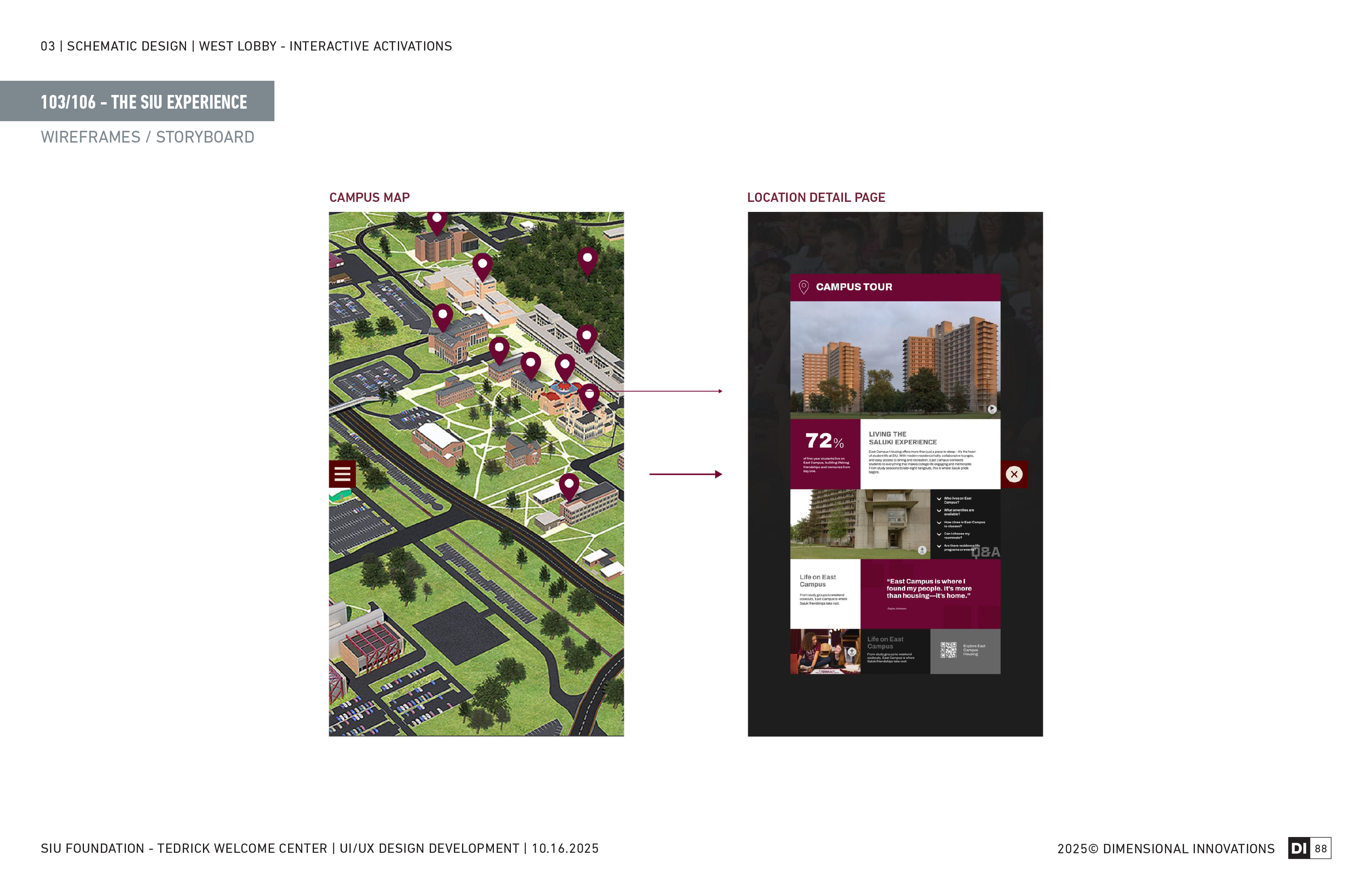
Sitemap caption The structure is straightforward — a map home state with selectable building markers, each linking to a detail panel with information about that building. The simplicity was intentional: this is a way-finding and curiosity tool, not a deep content system.
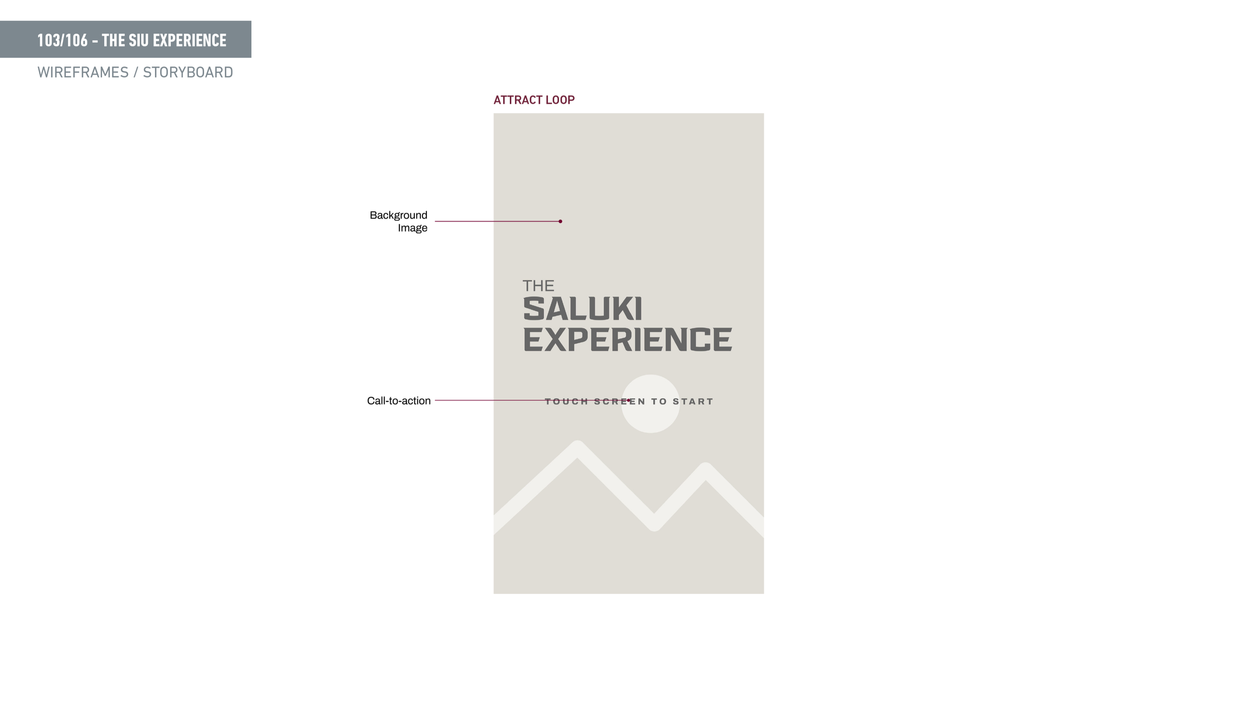
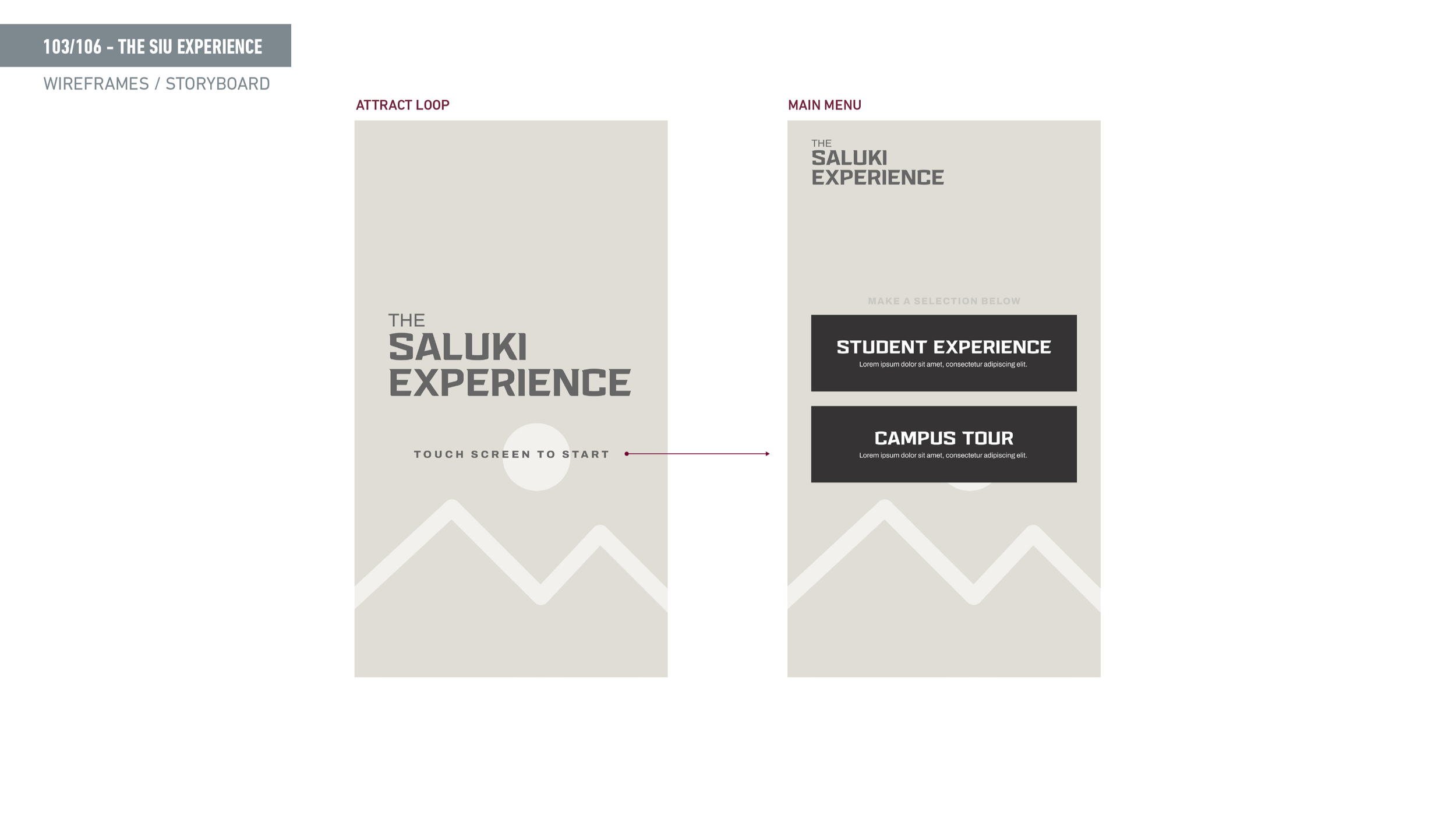
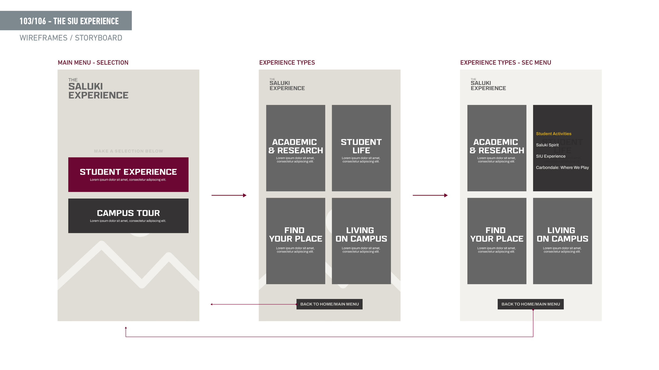
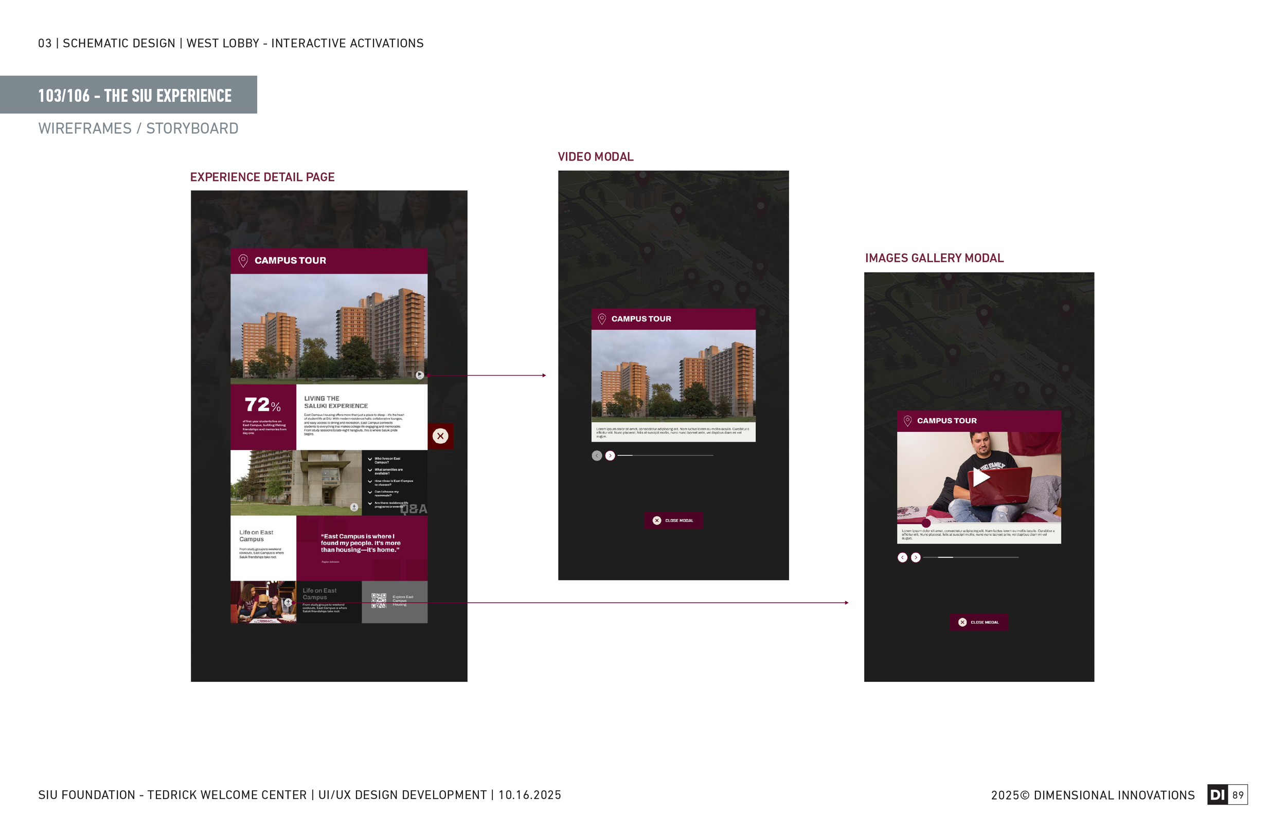
Wireframe caption The wireframes focused on the touch interaction model — how building markers behave on tap, where the info panel appears, and how visitors navigate back to the full map. Accessibility and reachability were considered throughout, keeping interactive elements in the natural touch zone.
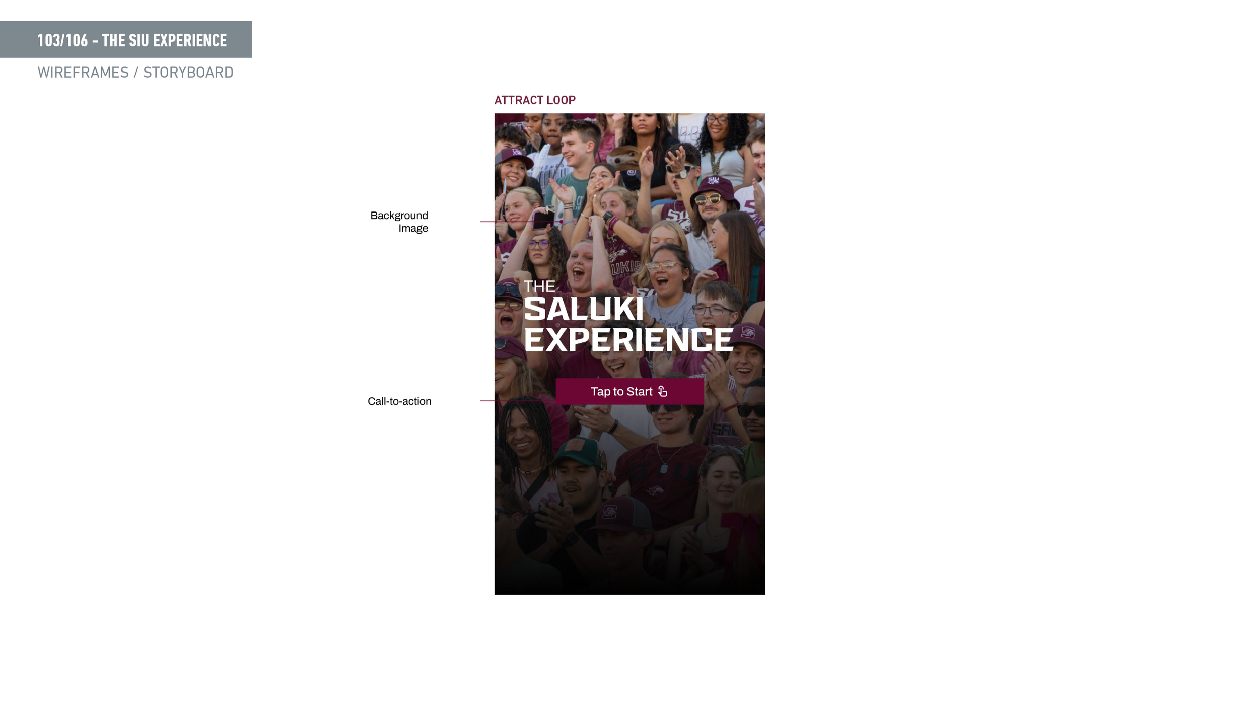
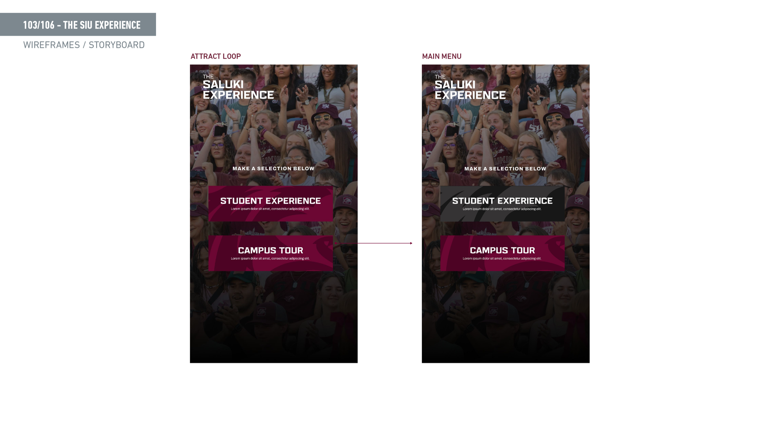
Final UI caption The finished design brings the SIU brand into a clean, functional map interface — maroon accents, clear typography, and a layout that works comfortably at kiosk height.
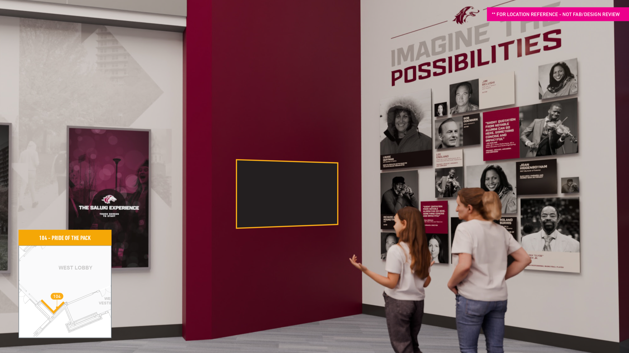
104 — Pride of the Pack
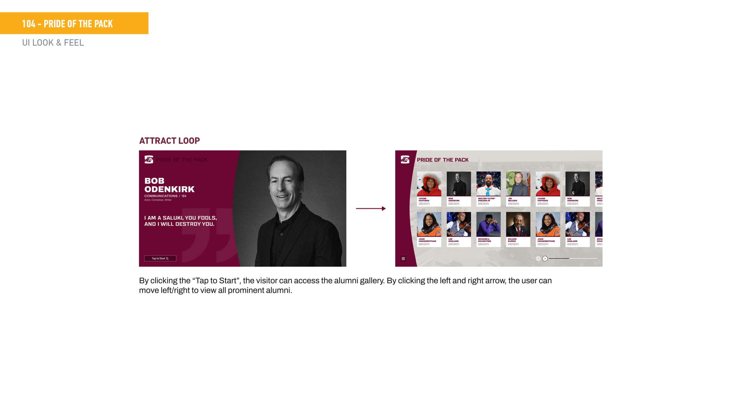
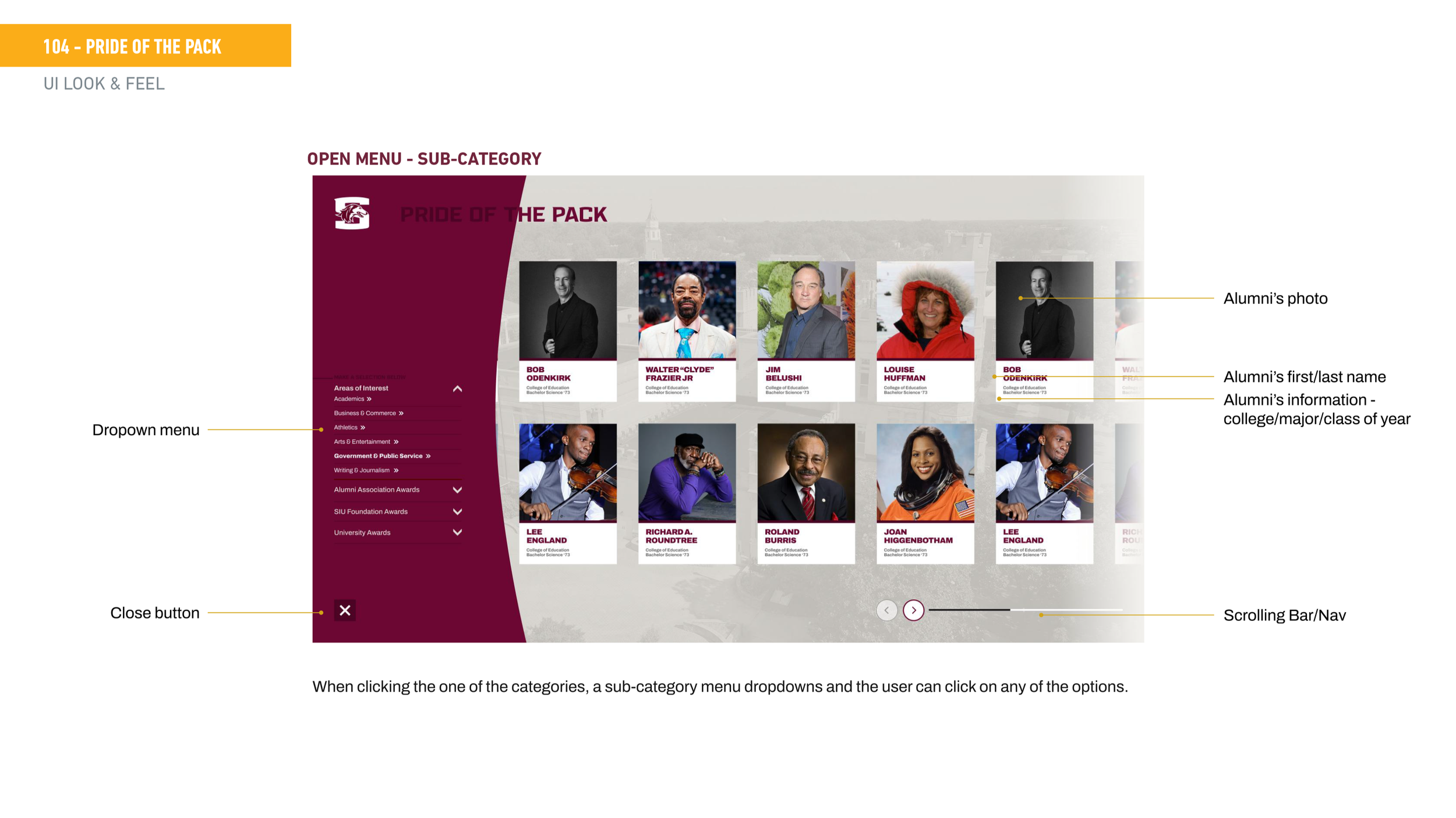
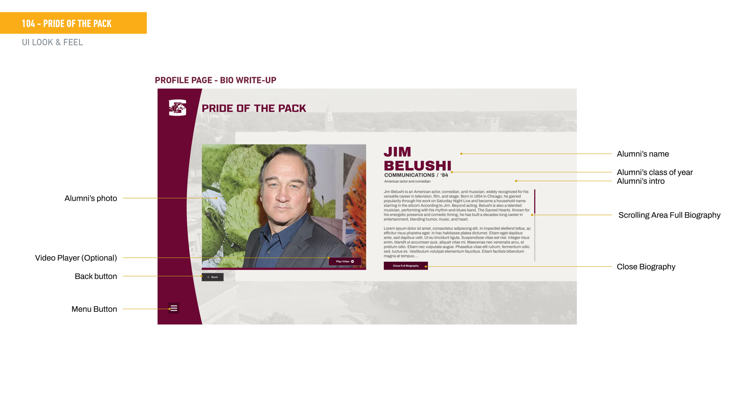
Overview Pride of the Pack is an interactive alumni recognition kiosk that lets visitors explore SIU's alumni network — filtering by career field or award category. The goal was to make it feel celebratory and browsable, not like a database. It needed to work for a wide range of visitors, from a kid walking through with their parents to a returning alumnus looking for someone they know.
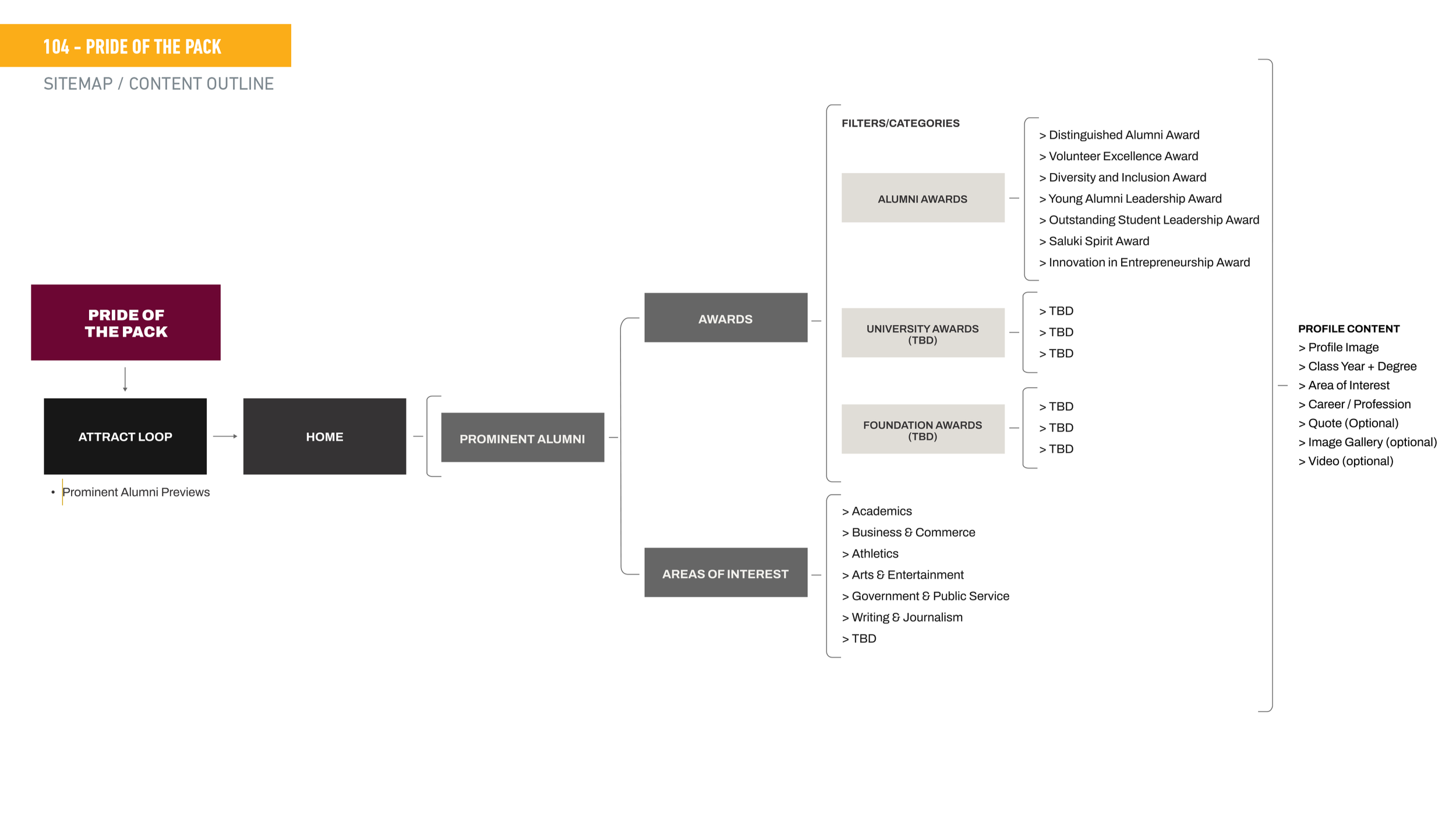
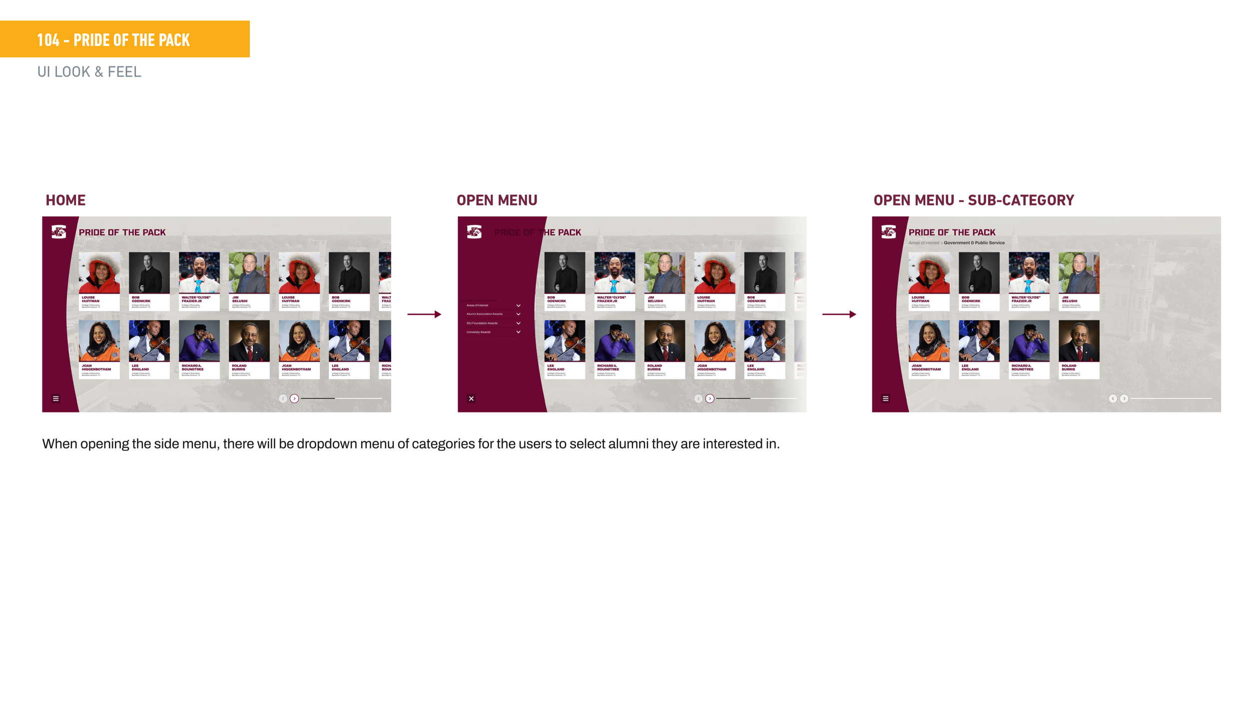
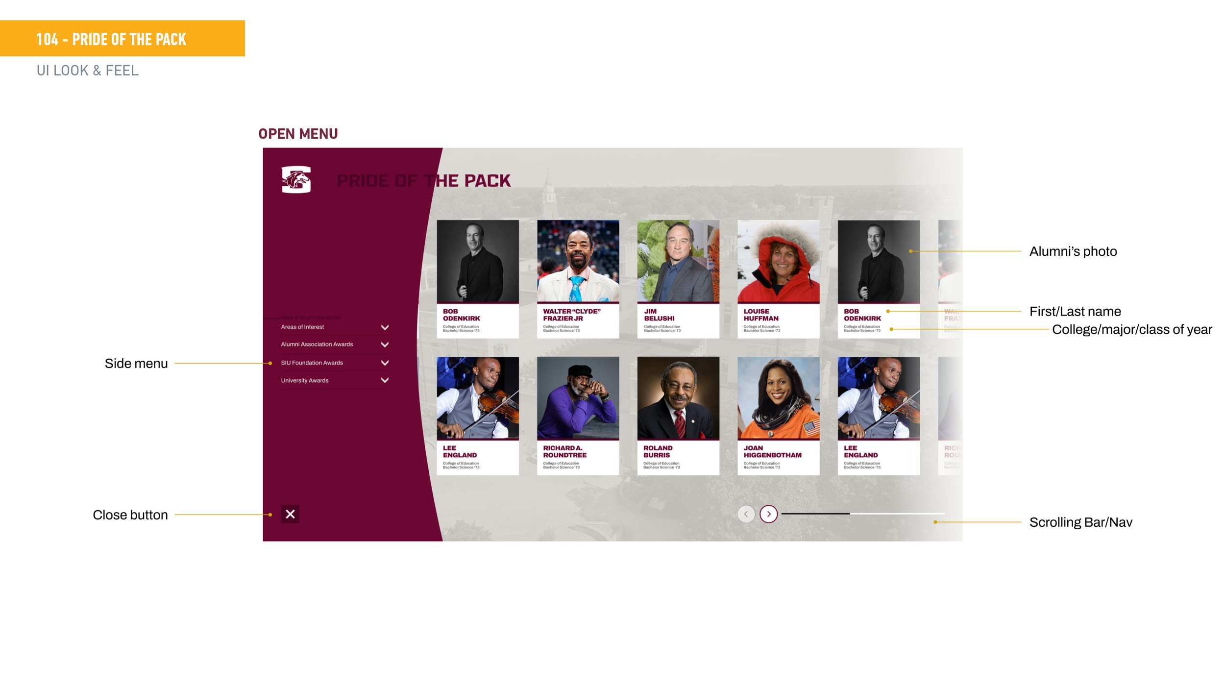
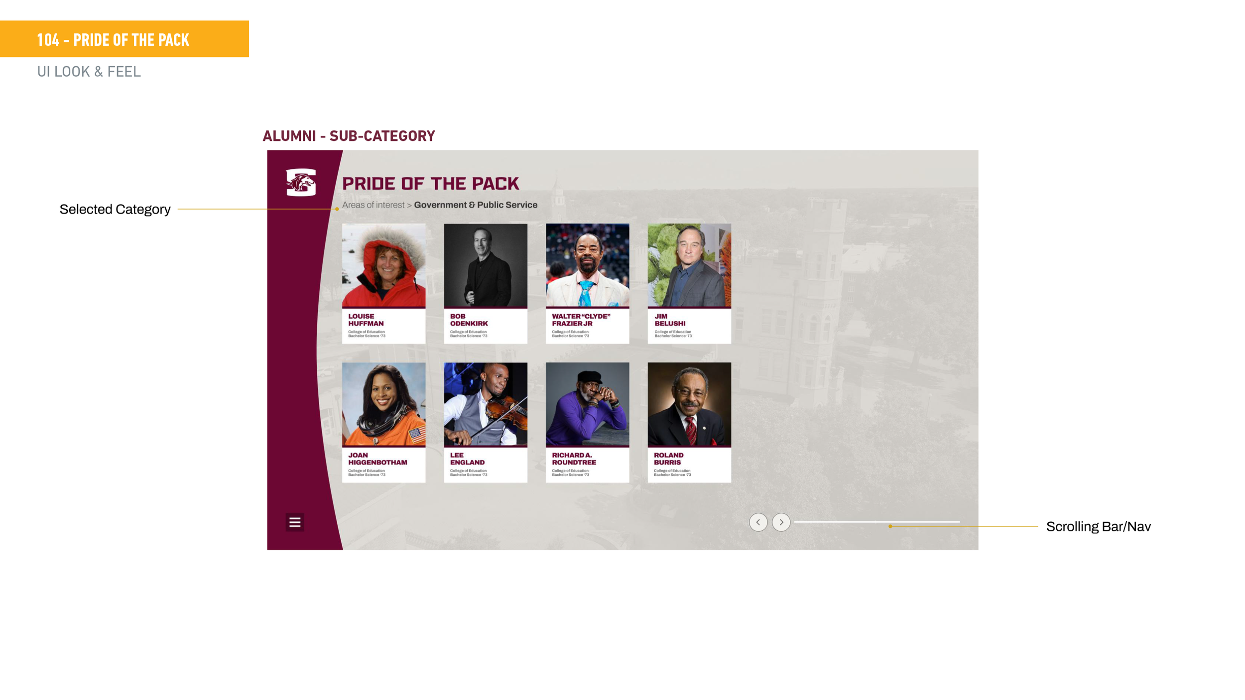
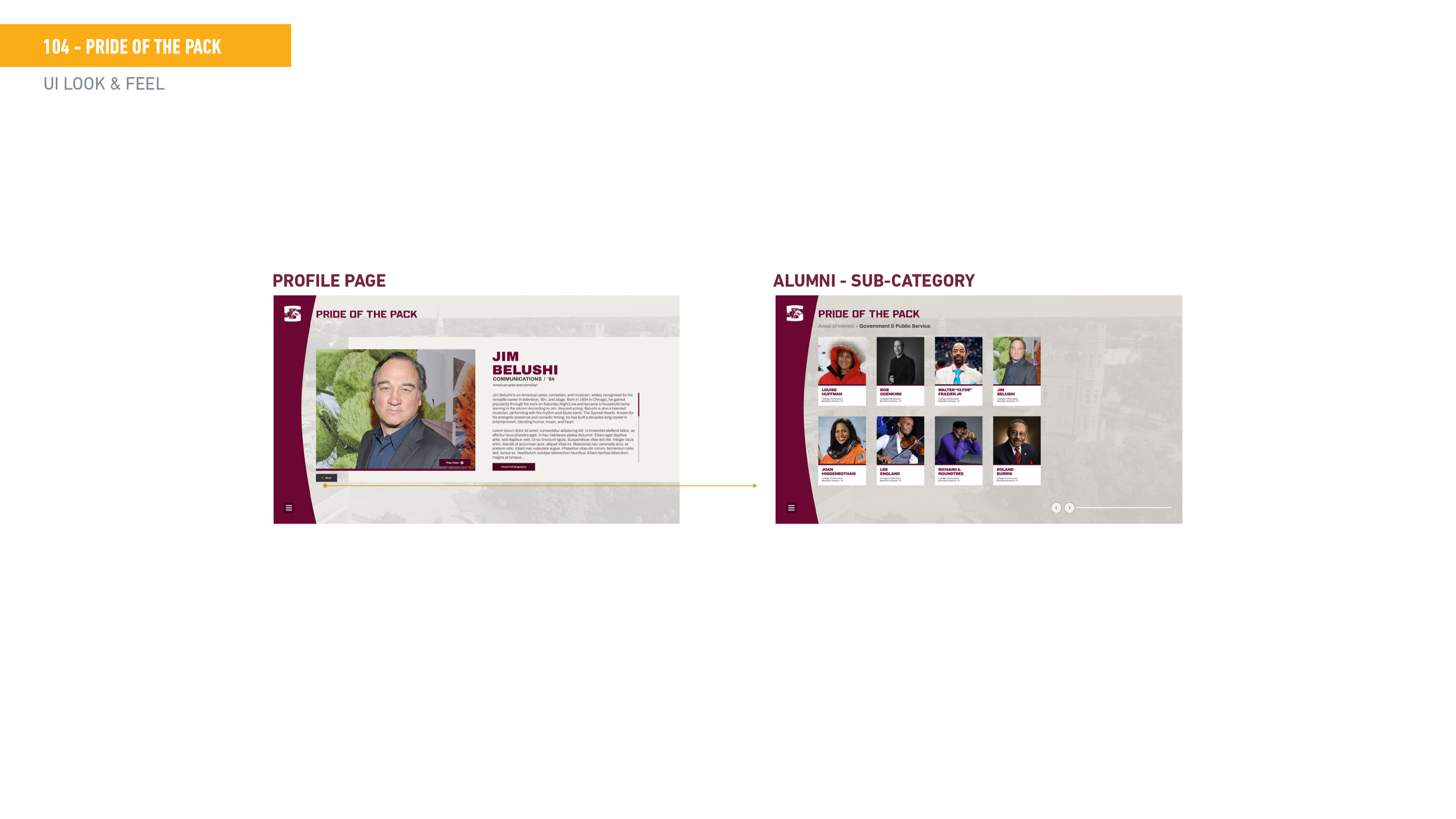
Sitemap caption The experience starts with an attract loop cycling through prominent alumni profiles, then opens into a browsable grid. From there visitors can filter by Areas of Interest (Academics, Business, Athletics, Arts and Entertainment, Government and Public Service, Writing and Journalism) or by award categories across Alumni Association, SIU Foundation, and University Awards.
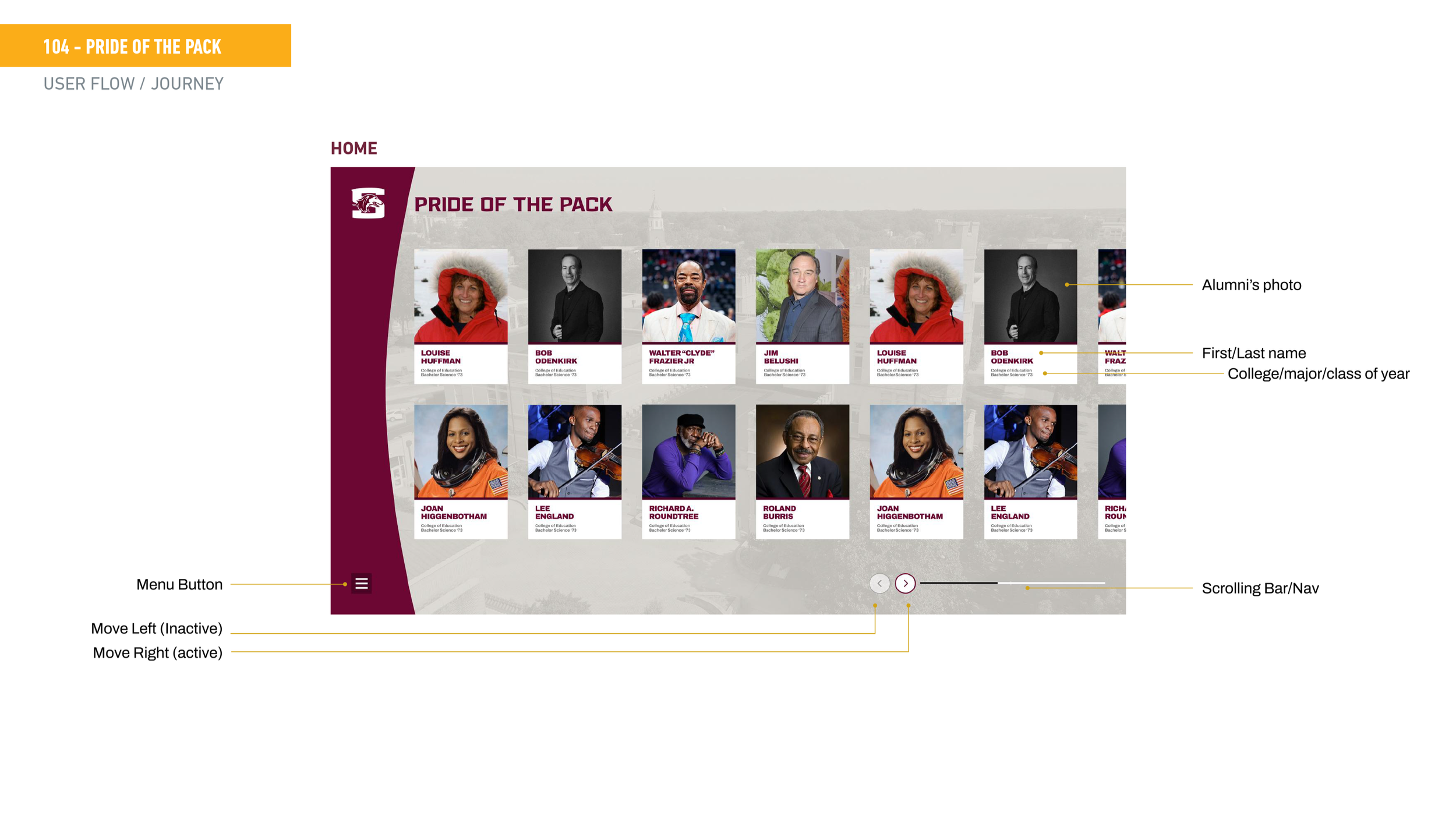
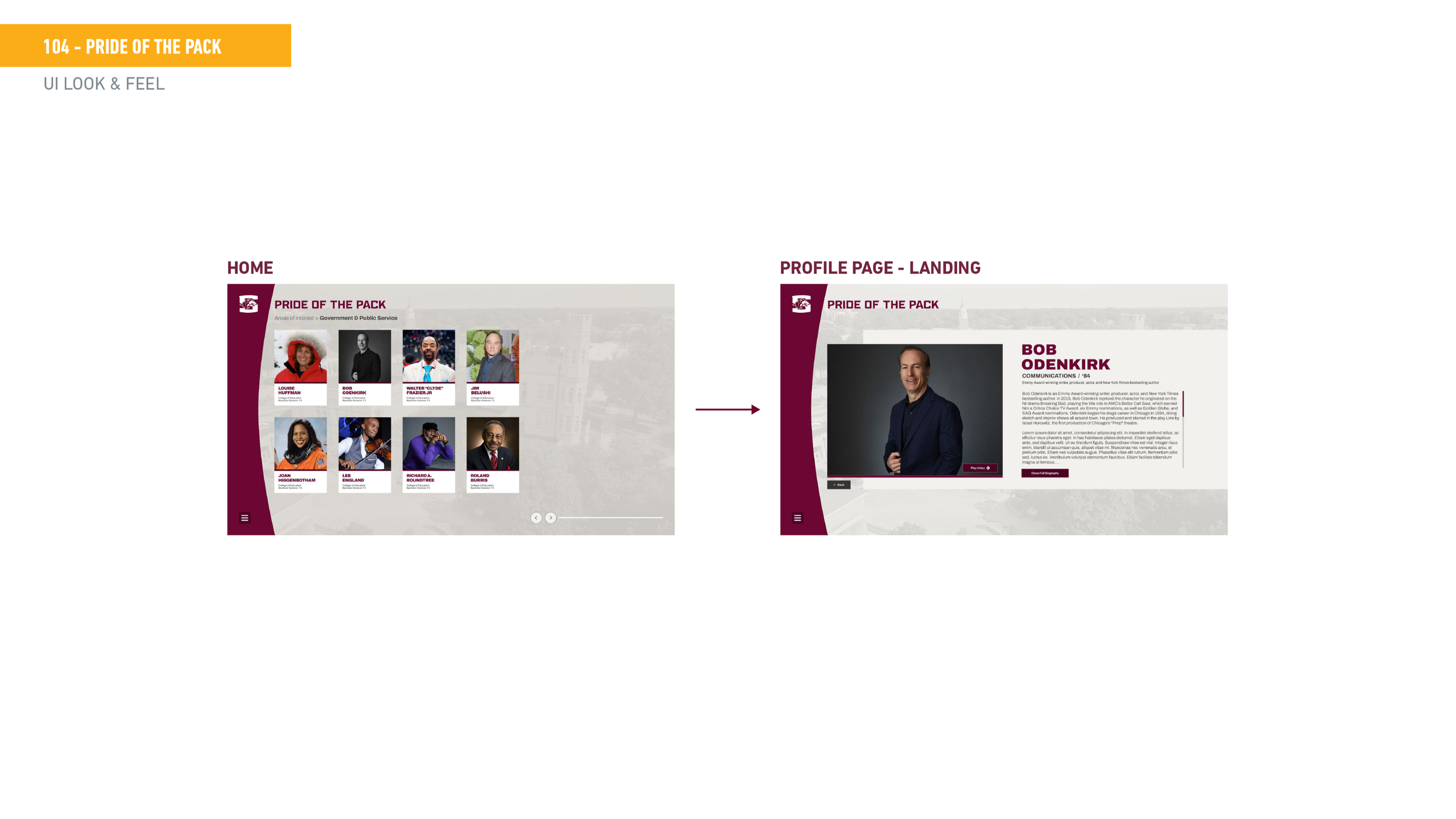
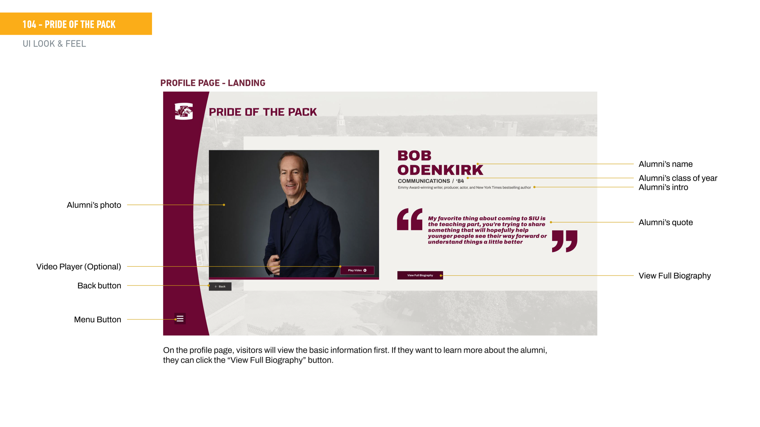
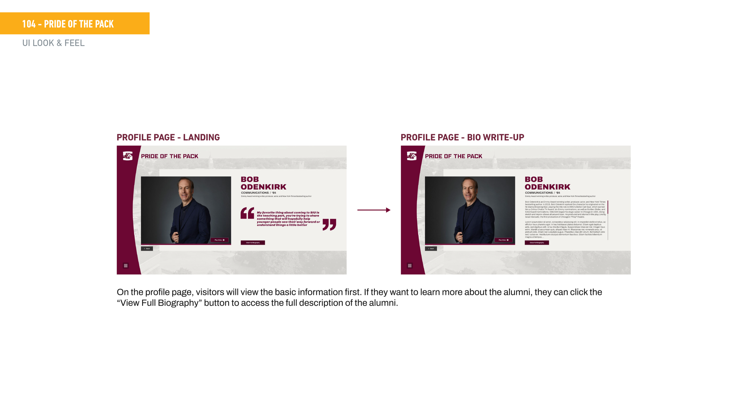
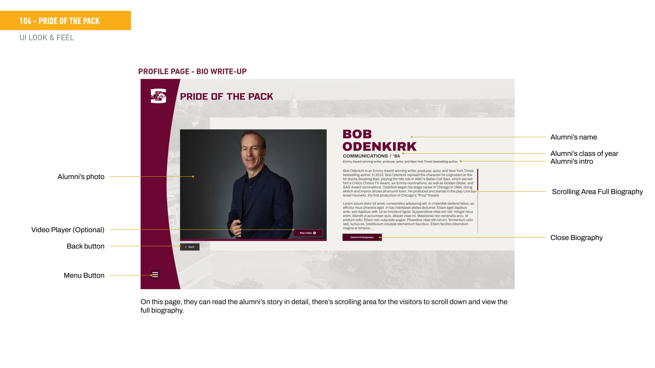
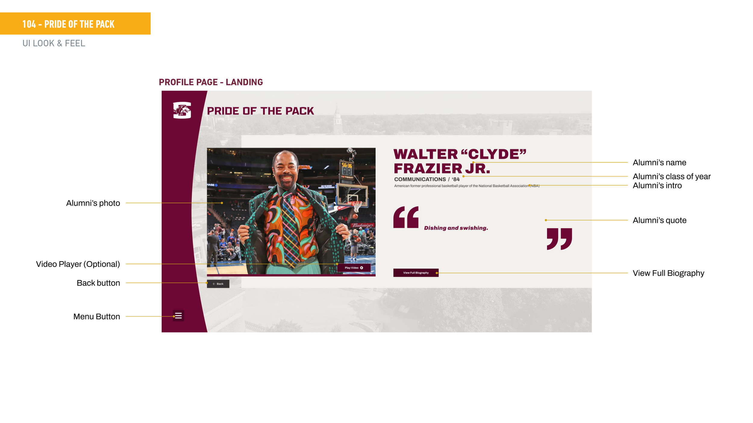
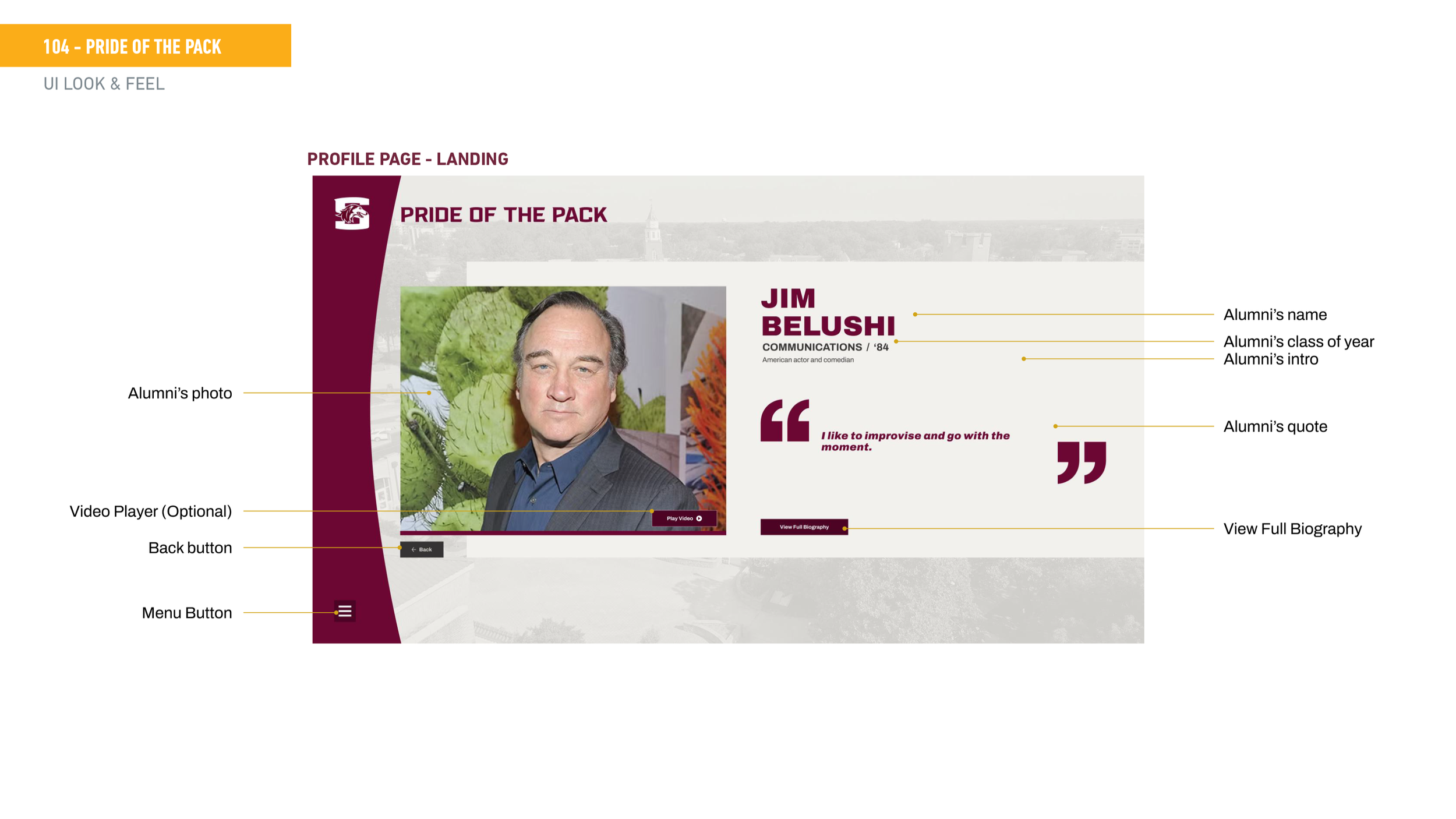
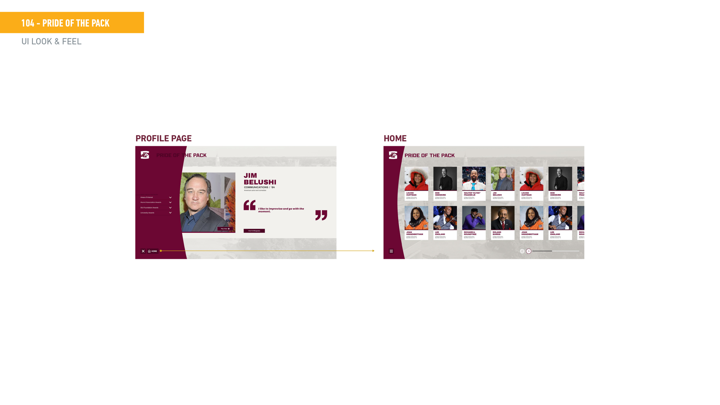
Wireframe / user flow caption The user flow maps the path from attract loop through home grid, into the menu and sub-category filter, and finally to the individual profile page. Each profile has two states — a landing view with photo, quote, and intro, and a full biography view for visitors who want to go deeper.
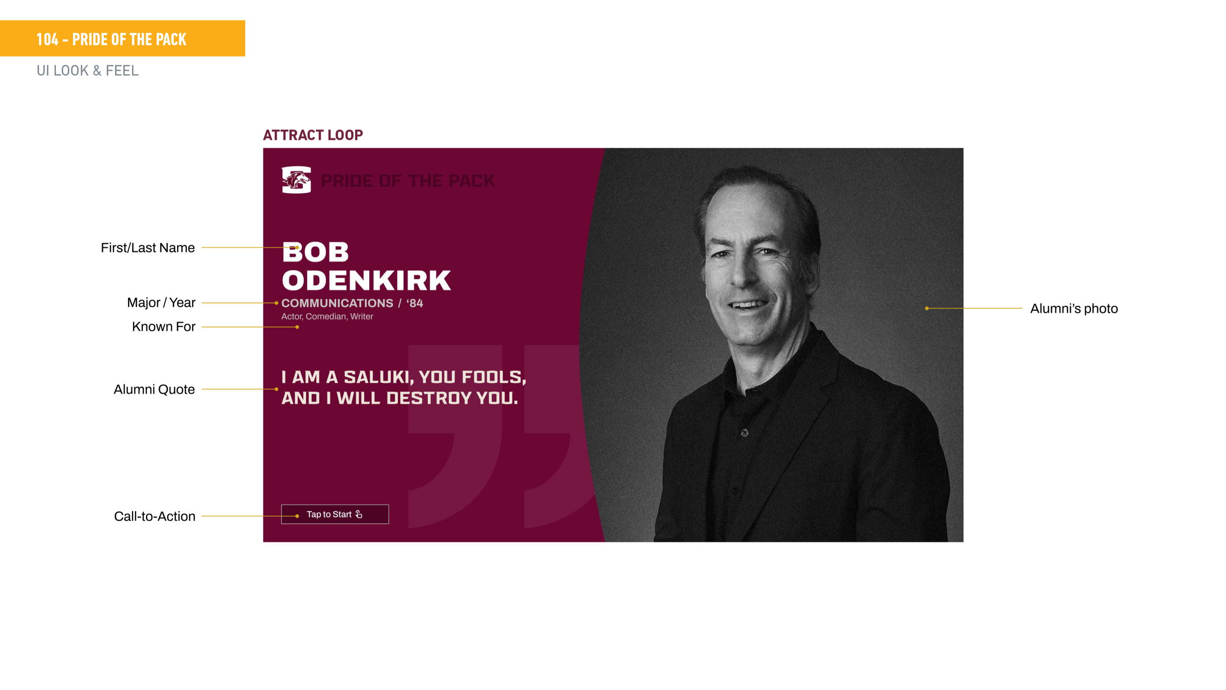
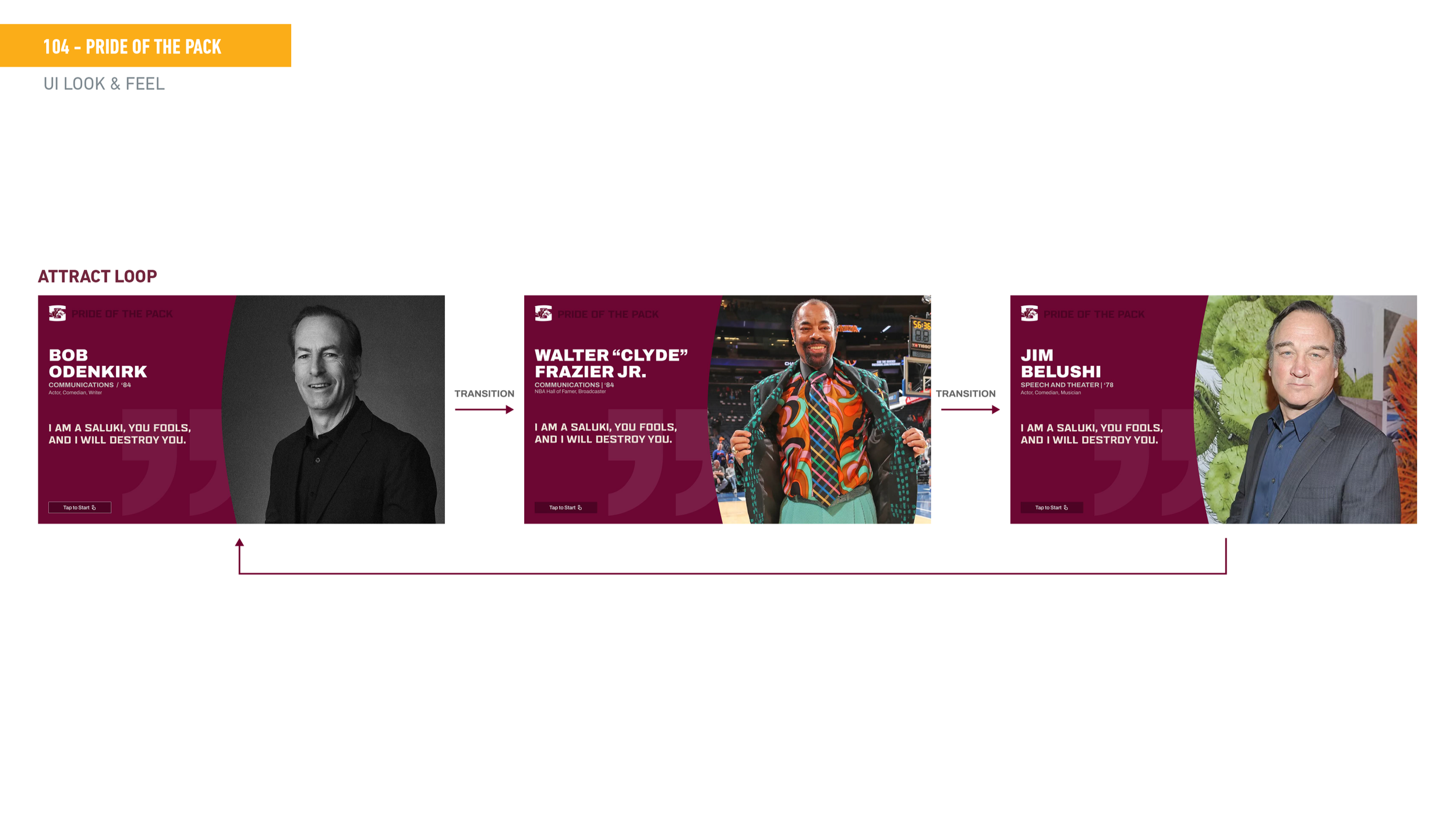
Final UI caption The attract loop is the moment that stops people in their tracks — full-screen alumni portraits with a bold quote and "Tap to Start" prompt. The home grid keeps things visually rich while the side menu keeps filtering simple and accessible.