Accenture Federal Services — The Forge®
Experiential Design · UI Design · Washington, DC · 2025
Client:
Accenture Federal Services
My Role:
UX UI Designer
Graphic Designer
Conceptual Illustrator
Year:
2025-2026
Tools
Figma
Illustrator
Photoshop
Procreate
The Forge® is Accenture Federal Services' flagship innovation center in Washington DC — a fully immersive, technology-driven experience environment built to show federal government clients what's possible when cutting-edge technology meets mission-driven work. Every visit is personalized from the ground up, controlled through a custom CMS that manages content, lighting, and activations across the entire space.
Conceptual Design Phase
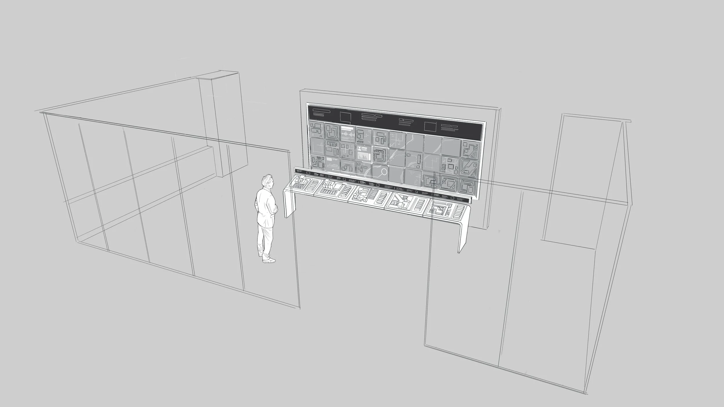
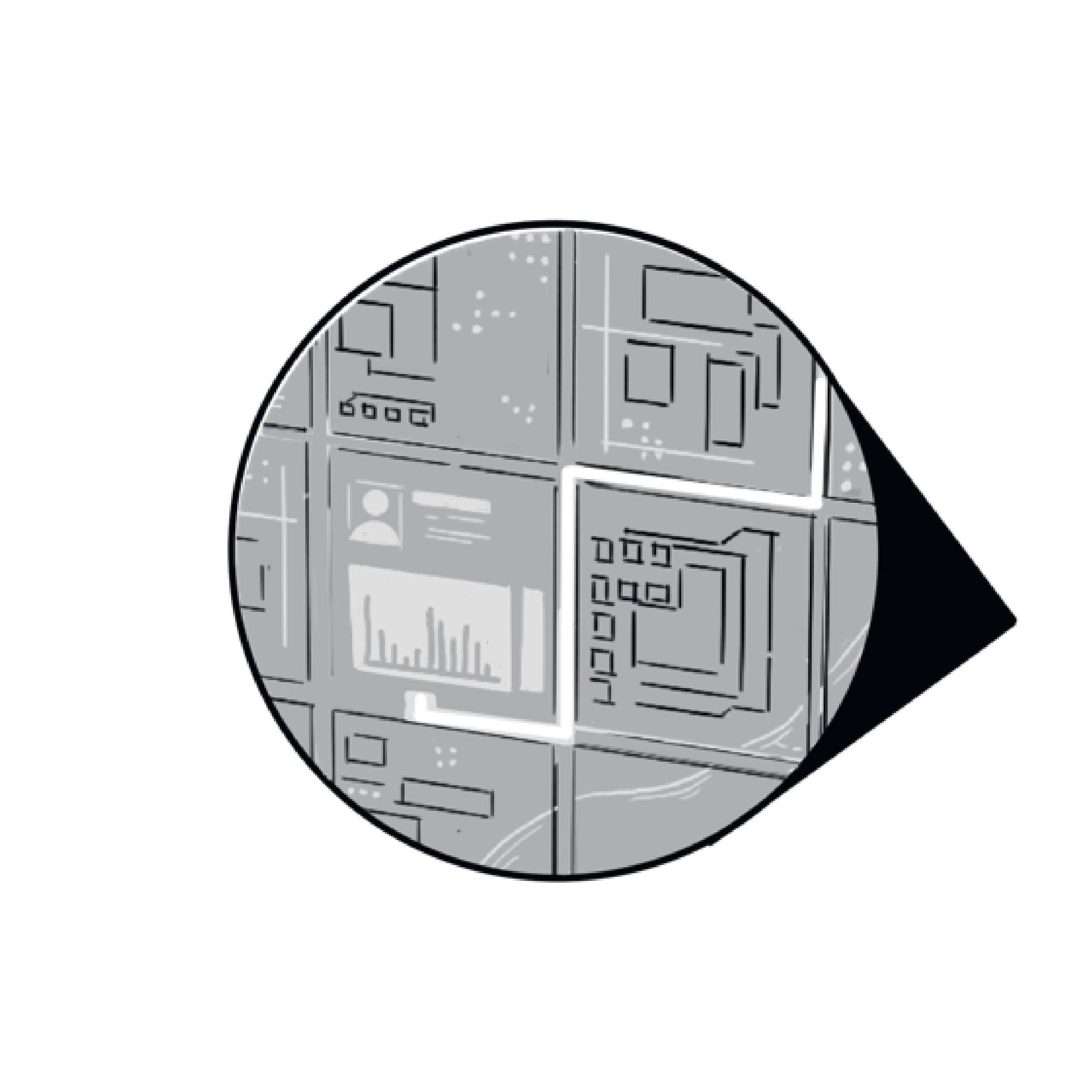
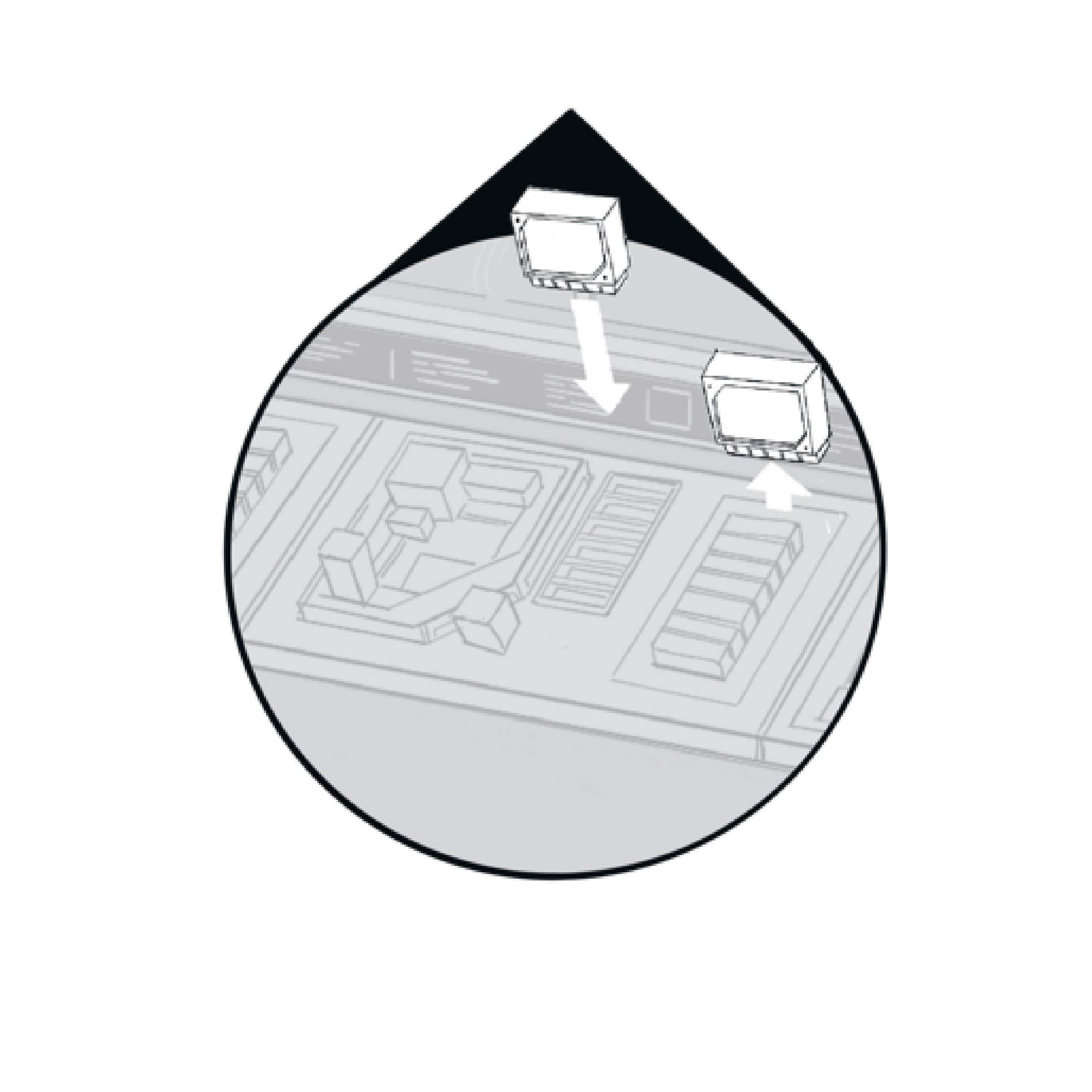
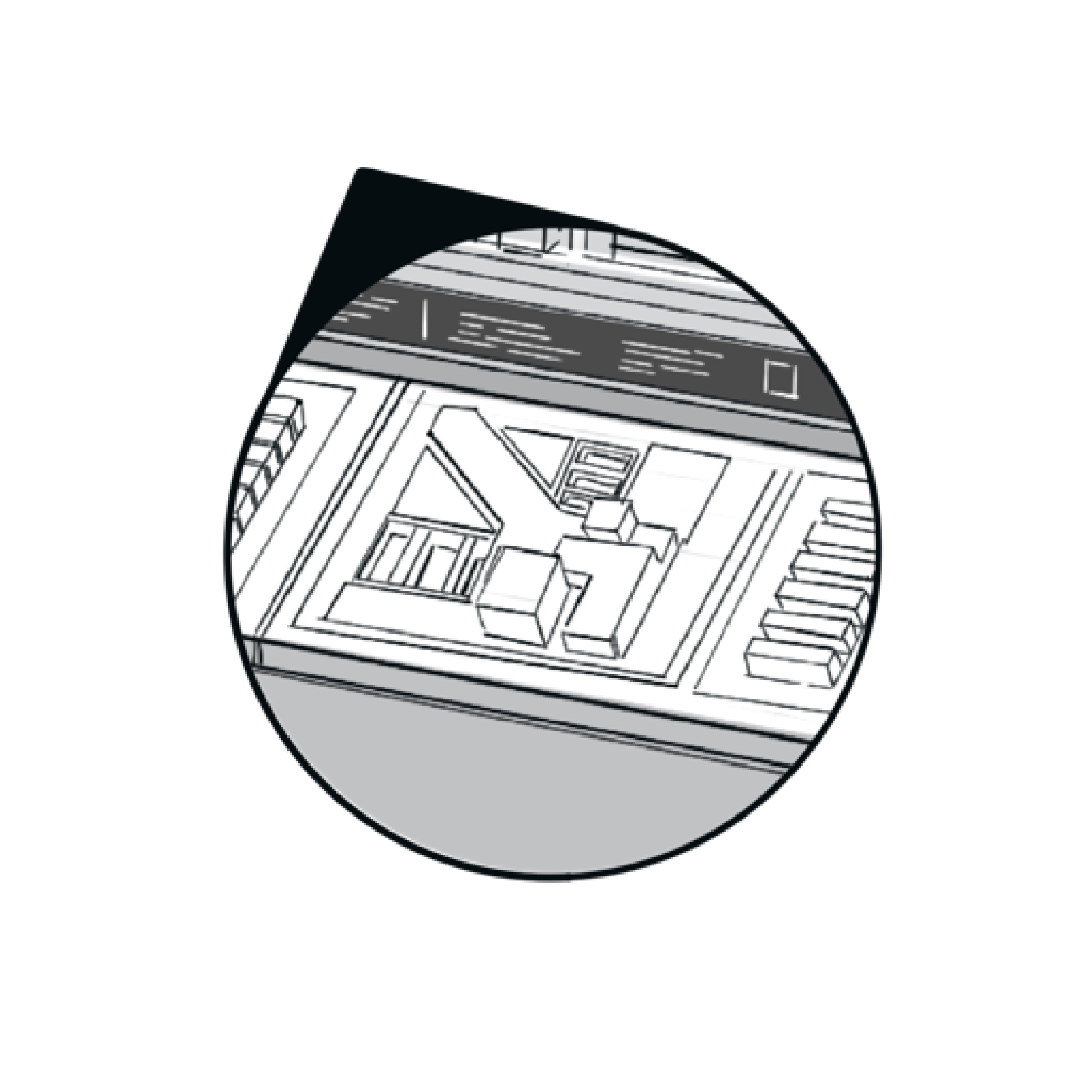
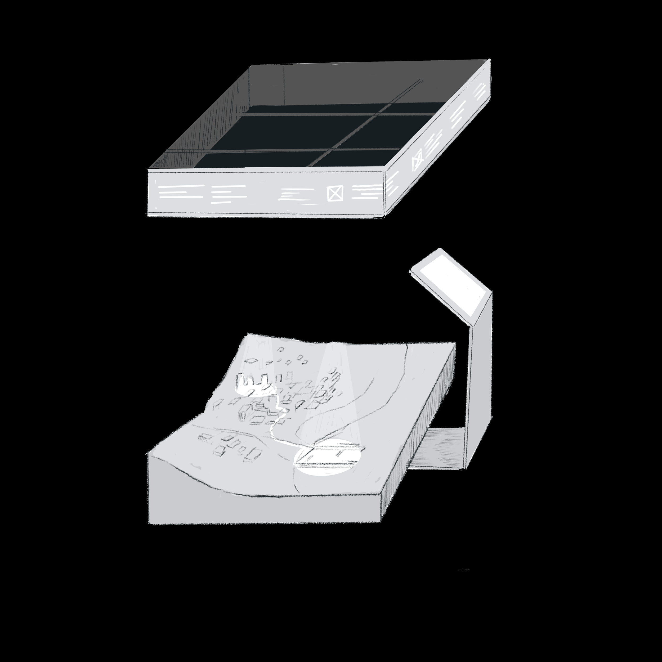
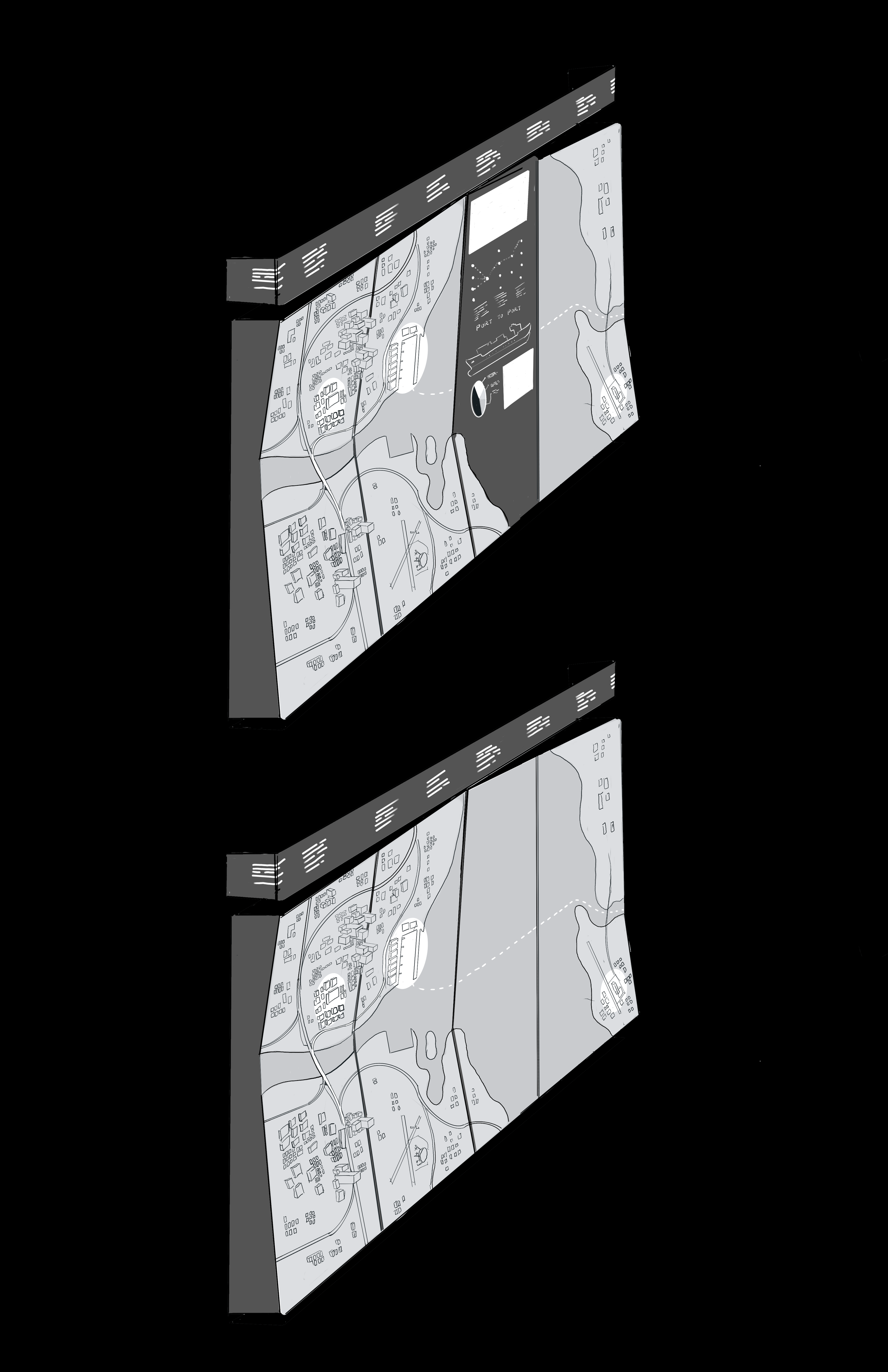
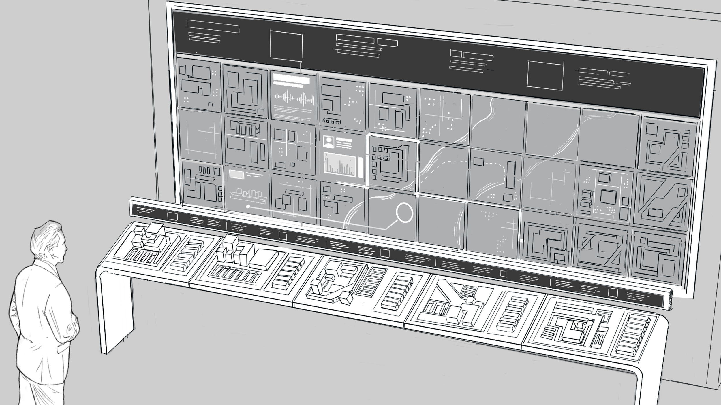
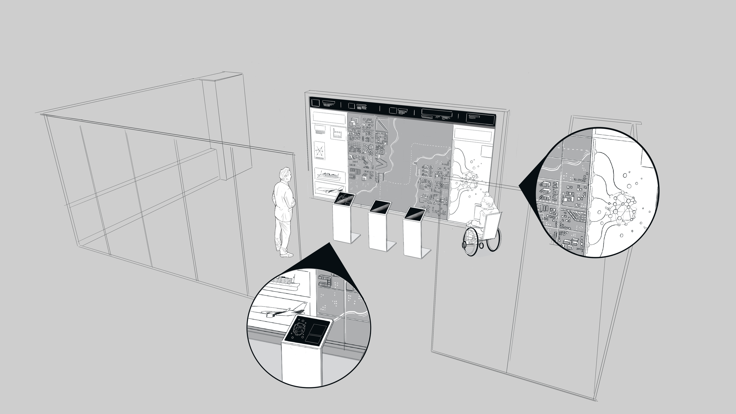
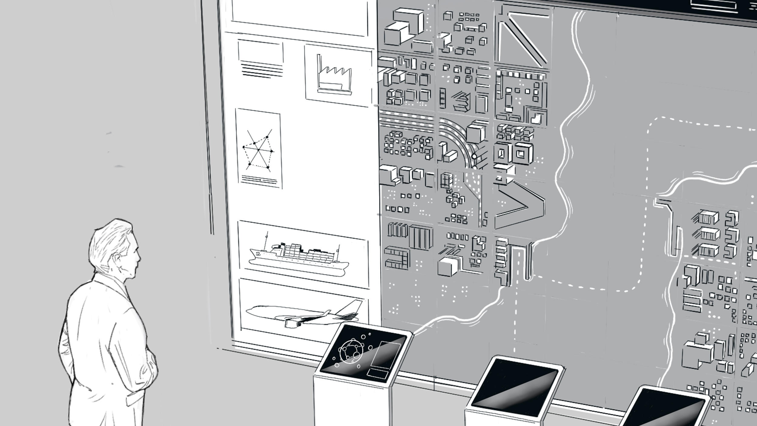
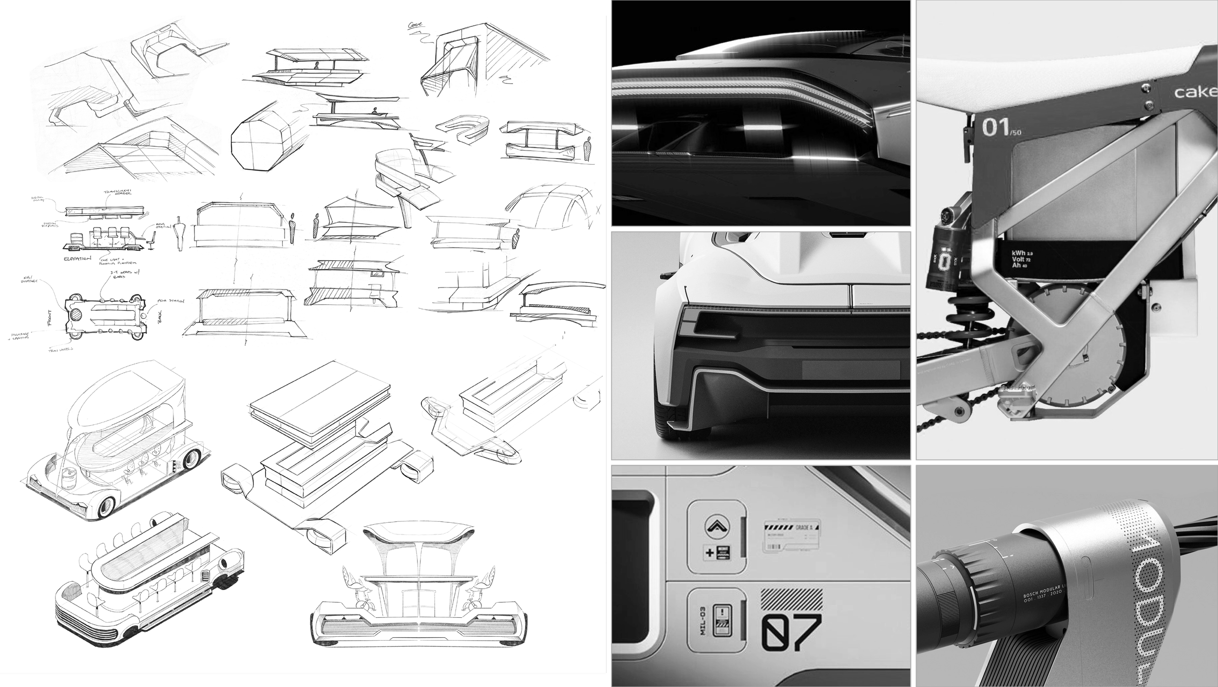
Before the project moved into design development, the team explored the space conceptually — considering materials, scale, lighting, and the overall experiential vision through renders and concept illustrations. I was brought into this phase to contribute conceptual illustration work for one of the corporate experience rooms. Those early illustrations had to account for how the space would actually feel at human scale — how light would interact with materials, how people of different heights and abilities would move through and engage with the environment, and how ADA compliance shaped design decisions from the start. Those concepts helped establish the direction of the space and evolved into what you can see in the final renders.
Style Guide:
Working in Figma and Illustrator, I adapted Accenture's existing brand system into a visual language tailored specifically for the space — translating their corporate identity into something that works at DVLED scale and across an immersive physical environment. The style guide covers wordmark usage, color palette, typography scaled for large-format viewing distances, digital backgrounds, iconography, touchscreen layout grids, passive screen states, navigation patterns, and a full component library used across the interactive touchscreens throughout the space.
What I Built
UI Style Guide (v2.0) — color, typography, iconography, digital backgrounds, wordmark usage
Hub screen layout system — 8-section grid across east, south, and west walls
Screen states and static background treatments for The Hub
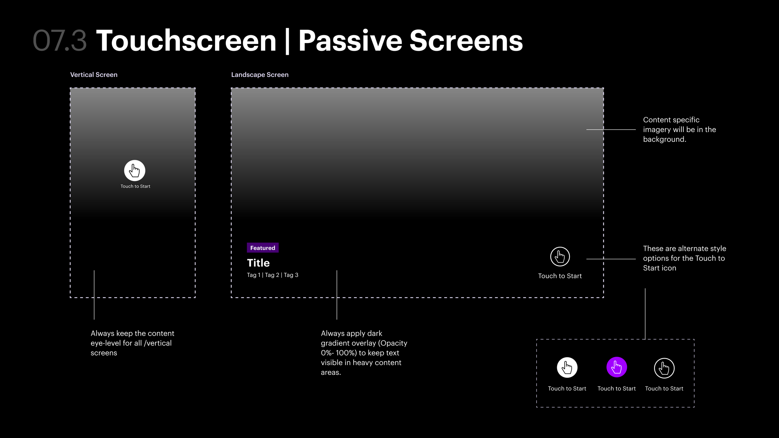
Touchscreen layout system — 12-column grid, spacing rules, accessibility heat map, passive screens, navigation patterns
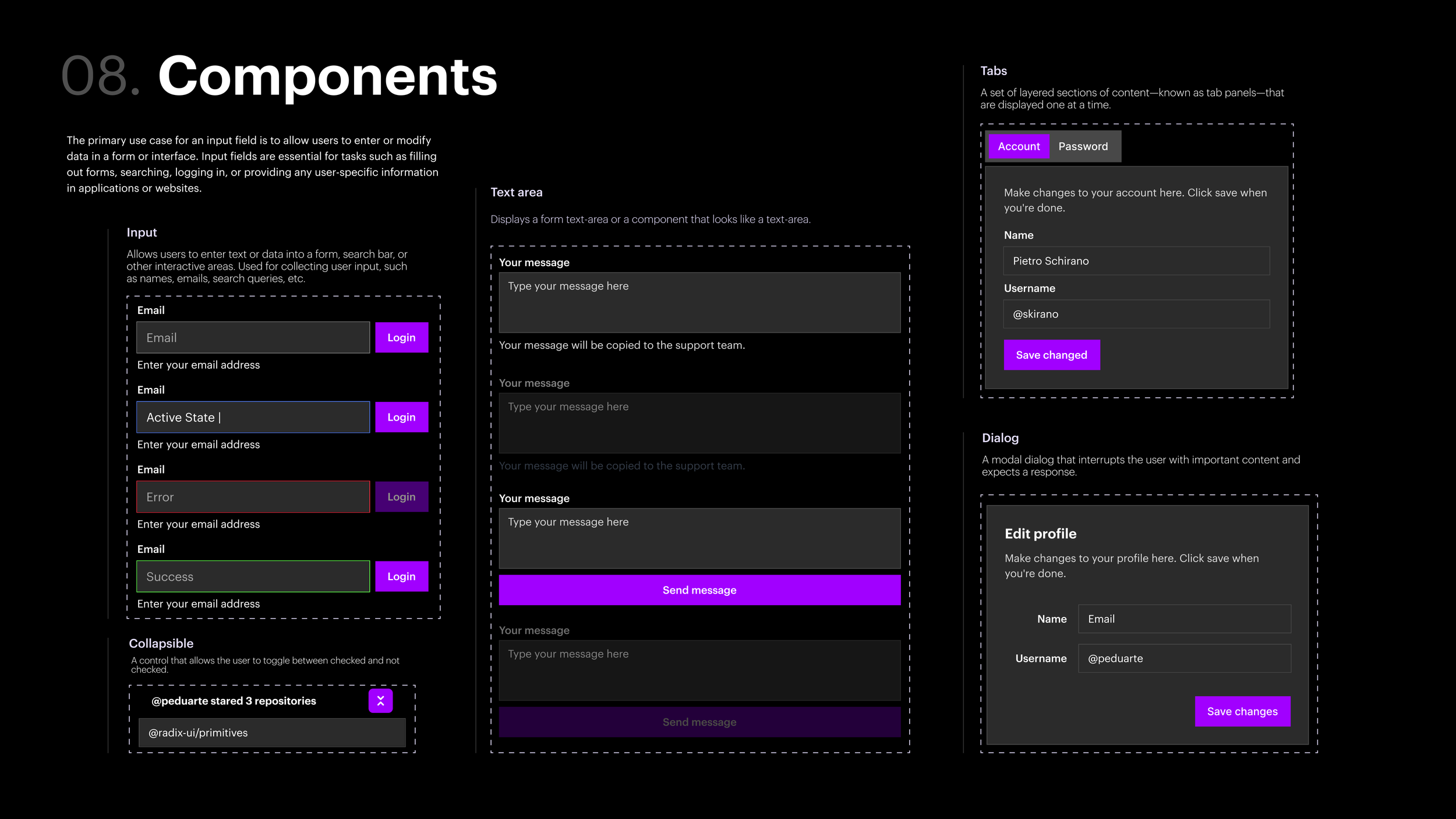
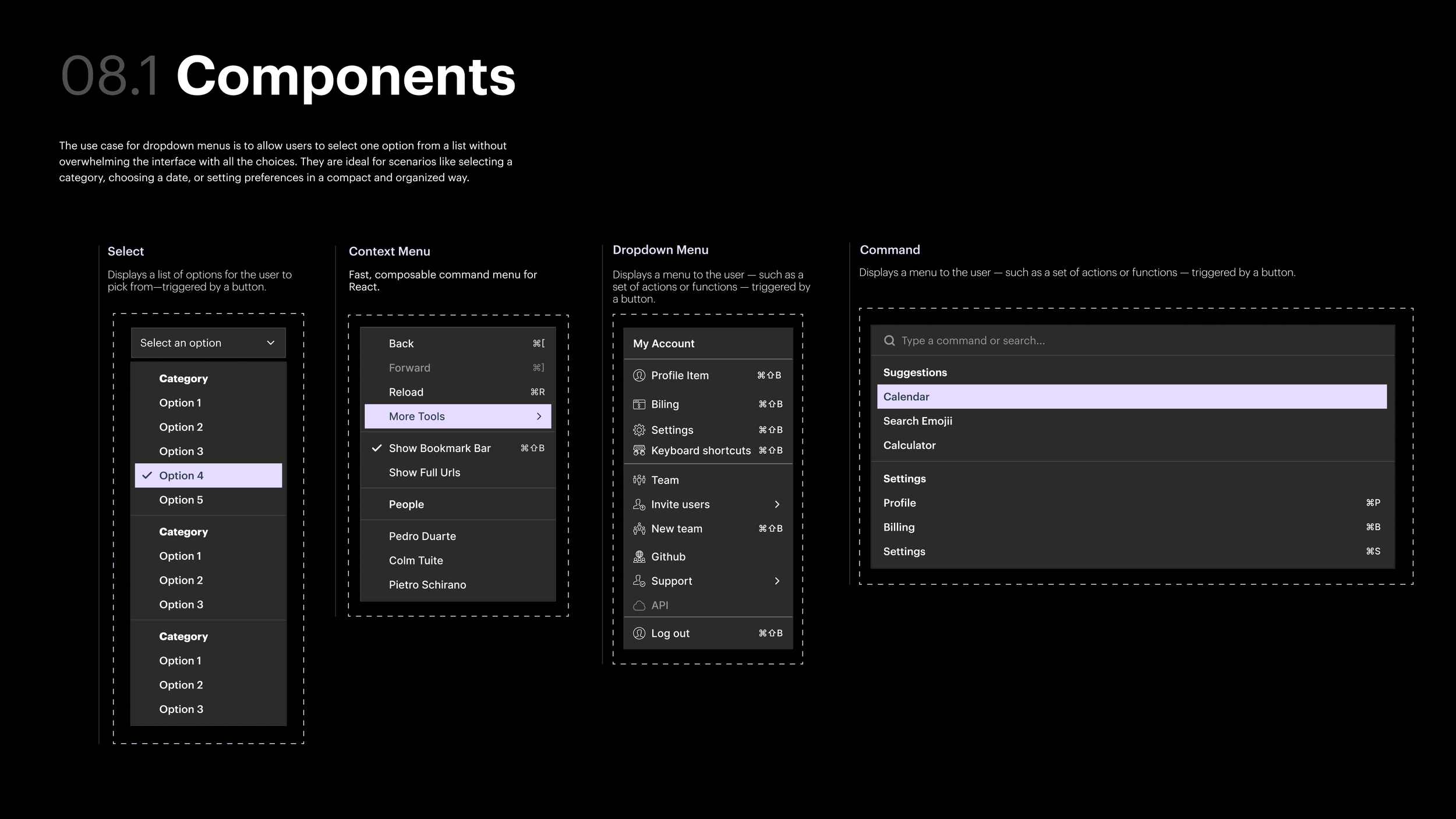
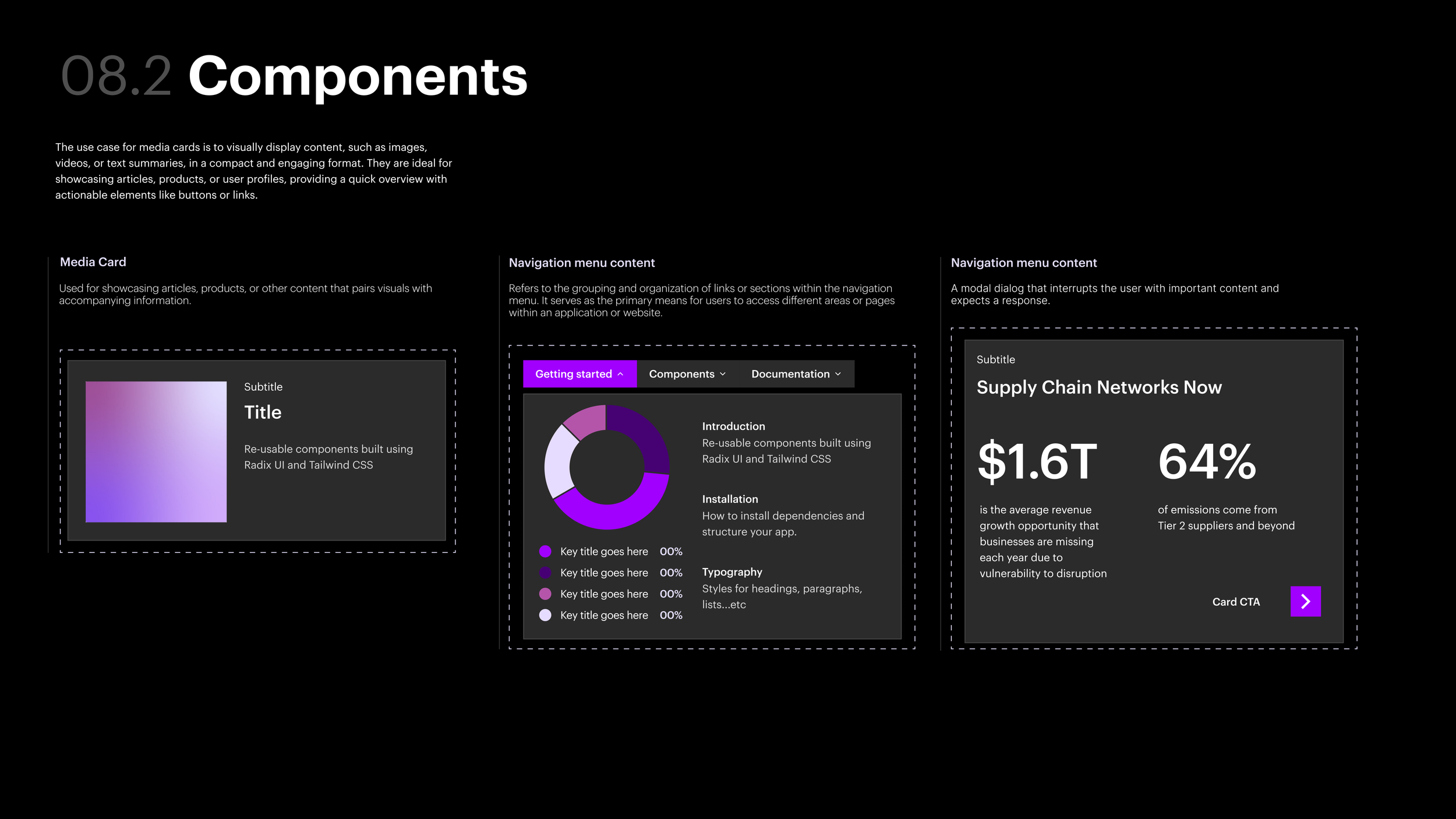
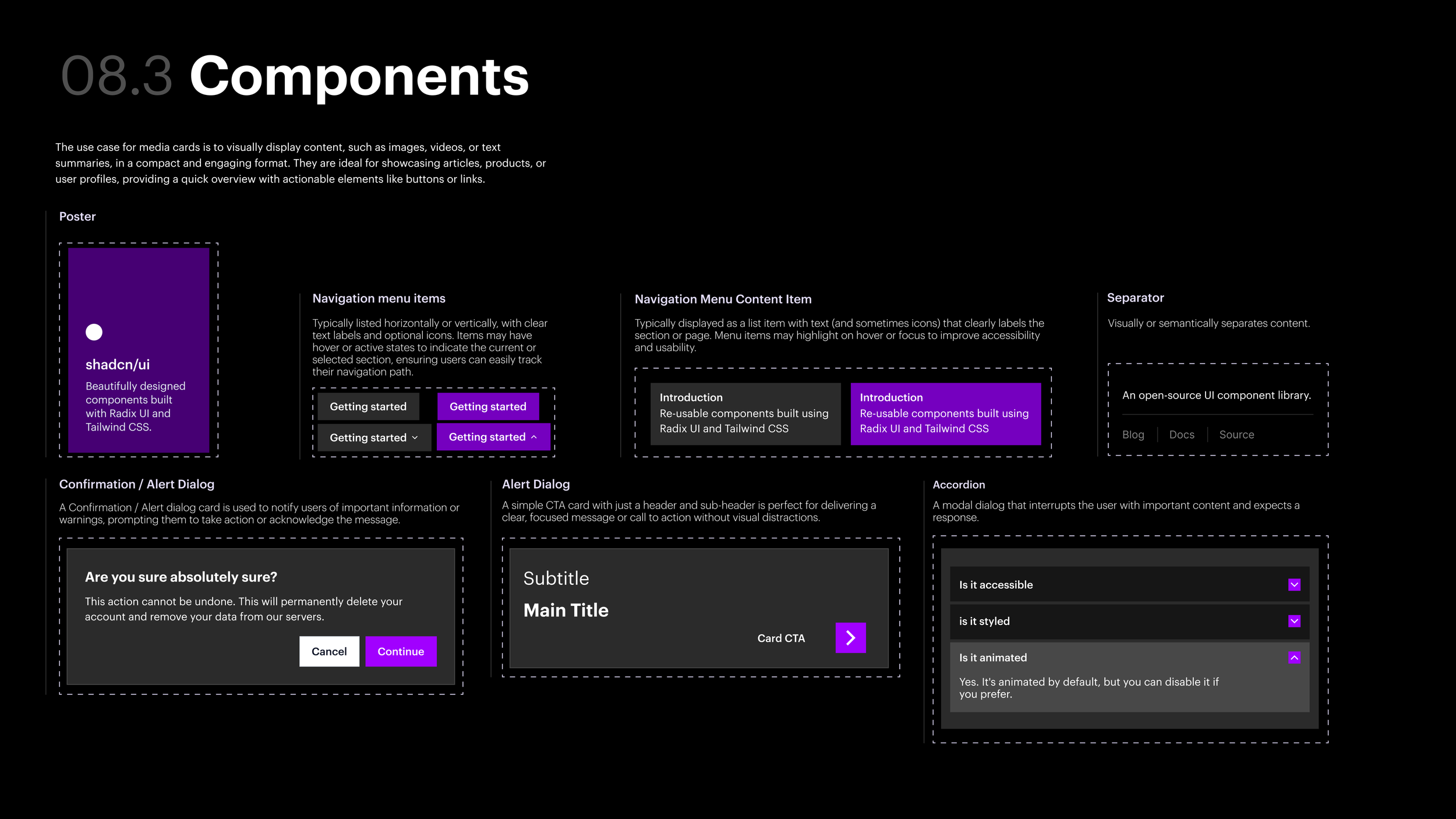
Component library — inputs, cards, navigation, dialogs, dropdowns, tabs, and more
Docent app UI contributions
1.0
Wordmark
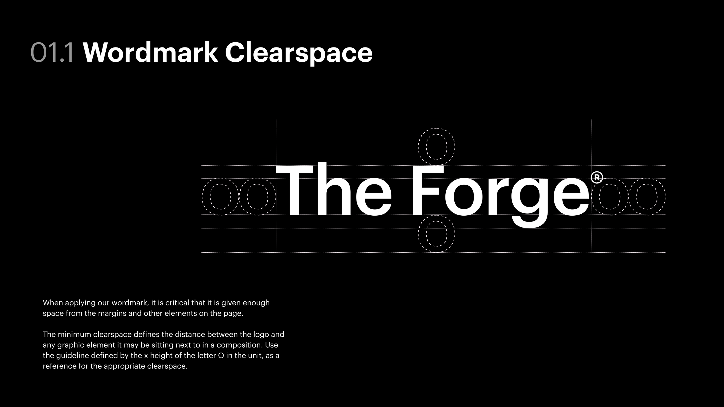
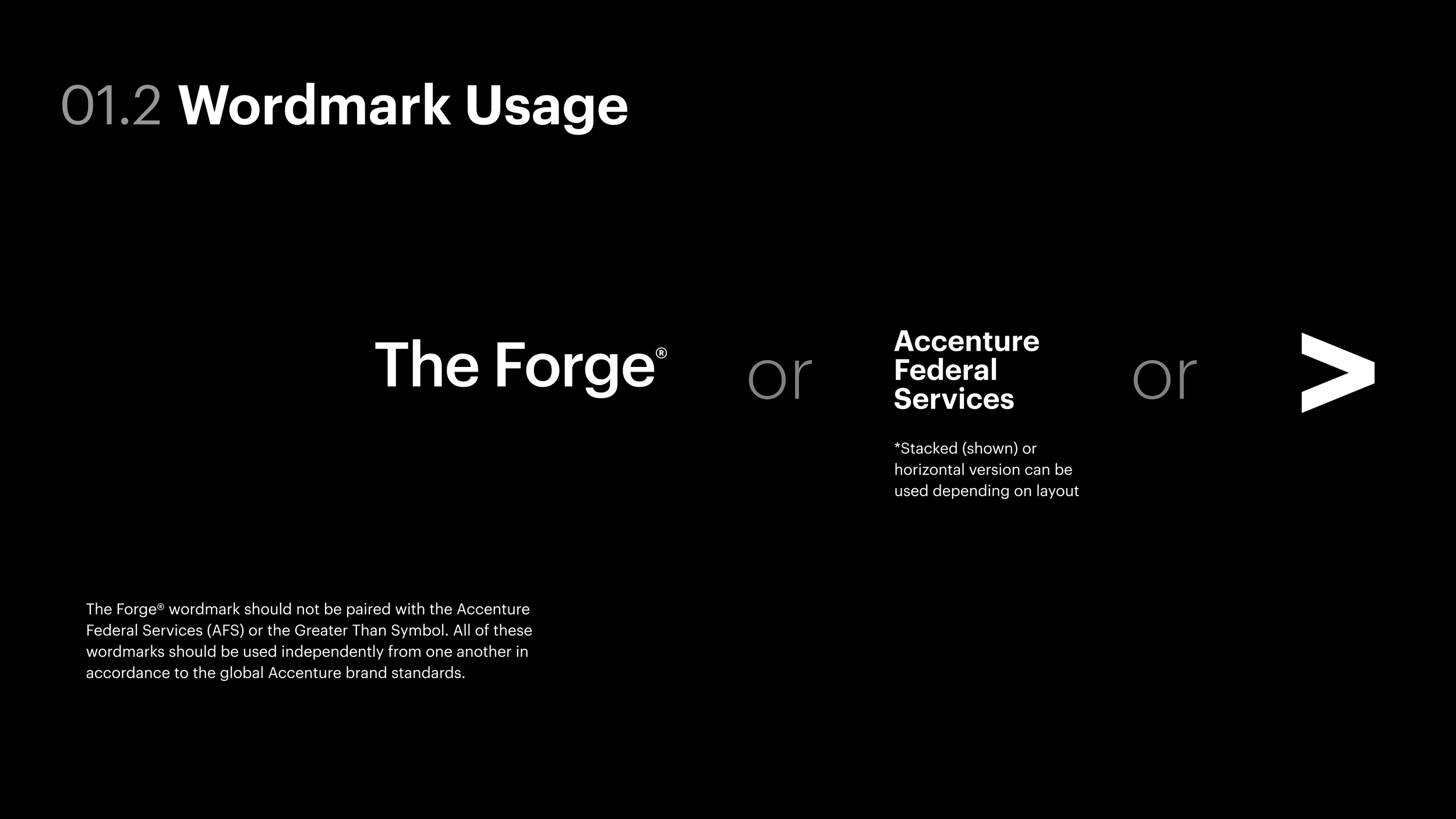
The Forge® has its own brand identity that lives within — but is distinct from — the larger Accenture family. These slides define how the wordmark is used, how much clearspace it requires, and the rule that The Forge®, the AFS wordmark, and the Accenture greater-than symbol are never used together.
2.0
Color System
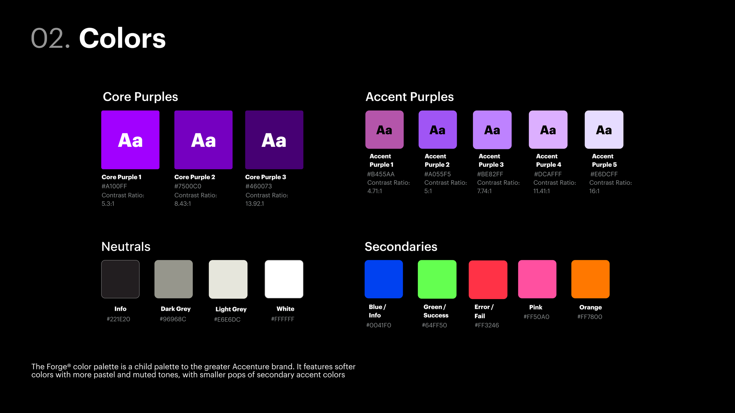
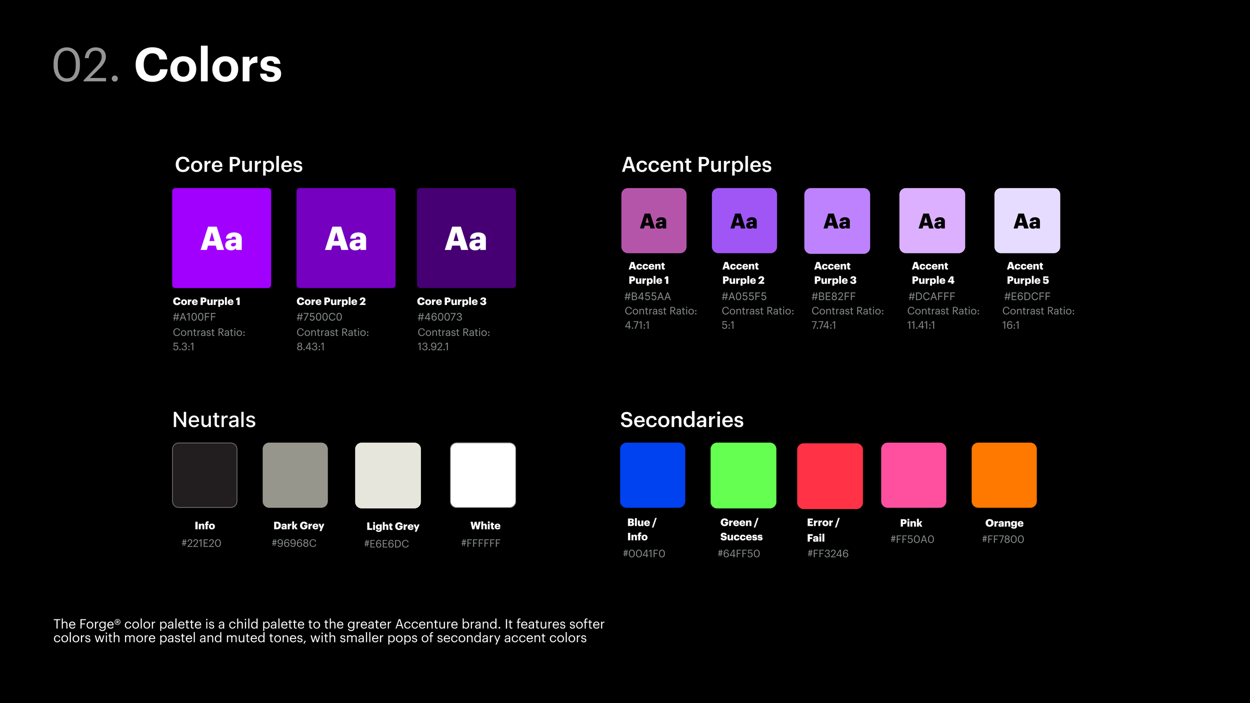
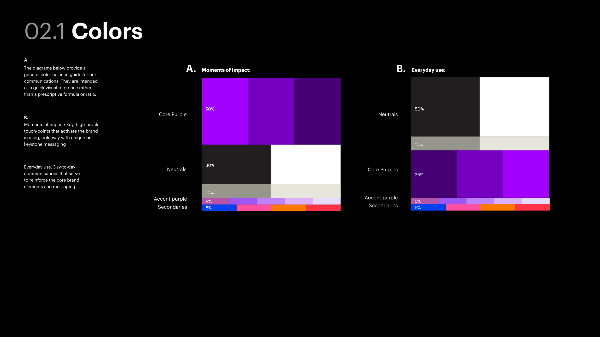
The color palette is a child system of Accenture's parent brand, built around three core purples and five accent purples, each documented with contrast ratios for accessibility compliance. The balance diagrams define exactly how much of each color appears in high-impact moments versus everyday content across the space.
3.0
Typography
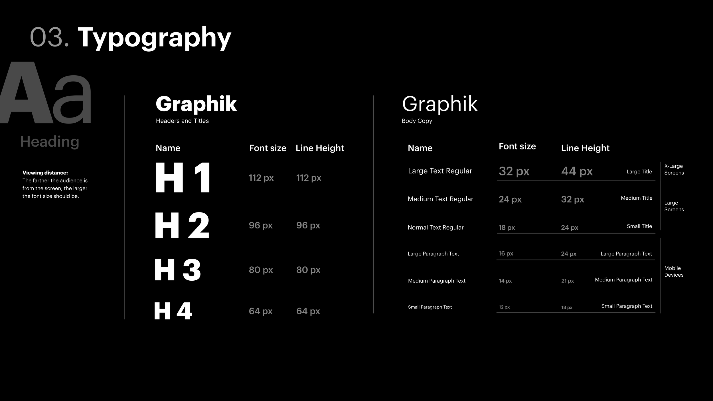
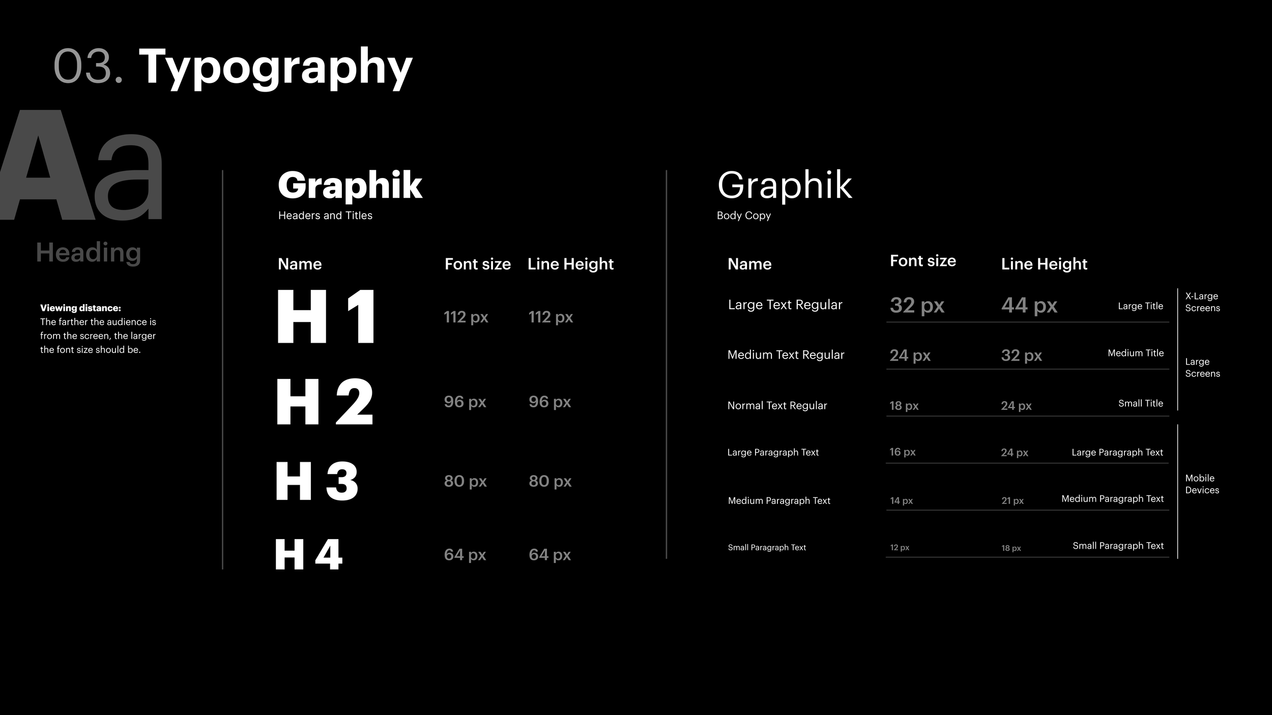
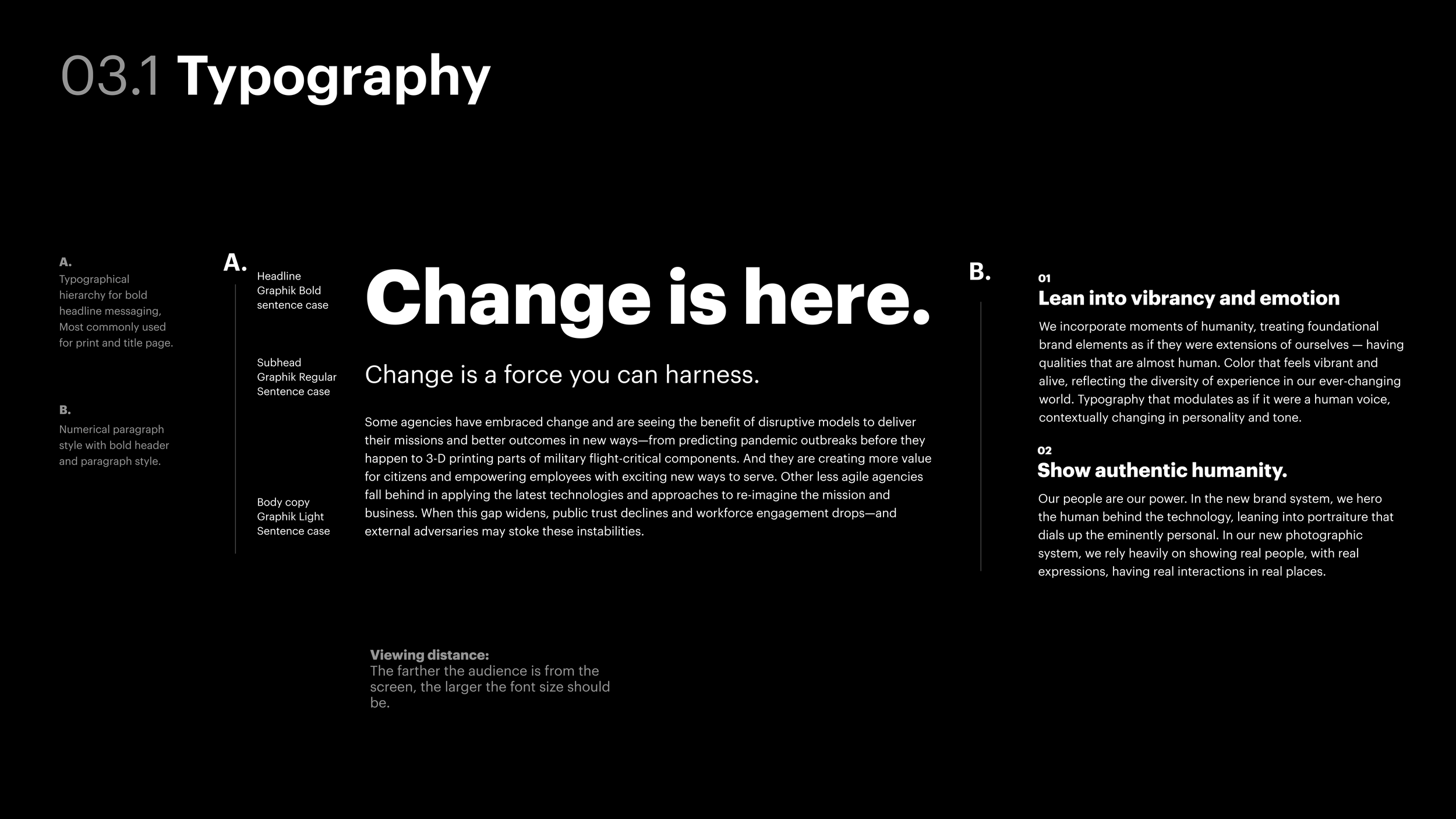
The type system uses Graphik throughout, with heading sizes scaling from 112px down to 64px. A key consideration unique to this environment — viewing distance. Because content appears on a floor-to-ceiling DVLED wall, font sizing had to account for how far the audience is standing from the screen at any given moment.
4.0
Iconography
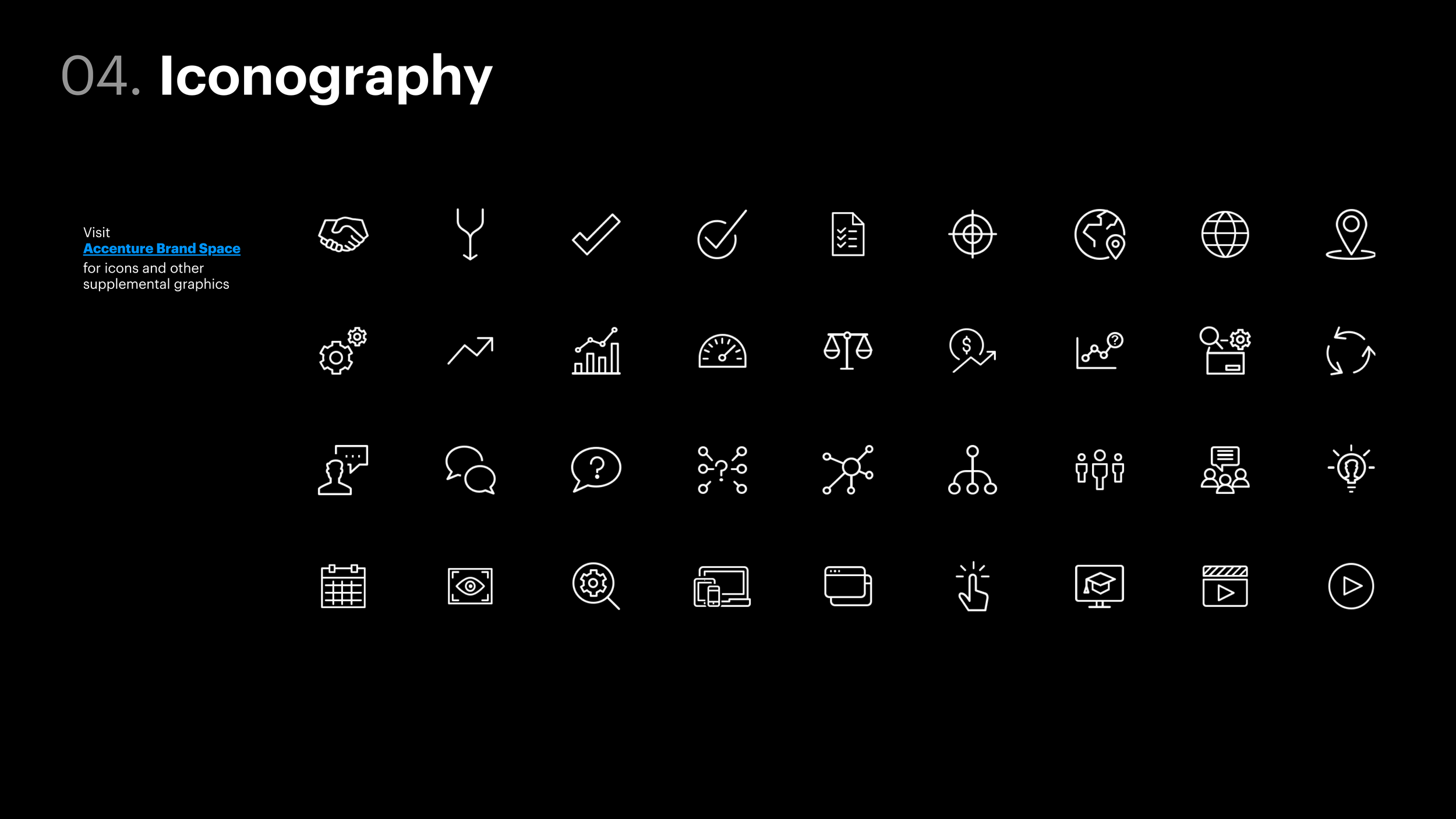
A library of 36 line icons pulled from the Accenture Brand Space, covering the core subject matter of the space — analytics, global operations, collaboration, technology, and workflow. These are used throughout the touchscreen interfaces across The Forge.
5.0
Digital Backgrounds
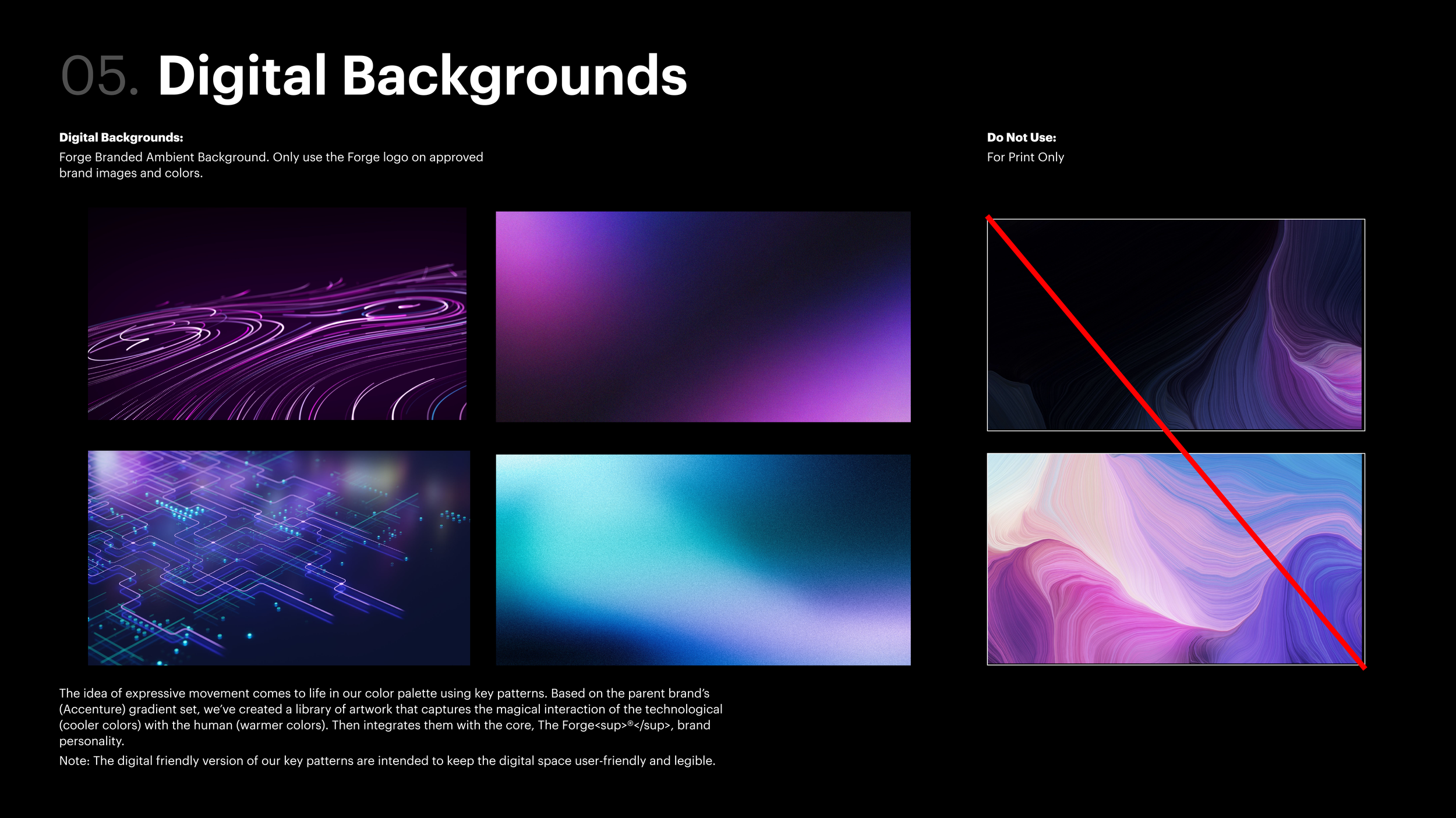
Approved ambient backgrounds for The Hub display system, derived from Accenture's gradient library. The system captures what the brand describes as the interaction between the technological (cooler tones) and the human (warmer tones). Two options are marked as print-only and excluded from digital use.
6.0
The Hub — Screen Layout System
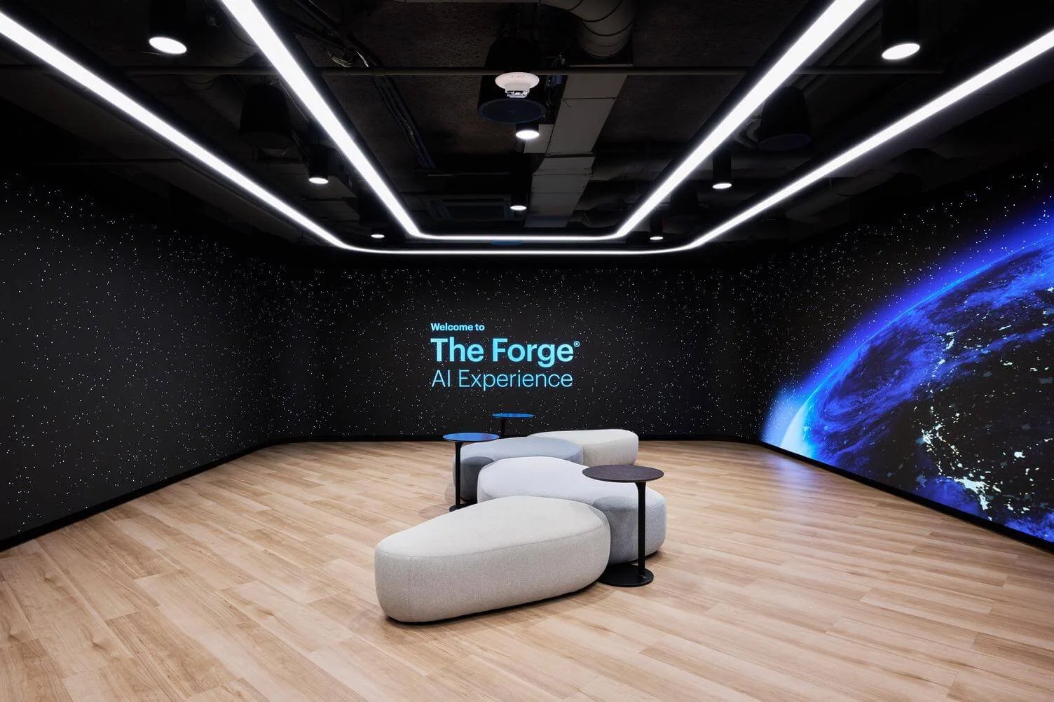
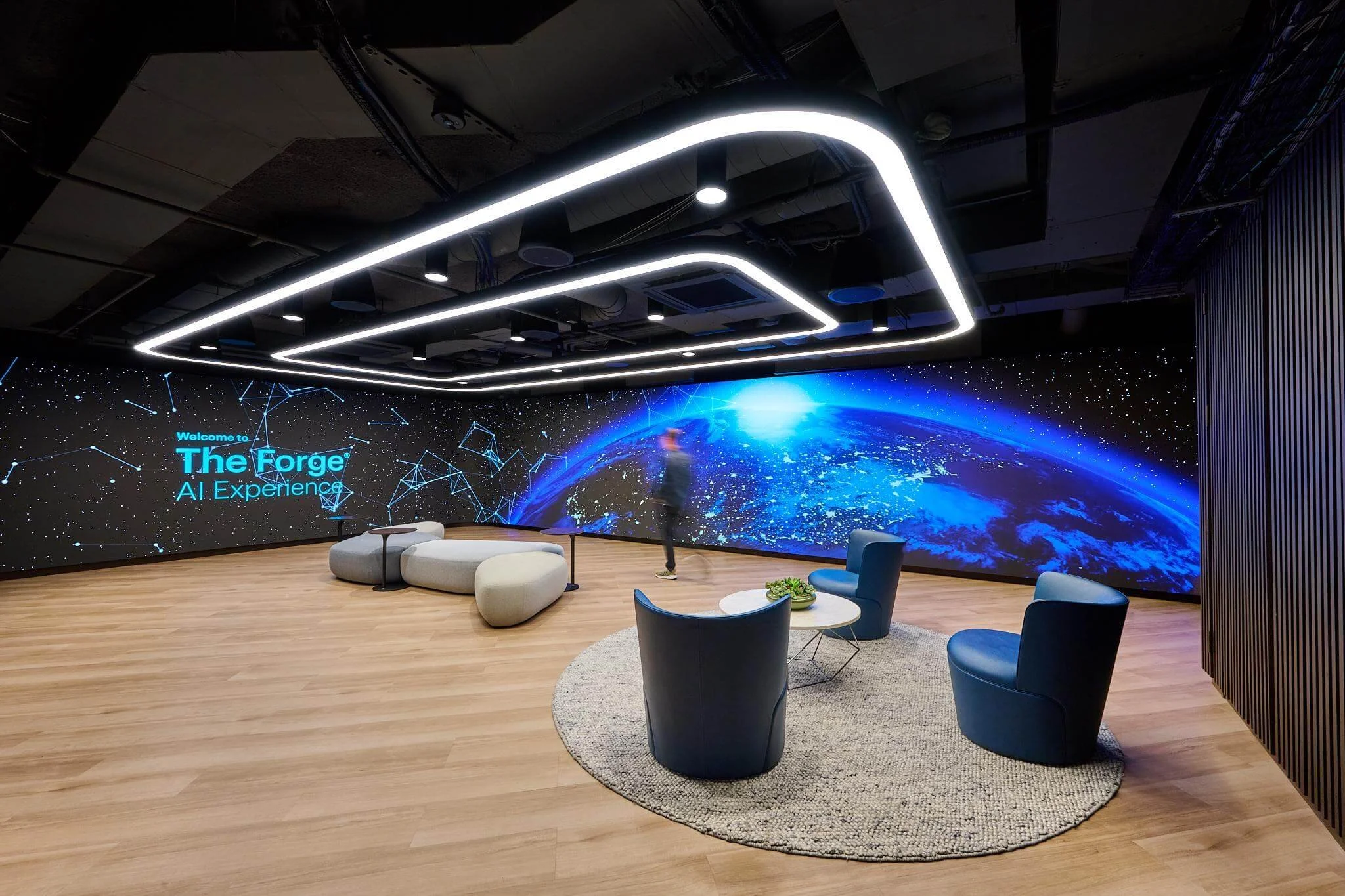
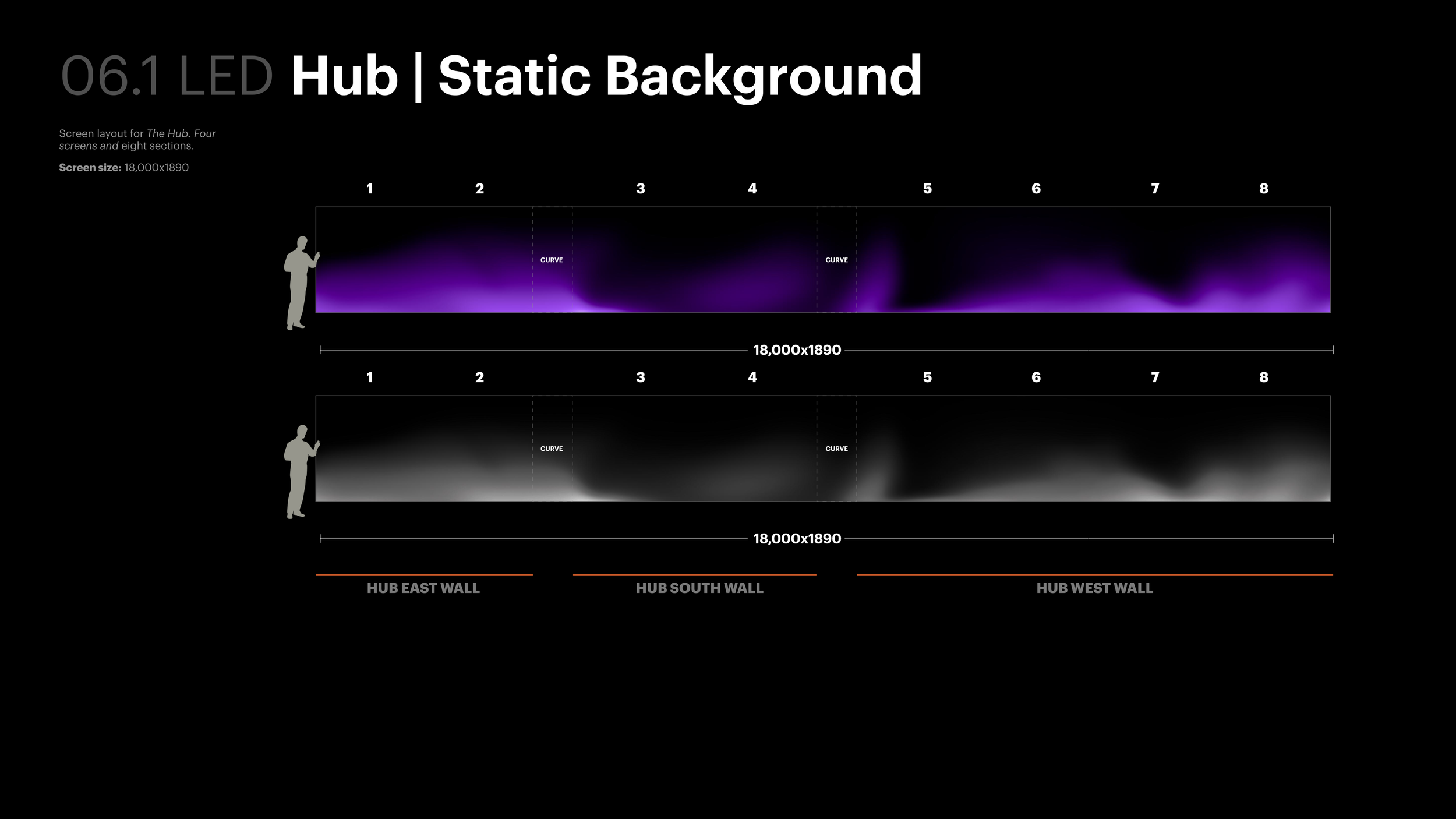
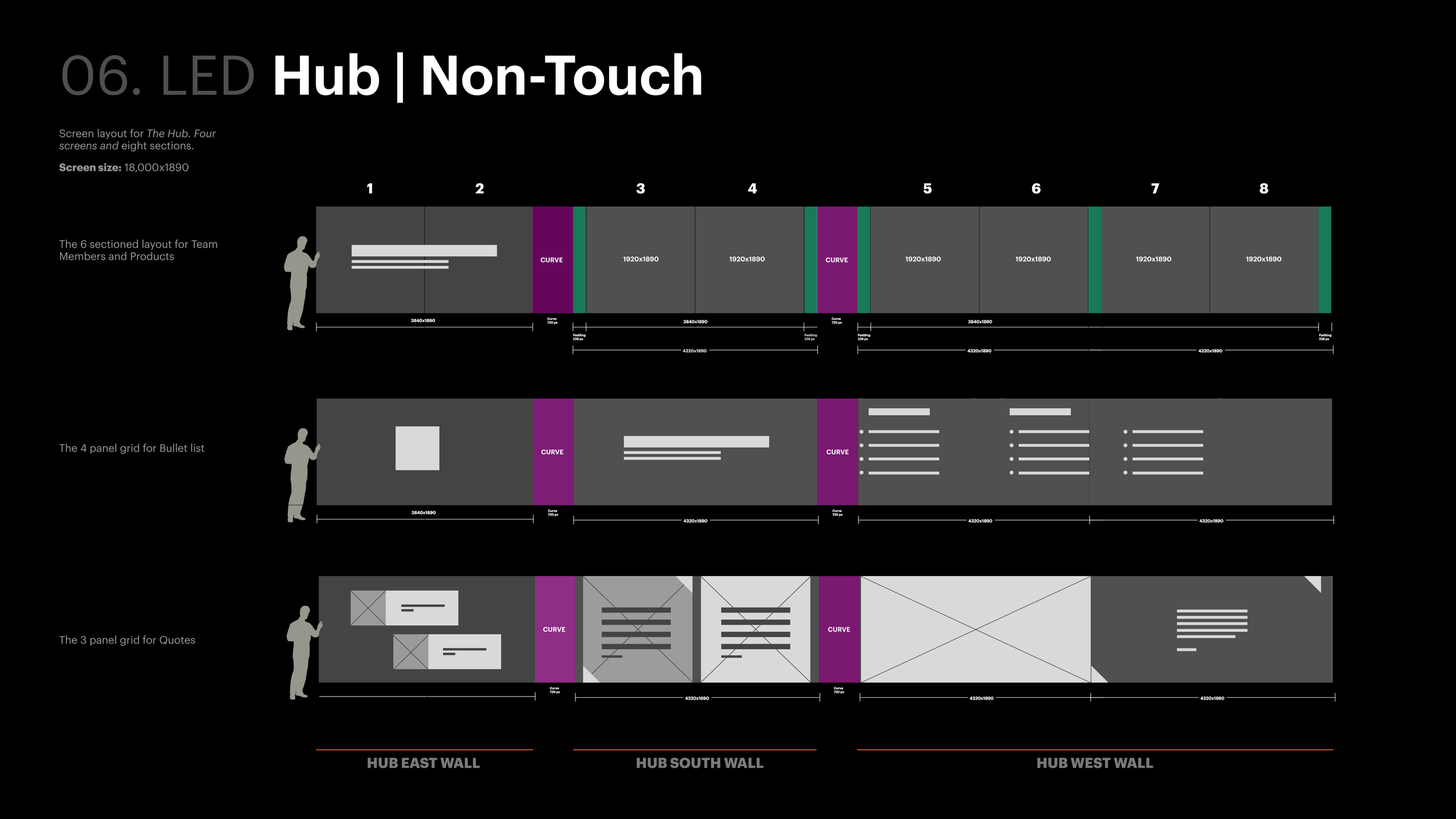
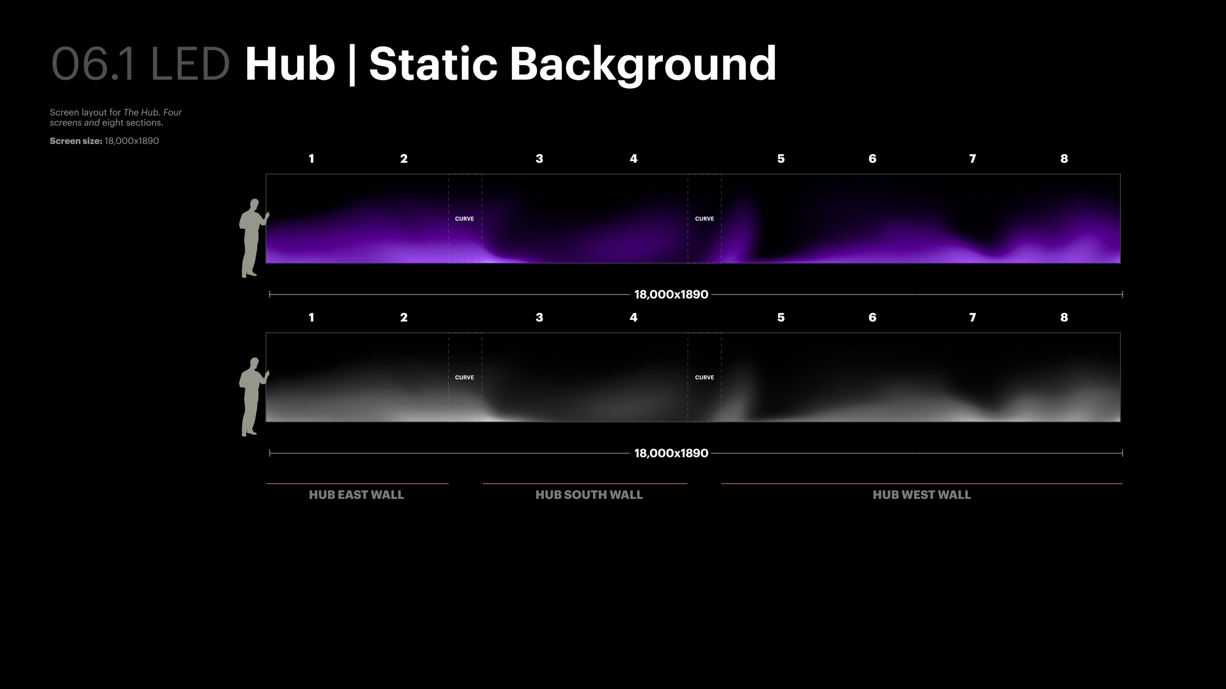
The Hub is a seamless three-walled DVLED installation spanning 18,000 pixels wide across east, south, and west walls, divided into 8 numbered sections. These slides document the layout grid for three content modes — a 6-section layout for team members and products, a 4-panel layout for bullet lists, and a 3-panel layout for quotes — along with static background treatments showing how content sits against the full width of the display.
7.0
Touchscreen Layouts
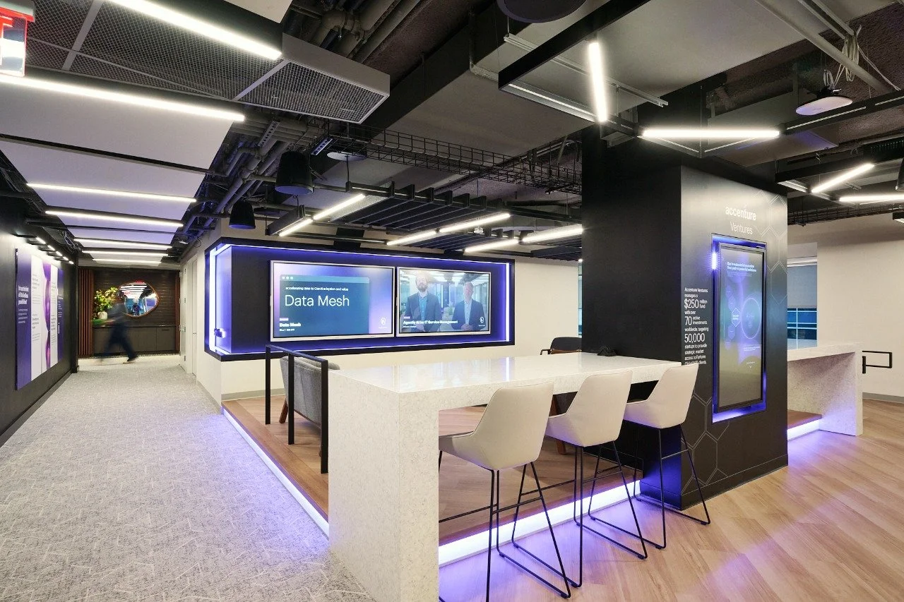
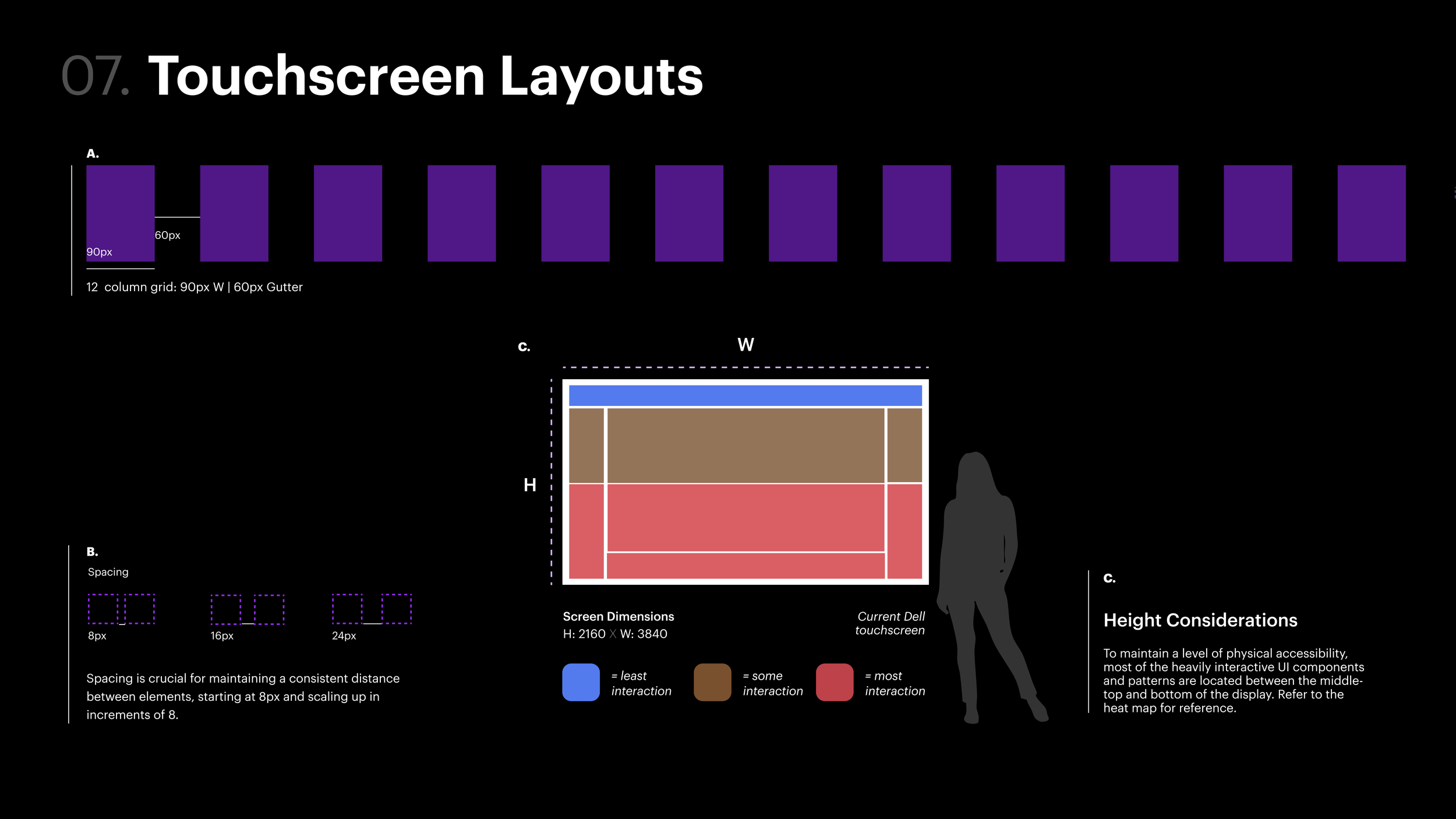
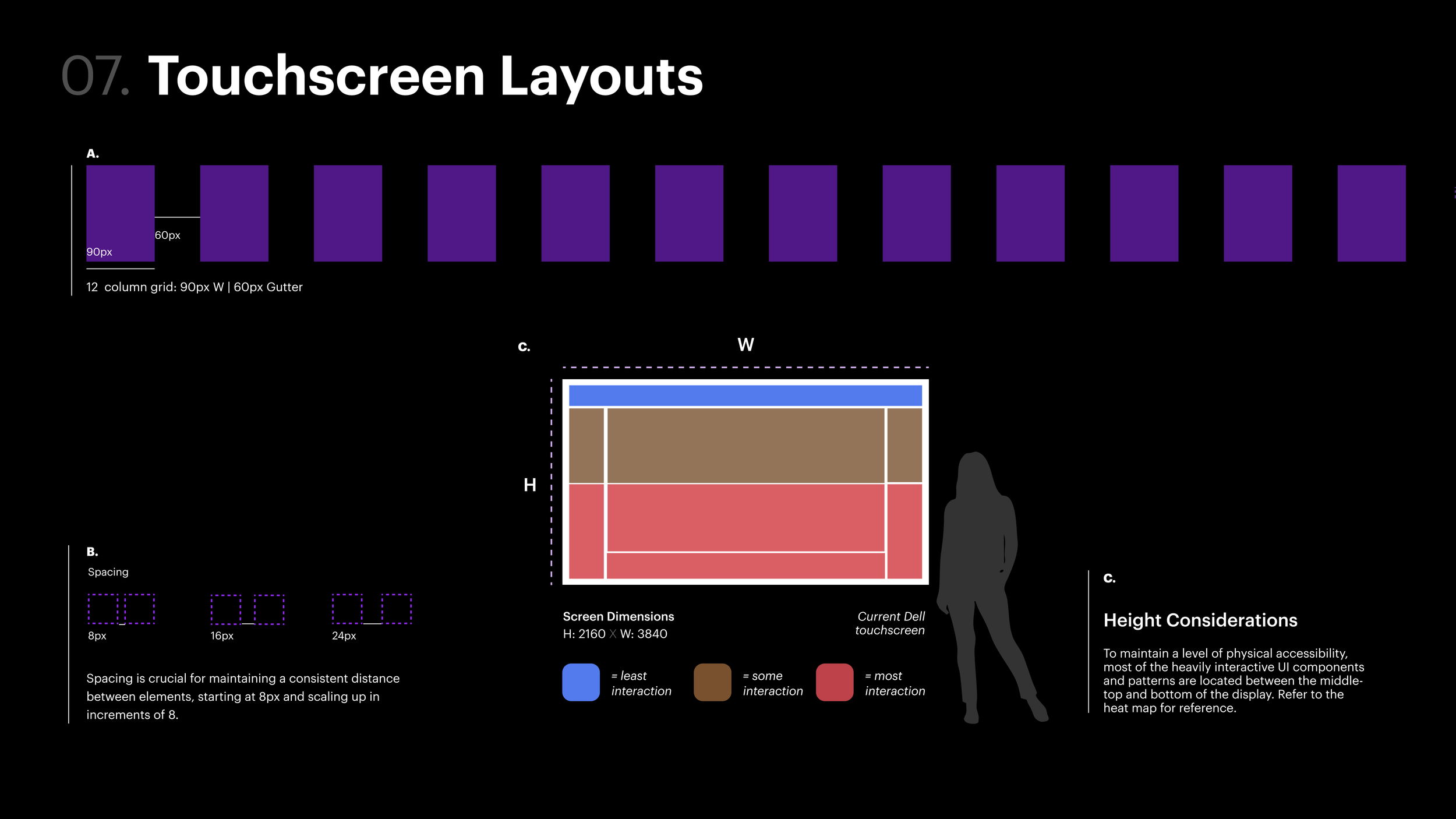
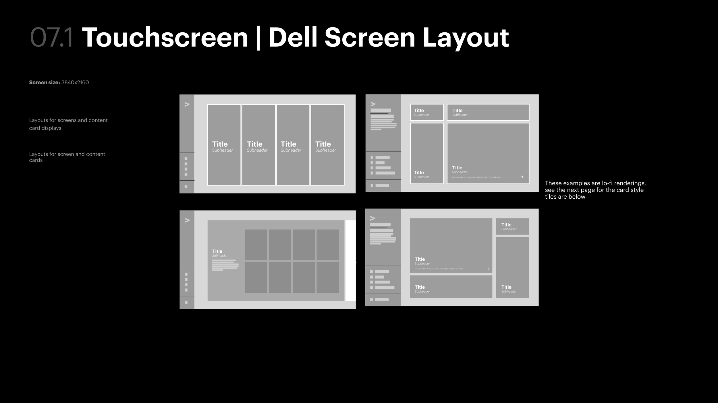
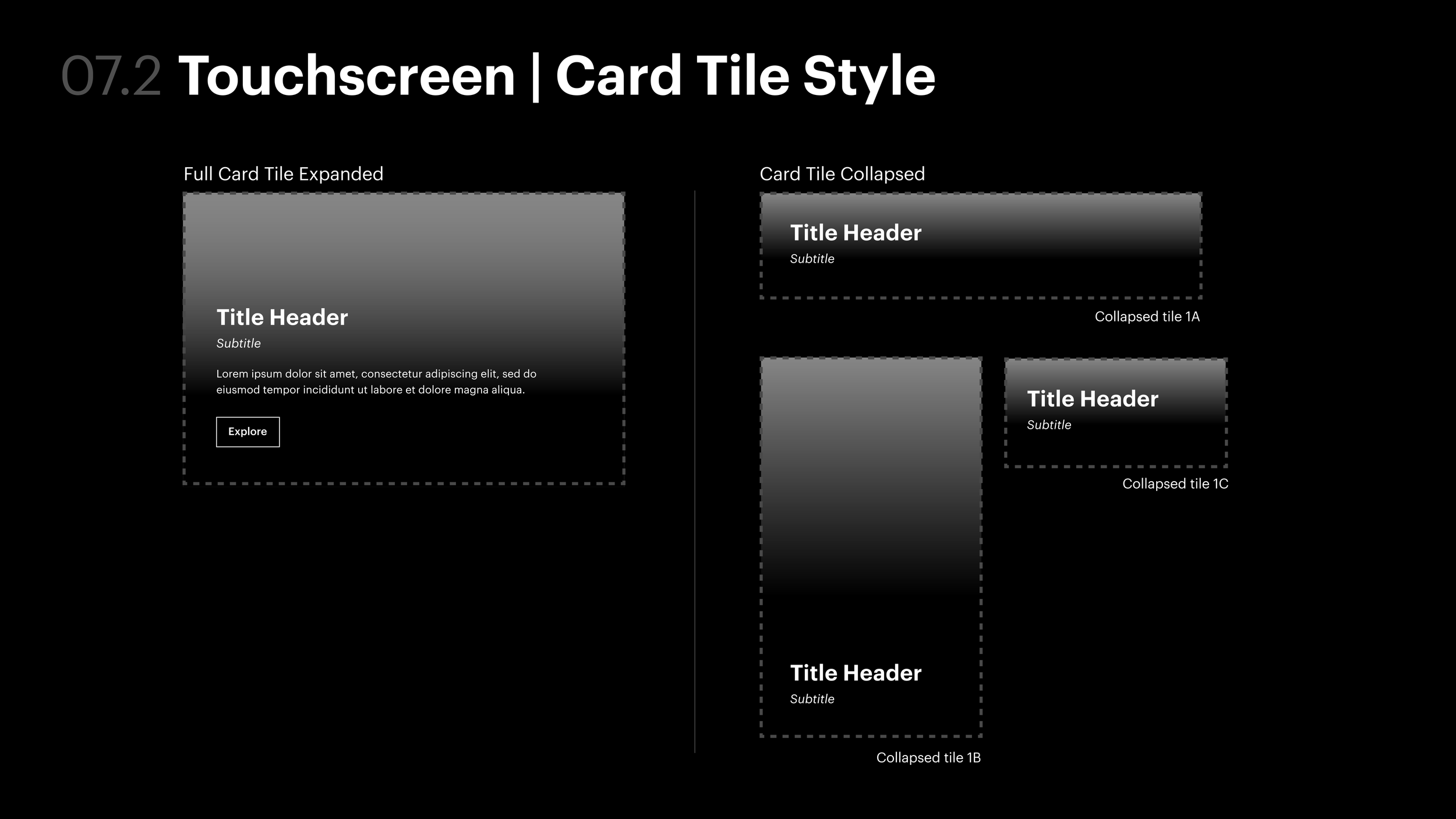
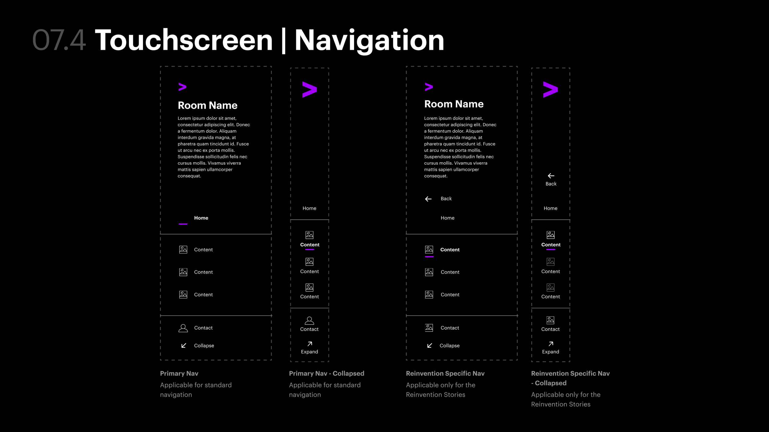
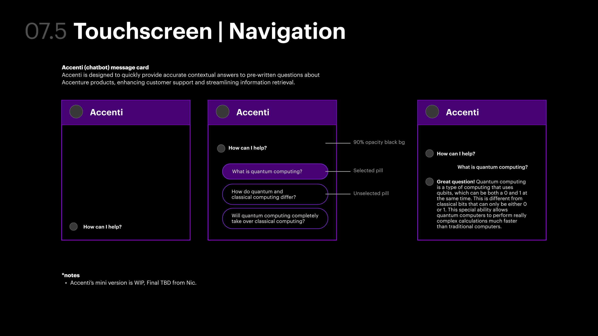
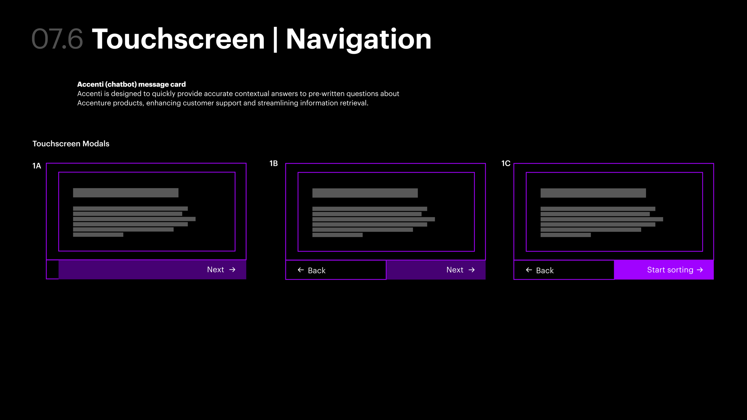
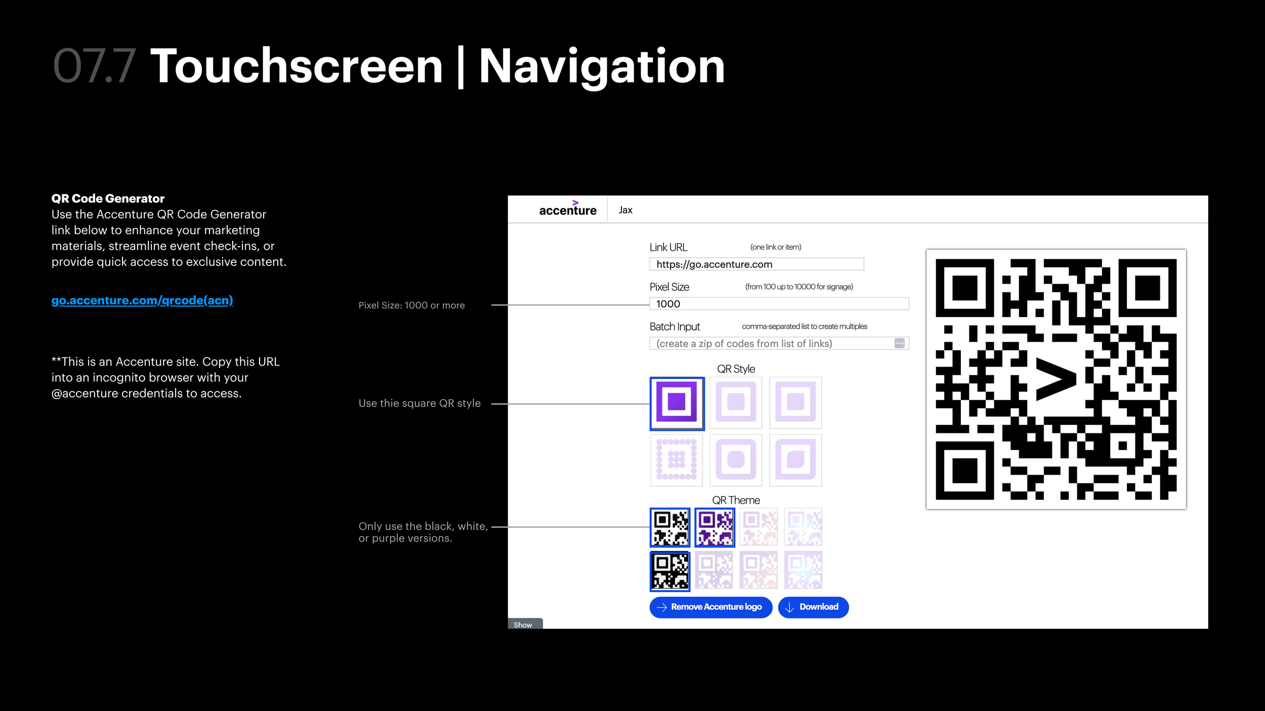
The touchscreen system is built on a 12-column grid at 90px wide with 60px gutters, running on Dell displays at 3840x2160. The accessibility heat map shows where interactive elements are concentrated — between the middle and bottom of the screen — to ensure the UI is reachable for users of varying heights. Four content layout templates are shown for the Dell screen.
8.0
Component Library
The full component library covers every interactive pattern used across the touchscreen interfaces — form inputs with four states (default, active, error, success), text areas, collapsibles, tabs, dialogs, select menus, context menus, dropdowns, command palettes, media cards, navigation menu patterns, confirmation dialogs, alert dialogs, and accordions. Everything is built in the dark purple system with consistent interactive states throughout.
The Space
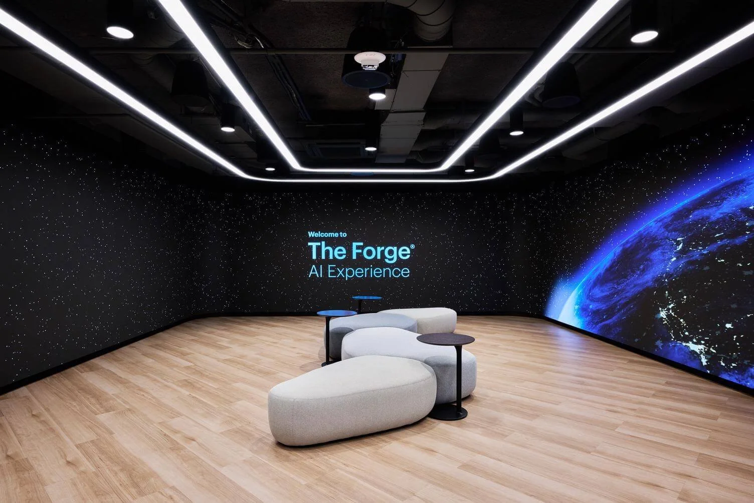
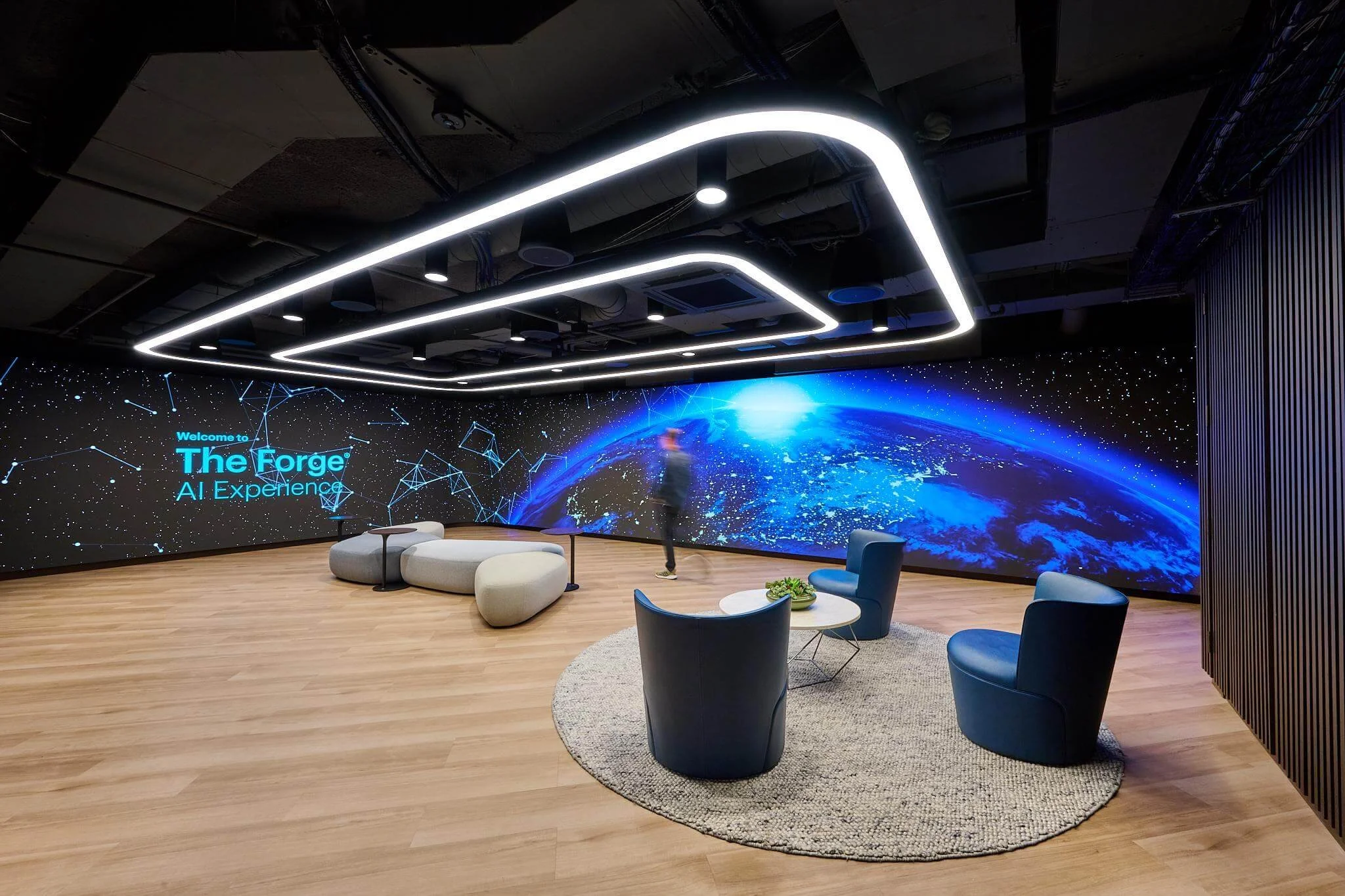
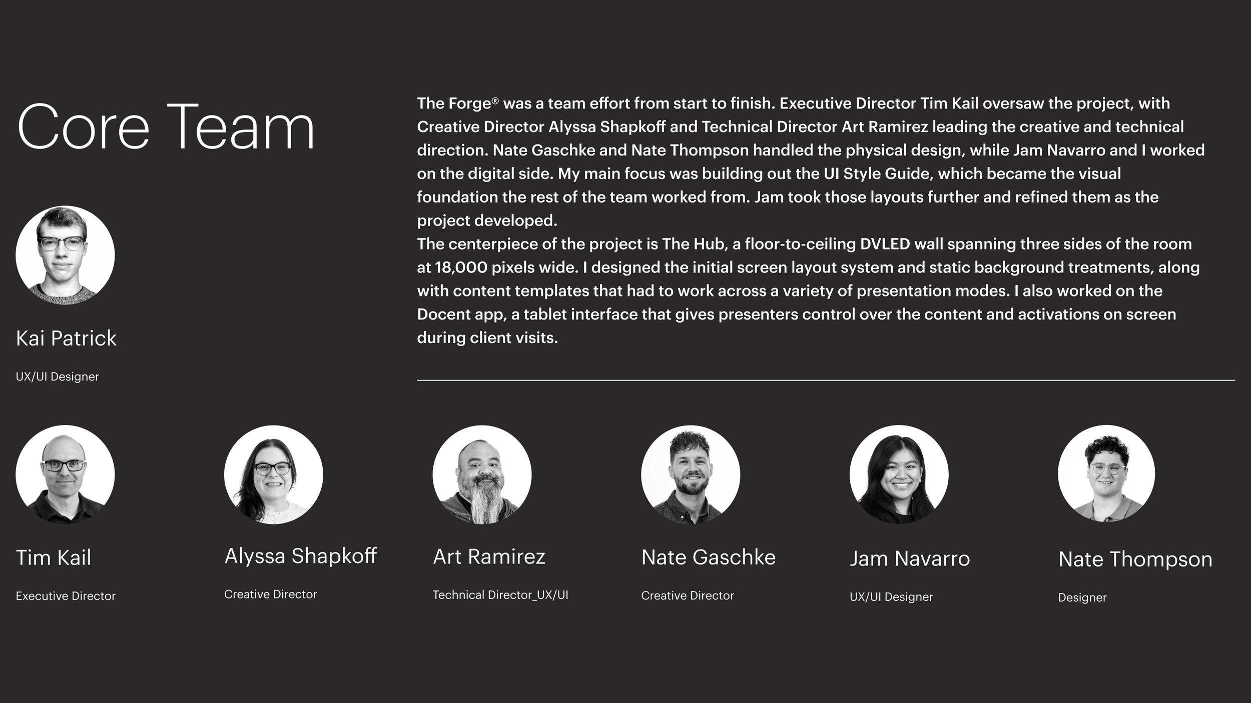
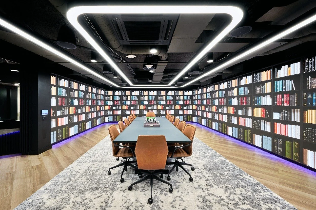
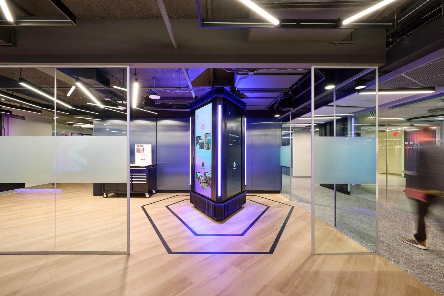
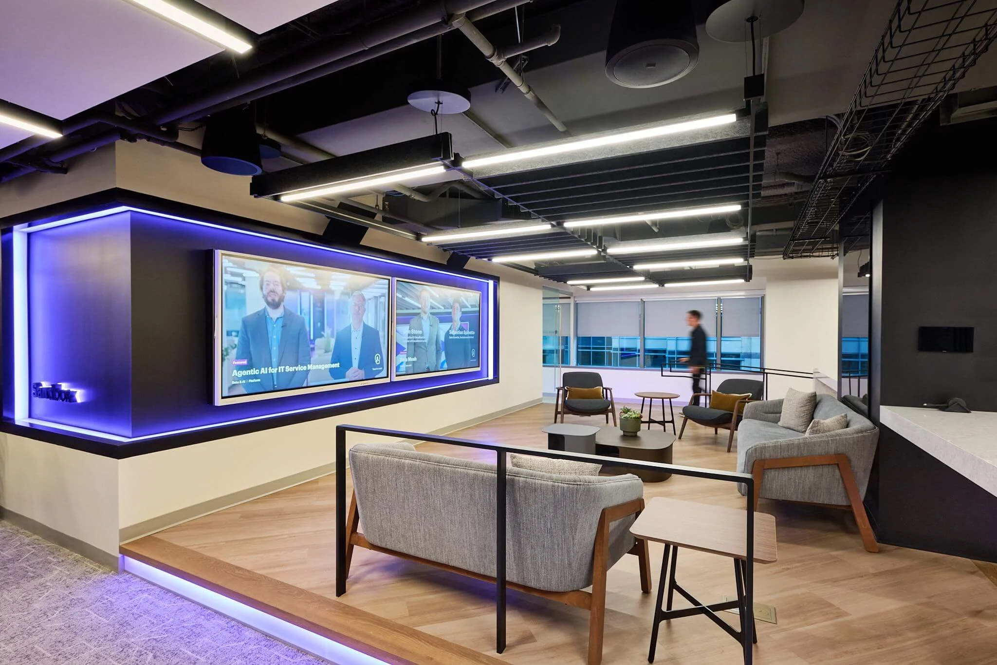
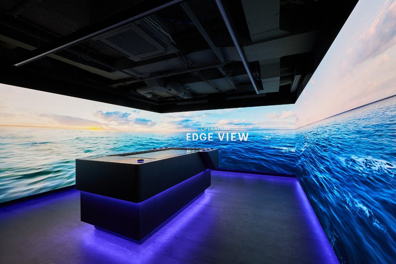
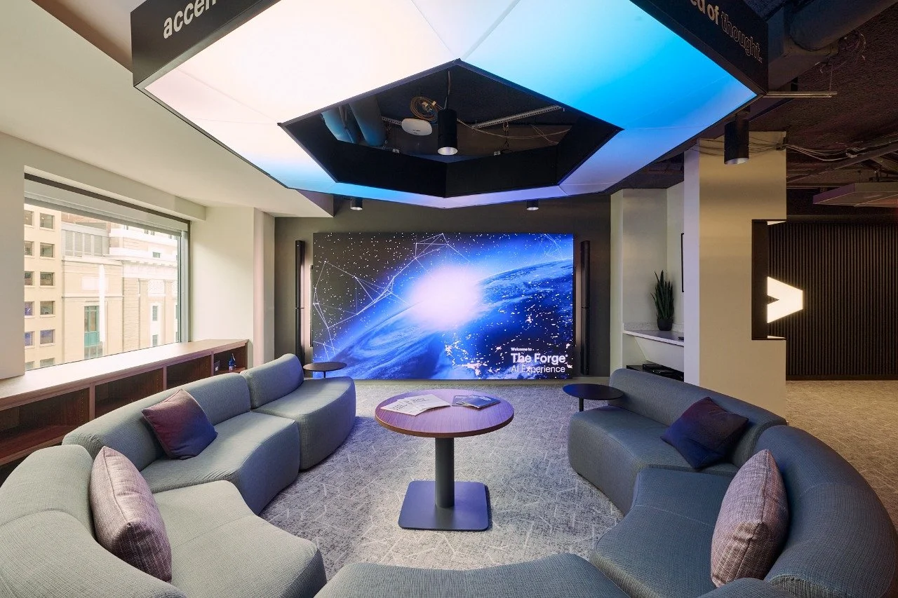
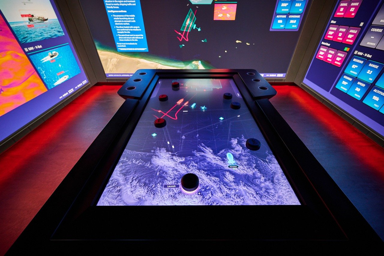
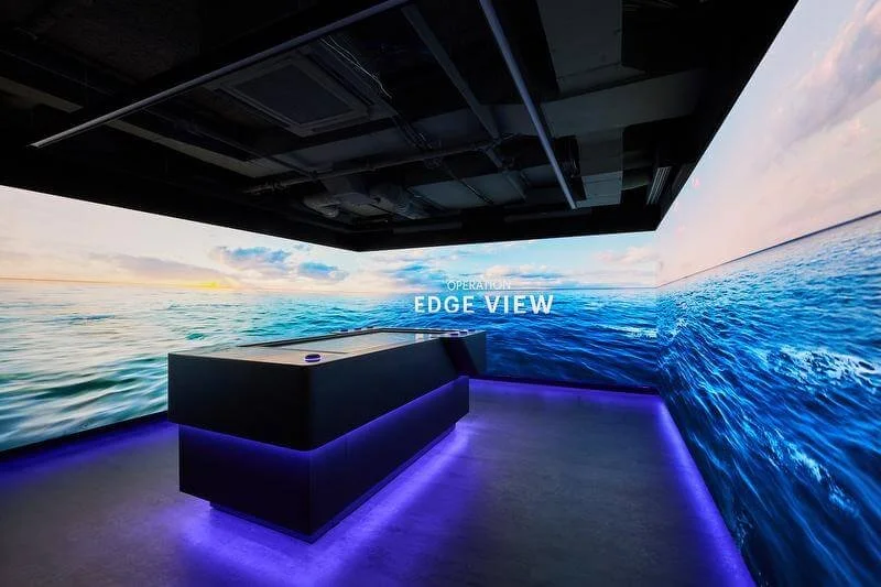
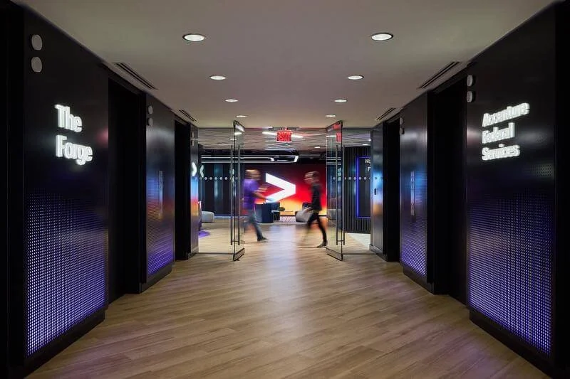
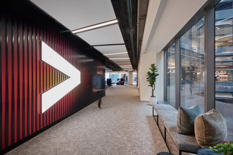
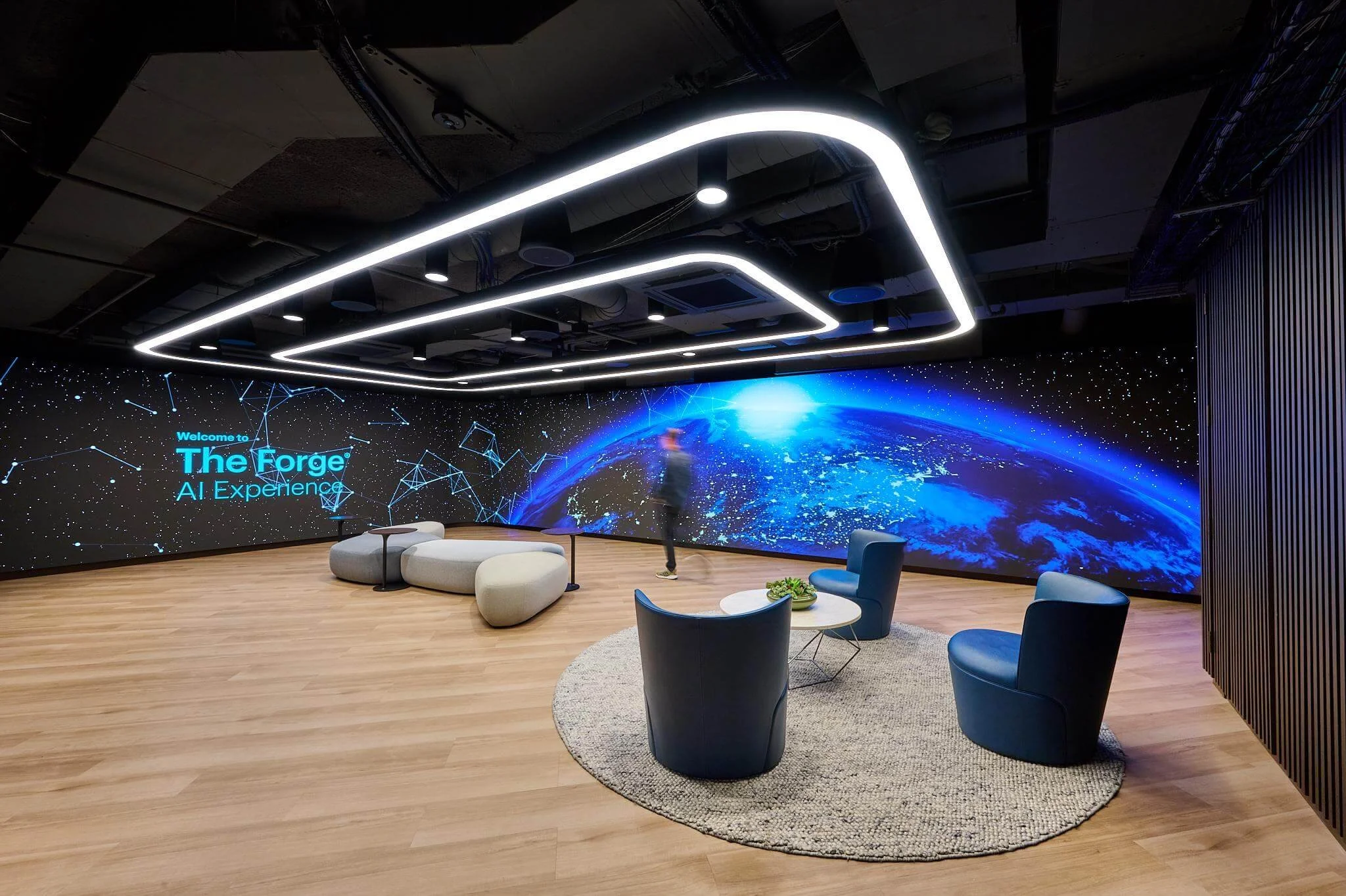
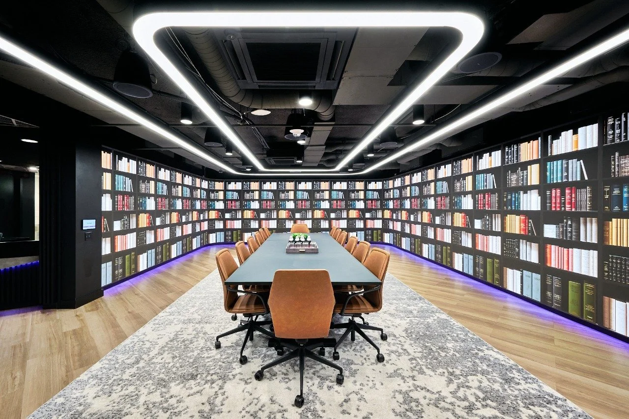
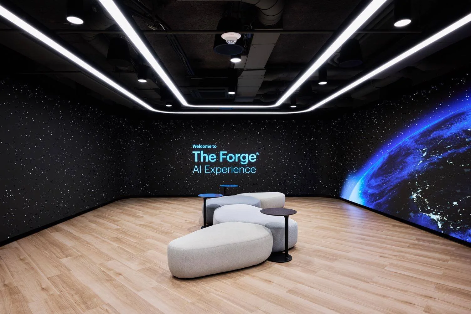
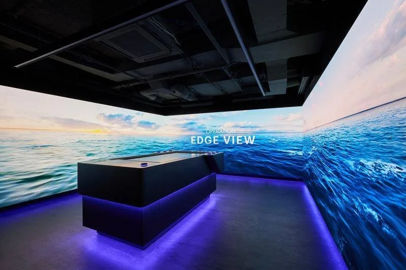
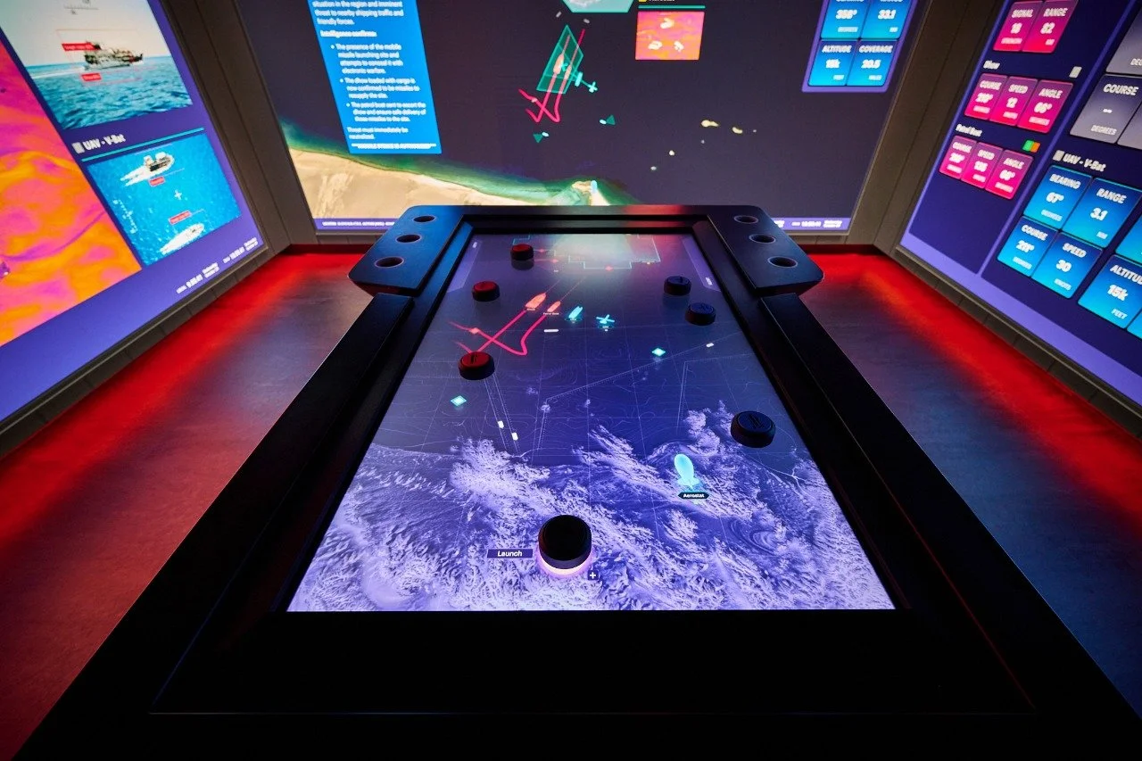
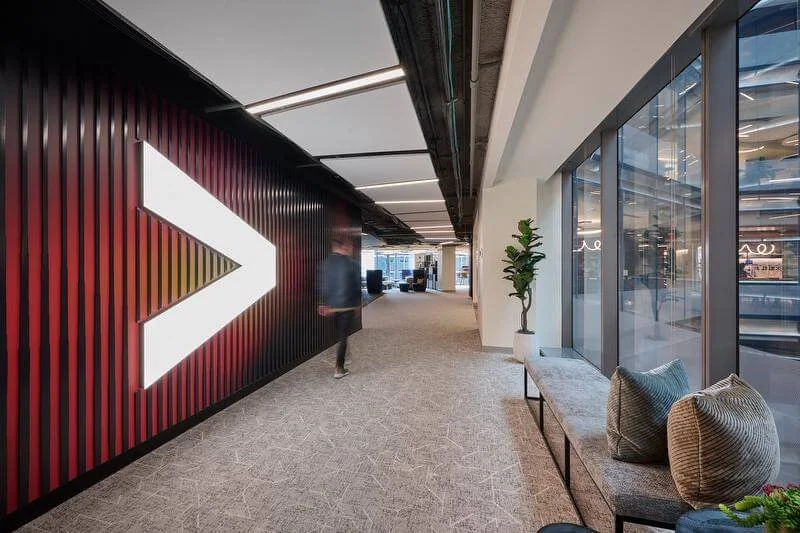
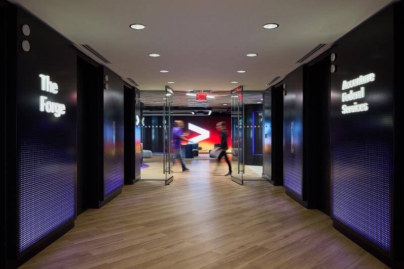
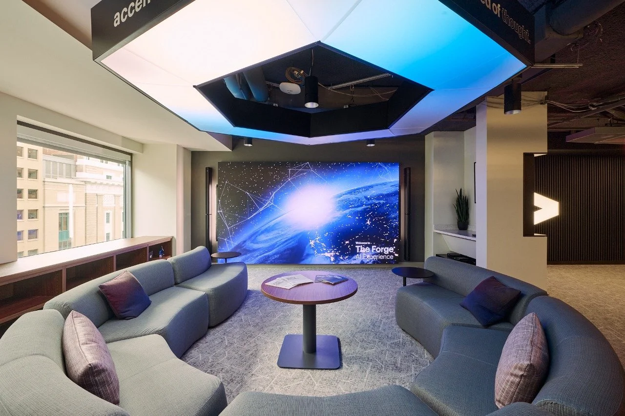
The photos below show the finished environment — the product of a large, talented team. The Forge® was designed by Dimensional Innovations in collaboration with HOK, Electrosonic, and HITT Contracting, led by Executive Creative Director Tim Kail. My contribution was on the UI and visual design side — the style guide, screen content system, and component library that govern how everything looks and behaves across the digital touchpoints throughout the space.
Within its first 45 days of reopening, The Forge engaged over 300 clients and generated 60 new business opportunities. In 2026 it received the Gold Award for Showroom, Exhibit and Gallery Interior Design from the International Architecture and Design Awards.


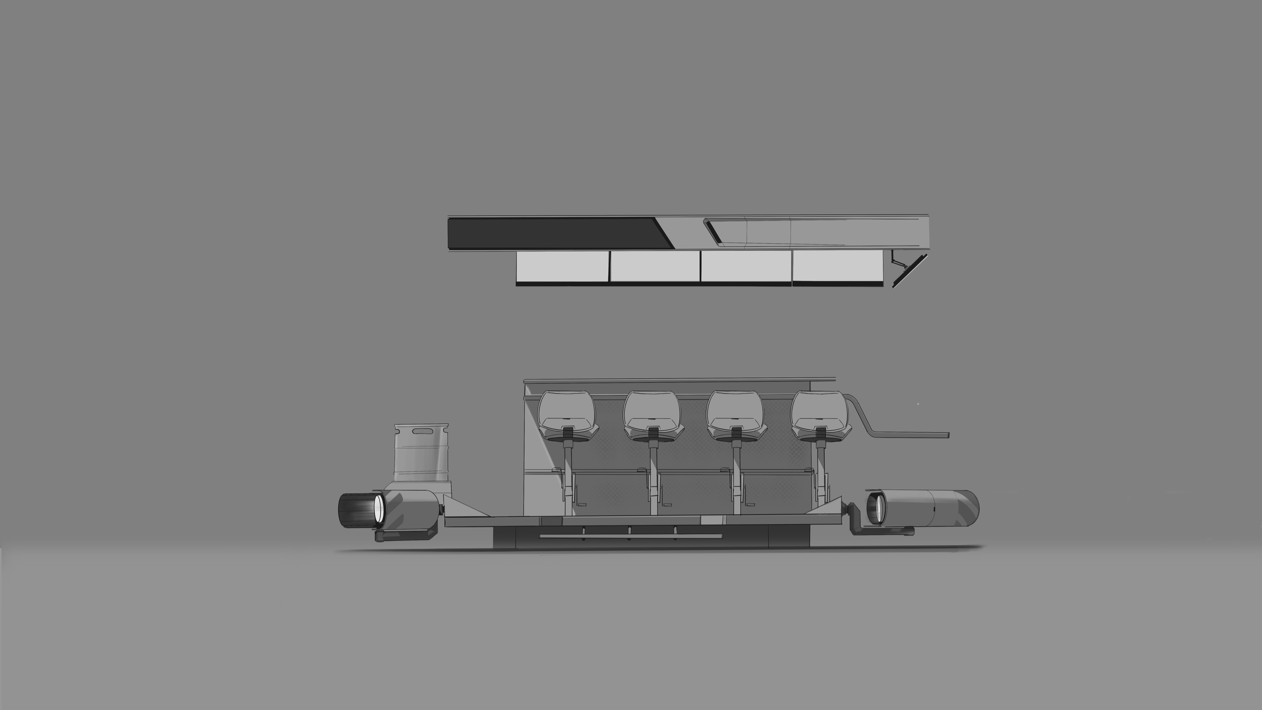
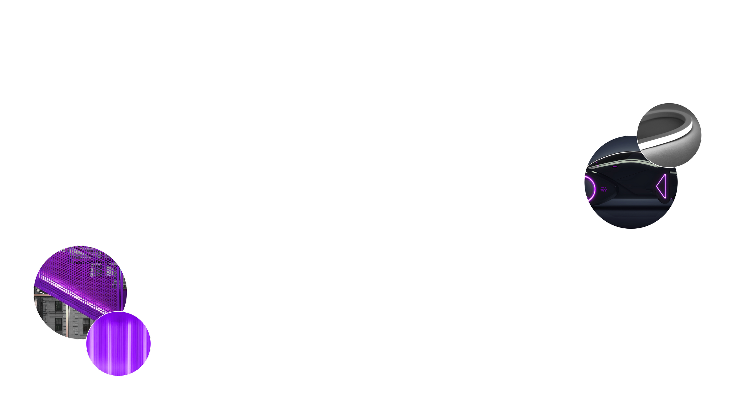
Materiality : The use of translucent and perforated materials tie into the larger Forge vision, and create a clean, tech-forward aesthetic. These materials allow for integrated programmable lighting.
Integrated Lighting : Light channels and coves across the structure come to life creating engaging animations enticing guests to interact. Opportunity for lighting to be responsive to the experience.
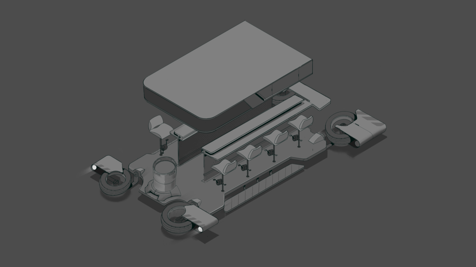
Seating: This creation station incorporates commercial grade comfortable seating that allows for longer linger times and a more elevated experience. Finishes TBD following final design.
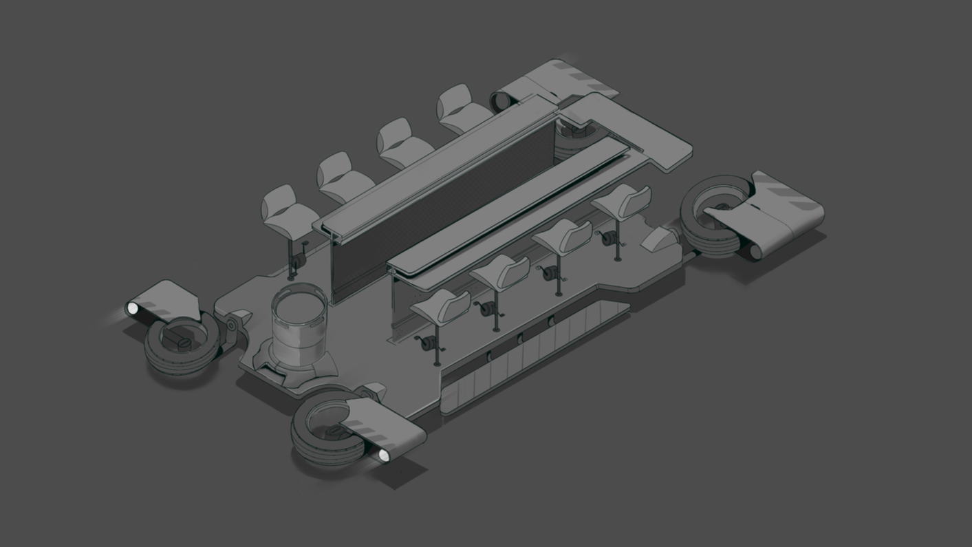
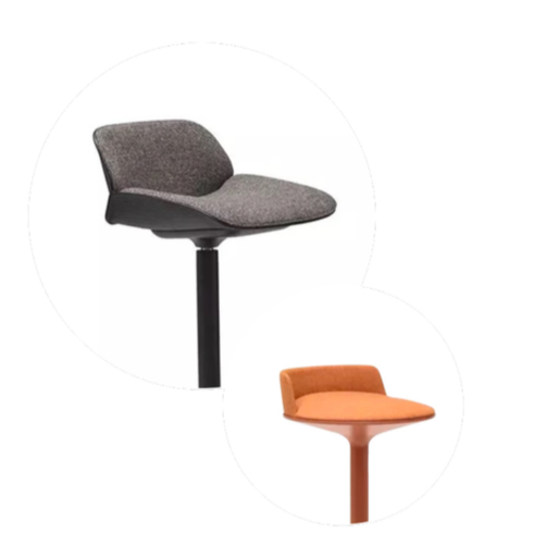
ADA Accessible Station: The back bar area of the creation station cascades down to create an ADA accessible station for individuals who are unable to use the other stations. A portable chair will be available..
Digital Displays: 6-8 digital displays that flank both sides of the interior canopy of the creation station. These displays correspond with the seating at each corresponding station. Hardware by others.
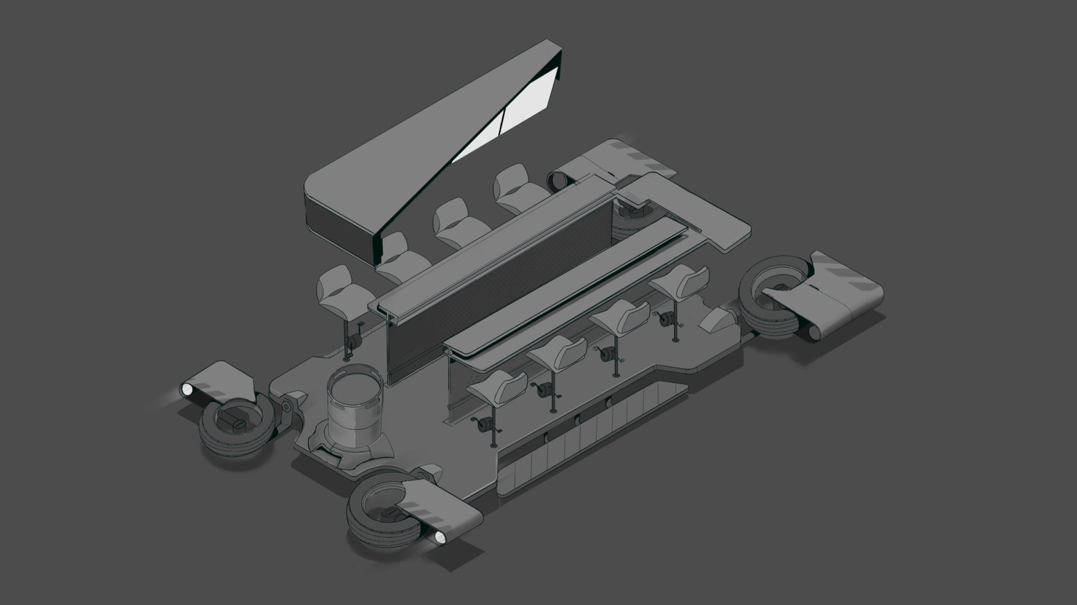
AI Prompt Stations: 6-8 stations for guests to learn and engage with prompt engineering. Stations to include a mouse + keyboard that allows for seamless interaction. Final specs and needs TBD, hardware by others.